Improvement Insights Blog
An open and clothed case…

The other day, I found myself with a few hours to kill between appointments. I happened to be near the hip, fashionable area of town so I thought I’d wander around and peruse some of the shops. While the past year has been hard on retail businesses and has resulted in the closure of several places I remember, it’s good to see that others have started to spring up in their place.
As I was wandering the aisles at a small, newly-opened clothing store, a voice from behind me called out my name. I turned to see a tall, handsomely dressed man.
“I thought I recognized you! It’s been years since you moved out of the upstairs apartment, but I was sure that was you. How are you? And welcome to my little boutique!” he exclaimed enthusiastically.
“Hi, Mauro!” I replied, smiling and shaking his hand. Many years ago, I lived in an upstairs apartment and Mauro lived in the apartment below mine. Though our interactions were mostly just hellos in passing, occasionally on summer evenings we shared neighborhood gossip over frosty beverages on the front porch.
“It HAS been a long time since Detroit Street! I’m fine… and what about you? When did you open this store?”
“Oh, about six months ago,” Mauro answered. “Both my jobs at the bridal shop and menswear store went POOF and vanished last year, so I spent the time off growing the contacts I’d made in the industry over so many years. When the time was right, I used some savings to start this place. We’ve done most of our business so far online, but I’m starting to see more foot traffic. That’s why I hired these two,” he said, pointing toward one woman near the cash register.
“Uh… these two?” I began. “I only see one person there.”
Mauro rolled his eyes. “Honey, you don’t know the half of it. Brenda here has been a godsend. Always on time, always willing to stay late to help restock. As for Allen…” Mauro threw up his hands. “If he’s only 20 minutes late, I’m thrilled. But he’s a good worker when he’s here, and help is SO hard to find nowadays. Say, if you’re still doing that improvement thing, maybe you can help me with something.”
“Sure, Mauro. I’ll be glad to take a look.”
A few minutes later, in his back office, Mauro shows me this line chart:
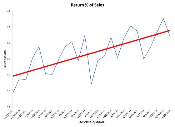
“I’ve been keeping track of the returns we get on a weekly basis, and I’m concerned at the trend here. Look how much it’s increasing!” Mauro said, exasperated.
“First things first: how did you create this line chart?” I asked.
Mauro replied, “In Excel. Then I clicked to include a trend line.”
“I thought so,” I said, getting my laptop out. “Why don’t you email me those numbers and I’ll use a chart that’s a little smarter than this line chart to give you a little more insight about your data.”
“How can one chart be smarter than another?” asked Mauro.
“Well, my watch just tells the time. Your watch tells the time and can also check your email, the weather, your pulse, your checking account balance and lets you order groceries online. That would make it a smart watch, right?”
Mauro held up the device on his wrist. “It would, it is, and I absolutely love it.”
“Well, if one chart showed you just your data and another showed you not only the data, but also a range of where you’d expect your data to be based on past performance, and also highlighted for you any points or groupings that aren’t likely to have occurred under normal circumstances, wouldn’t you say that chart’s a smart chart?” I responded.
Mauro nodded. “Okay, you’ve got me there.”
“Excellent, but let’s pause on smart charts for now and talk about this trendline you used. See, according to statistics, you can’t just plop a trendline on any old graph. There’s rules about when you can and can’t use a trendline. Remember that time you stopped me from going out for the night because you saw I was wearing…”
“…A brown belt and black shoes? Yes, I remember. It was horrible. You’re doing SO much better now,” he said, indicating my matching belt and shoes. “That shirt, however…” he continued, in a joking manner.
I laughed. “Trendlines are kind of like the ‘belt matching the shoes’ thing: You should only use them when certain conditions apply, otherwise they don’t work. Here, I have your data. Let me plug it into some software I have and show you something about this trendline.”
I highlighted his data and selected XmR Trend from the QI Macros menu:
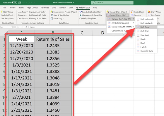
In less than a second, the software generated the XmR Trend charts.
“Now there’s something called an R Squared Value that describes how well that trendline fits the data. This ranges from 0 to 100%. If the R Squared Value is smaller than 80%, you shouldn’t use a trendline because there’s just not enough fit. This chart I used calculates not only the trendline, but also tells you whether the R Squared Value is high enough where you can use the trendline. The first row of text indicates that the R Squared Value for this trendline on your data is less than 80%. The line below that shows the Ryx value, and that is the Linear Correlation Coefficient. if you take that number and square it, that’s your R Squared Value. Perform that calculation on your data and you’ll see that yours is less than 51%.”

“But it looks like it fits! Why would the value be so low?” asked Mauro.
“Good question. It has to do with the week-to-week variation being too far away from the trendline. Because of that, you can’t conclude that a steady and regular increase is occurring, and thus justify a non-horizontal centerline. You could if the variation were lower. Think about it this way: If you looked at the clock and Allen was supposed to be here 15 minutes ago, you wouldn’t be alarmed because it’s not that unusual given his past variation. But if Brenda was 15 minutes late, that would be highly unusual and you might suspect that something was wrong. Different levels of past variation leads to different conclusions.”
Mauro cocked his head. “That all makes sense.”
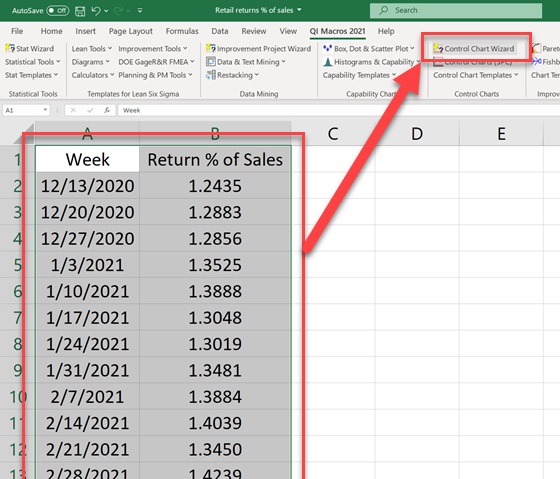
I smiled. “Now let’s circle back to the discussion earlier about smart charts. Let me show you a smart chart that accounts for past variation and shows a range of where you’d expect your data to be each week,” I said. I highlighted his data and selected the QI Macros Control Chart Wizard.
In a moment, the software generated the XmR charts:
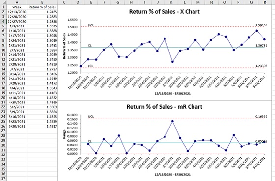
“What this shows is that even though it might look like this process is increasing, if you account for the week-to-week variation it’s actually a relatively stable, level process. As it stands, right now you can expect an average of 1.37% of a week’s sales to be lost to returns, but that number could realistically range anywhere between 1.23% and 1.5%. Considering what you said earlier about most of your sales so far coming from internet orders, that stands to reason. If someone can’t be in the store to try on a shirt, they might need to return it if it doesn’t fit quite right.”
“That’s true,” replied Mauro.
“It’s certainly one of the things that you should keep monitoring. If you want to try to reduce the returns or reduce the week-to-week variation, you can analyze the reasons customers give for the return. Find the one reason that accounts for more returns than the others. Figure out the root cause of that one reason, and you can figure out ways to address that root cause and see if that cuts down on your returns.”
Mauro stood up and began rummaging through shirts hanging on a rack behind the desk. “Well, I’m glad you decided to stop in. Leave me your card and let’s plan on me hiring you for some analysis later on in the summer.” He turned around with a beautiful blue shirt in his hands. “For today, since you were kind enough to take a look at these numbers, please accept this as a token of my appreciation.”
I smiled broadly. “Thank you, Mauro! You didn’t have to do that!”
Mauro nodded. “Oh, but I did. You’re welcome. You should put it on before your next appointment.”
I noticed Mauro’s expression, and something dawned on me. “So… you weren’t kidding earlier about my shirt, were you?”
If you’re interested in learning more about creating XmR Trend charts in QI Macros, click HERE and HERE to read about it on the QI Macros website. If you’d like to learn more about QI Macros’ Control Chart Wizard that chooses the chart for you automatically, click THIS link to find out more. Finally, to learn more about the XmR chart in QI Macros, click HERE.

