Home »
Blog » Pareto Chart » Page 2
Improvement Insights Blog
Posts tagged "Pareto Chart"
Yankee Spirit (50% reduction in delay, defects and deviation) is easy to achieve. It’s imperative. Here’s why:
“Hi, I’m Jay Arthur, author of “Lean Six Sigma for Hospitals” and QI Macros [software].
“When I first got started in Quality Improvement, our training folks talked about Yankee Spirit as a method of setting a goal. What’s Yankee Spirit? Well, Yankee Spirit is simply a 50% reduction in delay, defects and deviation.
“Well, that just sounds like we’re just taking a dartboard throwing a thing at it, but it was years later that I realized that this is actually scientifically doable. As I started to look at it, Pareto’s rule says 20% of what you do produces 80% of the waste, rework, lost profit, patient harm… whatever you want to call it.
Continue Reading "Yankee Spirit Goal Setting"
Posted by Jay Arthur in Improvement Insights, Six Sigma.
If you look at improvement project posters at quality conferences around the country, you’ll find that almost everyone is using Excel line and bar charts. Even after decades of Six Sigma training and association membership. What’s the hold up? Here’s my take:
“Hi, I’m Jay Arthur, author of “Lean Six Sigma Demystified” and QI Macros [software].
“Every year I look at lots of improvement posters and I keep wondering, “Why isn’t anyone using the tools of Quality?” Control charts, Pareto charts, histograms… Most of them are just using plain old Excel line and bar charts. Now it might be because they don’t know about the power and beauty and how easy it can be now to do Control charts, Pareto charts and fishbones.
Continue Reading "Why Are People Using Line and Bar Charts, not Control Charts?"
Posted by Jay Arthur in Improvement Insights, Lean, Six Sigma.
People over age 55 account for 92% of COVID-19 Deaths (data from CDC). Sweden is using similar data to leave the country open for most citizens while asking seniors to stay at home. How do we reopen the economy? Self-quarantine seniors; let everyone else get back to work.
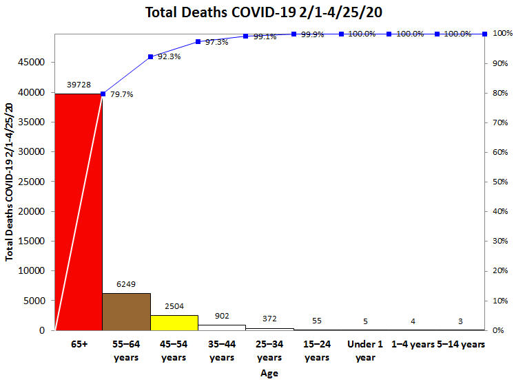
Here’s the 2019-2020 Influenza (i.e., Flu) deaths. Again, seniors are 83.5% of deaths. The flu death rate is about 1 per 1,000. COVID-19 death rate is 1-2 per 100, perhaps lower in people under the age of 55 and higher for those over age 55.
Countermeasure: Self-quarantining seniors will help flatten the curve and prevent overwhelming healthcare.
Continue Reading "U.S. Deaths by Age Group as of 4/24/2020"
Posted by Jay Arthur in Healthcare, Jay Arthur Blog, QI Macros.
Sometimes you’ll hear people say that software isn’t necessary for Quality Improvement. Let me demonstrate how much time you’re wasting if you create ONE Pareto chart by hand, instead of using software.
“Hi, I’m Jay Arthur, author of “Lean Six Sigma Demystified” and the QI Macros [software].
“If you’ve listened to any of my Insight videos or seen me present at conferences or [had me] train you in a workshop, you know that I don’t believe you can do Quality Improvement without software. We have to stop doing Quality Improvement the 20th century manual, slow way. We have to start doing it the 21st century way, and we have to start doing it quickly.
Continue Reading "Making Pareto Charts by Hand?"
Posted by Jay Arthur in Agile Lean Six Sigma, Improvement Insights, QI Macros.
Many people tell us that they have QI Macros, but they don’t know how to use it. Make a resolution to learn how! Here are my suggestions.
“Hi, I’m Jay Arthur and… it’s 2020. How did that happen? A new year; a new decade. Seems like just yesterday everybody was worried about Y2K. Somebody out there is thinking, “What’s Y2K?” That was a thing that happened back in the year 2000… you probably forgot all about it, but I’ve been at this for over twenty years now in the software field around Quality Improvement, so I’ve seen a lot of things.
Continue Reading "2020 New Years Resolution Part 1 – Learn One Tool Per Month"
Posted by Jay Arthur in Improvement Insights, Lean, QI Macros, Six Sigma.
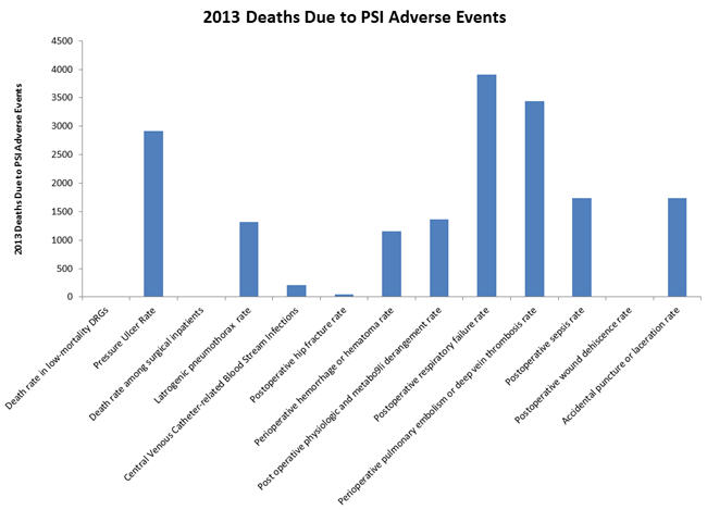
The July/August 2017 HealthLeaders magazine had a series of charts about the impact of Adverse Events. In general, the magazine used column charts:
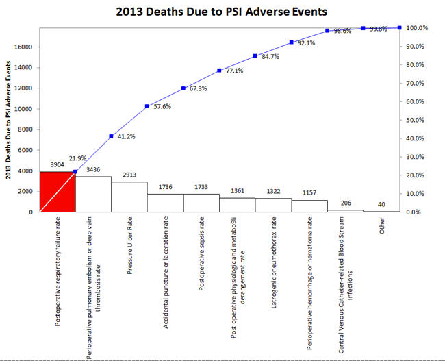
But wouldn’t a Pareto chart illuminate the important adverse events more clearly? The first three accounted for over 57% of 2013 deaths.
Continue Reading "Excel Bar Charts Hide The Signal in Noise"
Posted by Jay Arthur in Excel, QI Macros, Six Sigma.
The June, 2016 HRB article by Scott Berinato examines how to use charts and diagrams to express ideas and statistics. I agree with Anmol Garg, Tesla data scientist quoted in the article, “You can’t find anything looking at spreadsheets and querying databases. It has to be visual.”
Bernato says: “Convenient is a tempting replacement for good, but it will lead to charts that are merely adequate or, worse, ineffective.” He separates visualizations into four components: idea generation, idea illustration, visual discovery and everyday dataviz. Simple line, bar and pie charts are great for idea generation and illustration, but terrible for visual discovery and dataviz.
Continue Reading "Data Visualizations that Really Work"
Posted by Jay Arthur in QI Macros, Six Sigma, Statistics.
I first learned how to draw Pareto charts by hand using engineering paper if you can believe it. Our trainers were very specific about how they were to be drawn. One of the earliest references I can find is Kaoru Ishikawa’s Guide to Quality Control. Here’s the correct way to draw a Pareto chart using data from Ishikawa’s book:
The bars should be touching and the cumulative percentage line should go from corner to corner of the first bar.
Unfortunately, most Pareto charts drawn by computer look like the following one, bars not touching and cumulative line running out of the center of the top of the first bar.
Continue Reading "The Correct Way to Draw a Pareto Chart"
Posted by Jay Arthur in QI Macros, Six Sigma.
In his speech Sunday at IHI, Don Berwick called for everyone to “recommit to improvement science” (step 5 in ERA 3 of healthcare transformation).
He sounded annoyed with the lack of use of Lean Six Sigma tools and methodologies.
I understand his frustration. I was there in 2006 when he asked everyone to “pledge allegiance to science and evidence.”
Over the years, I’ve done a stroke tally of the quality tools used in IHI poster presentations.
I gave each poster one checkmark for each type of tool used.
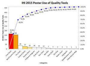
Sadly, even with all of the emphasis on control charts, Pareto charts and other tools of quality, they are used rarely in poster presentations.
Continue Reading "IHI 2015 Poster Use of Quality Tools"
Posted by Jay Arthur in Healthcare, QI Macros, Six Sigma.
Seth Godin’s blog brought this data to my attention: http://www.nextbigfuture.com/2011/03/deaths-per-twh-by-energy-source.html.
There’s lots of ways to display it, but I thought it would be fun to look at as Pareto charts.
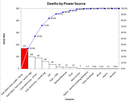
Deaths from nuclear power are small compared to the power produced. Coal and oil are still the heavy hitters in the mortality department.
Continue Reading "Deaths by Power Source Data"
Posted by Jay Arthur in QI Macros.


