Home »
Blog » Page 68
Improvement Insights Blog
Latest Posts
This month’s issue of Money Magazine discusses the 21 Most Valuable Career Skills. At the top of the list, statistical analysis increasing pay by 6.1%. Right behind statistical analysis is Data Mining at 5.1%. It’s incredibly easy to learn these two skills using QI Macros and Six Sigma.
Also on the list, Customer Service Metrics (4.3%). I have found that the written comments in customer service systems can be easily analyzed using the QI Macros Word Count tool to identify the most common type of call or complaint. Then simple root cause analysis can reduce or eliminate those calls.
Business analysis (3.8%) is easy with QI Macros Control Chart Dashboards.
Continue Reading "Most Valuable Career Skills"
Posted by Jay Arthur in Healthcare, Lean, Manufacturing, QI Macros, Service, Six Sigma.
As John Johnson and Mike Gluck point out in their book, EVERYDATA, ice cream consumption and murder rates both go up in the summer, but that does not mean that eating ice cream causes murder. Rising summer temperatures seem to be involved.
They also provide a link to Tyler Vigen’s website, Spurious Correlations.
Does U.S. spending on space, science and technology cause suicides? No, but they are correlated at a 99.79%. These and other crazy correlations are available.
So don’t confuse correlation with causation.
Continue Reading "Correlation not Causation"
Posted by Jay Arthur in Jay Arthur Blog, Six Sigma, Statistics.
At this years American Society for Quality World Conference in Milwaukee, winning teams improvement projects were displayed in posters in the exhibit hall. As I did at IHI in December, I took a stroke tally of the types of tools used. Like IHI, the vast majority of tools were line and bar charts, which are the dumbest charts on the planet. Only a few teams out of 36 used control charts, Pareto charts, histograms or fishbones.
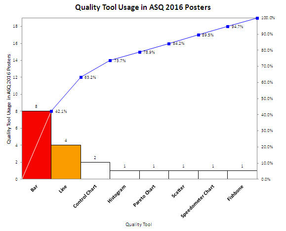
Shouldn’t quality improvement stories should be told with tools of quality, not simple line and bar charts? Shouldn’t we be using charts that went to college and took statistics?
Continue Reading "ASQ 2016 Quality Tool Usage in Poster Presentations"
Posted by Jay Arthur in Healthcare, Manufacturing, QI Macros, Service, Six Sigma.
Charles Duhigg, in his book Smarter, Faster, Better, describes a condition he calls “information blindness.” When faced with too much information, people shut down because they don’t know what to do with it.
I find this is true in most companies. They collect tons of data, but can’t “winnow” the data down into the vital few bits of information that would transform their business. What I invariably do is use PivotTables, control charts and Pareto charts to find the “vital few” bits that tell us exactly where to find and fix the problems that cause over half of the waste, rework and lost profits.
Continue Reading "Information Blindness"
Posted by Jay Arthur in Six Sigma.
A customer called today confused about her data. She wanted to draw a control chart and thought the data might have a binomial or poisson distribution. She thought it was attribute data. She’d used the QI Macros Control Chart Wizard to create a control chart of her data and it chose an XmR chart. She wasn’t sure that was right. When I asked her what kind of data she had, she said, “write-offs”.
Write-offs are money, plain and simple. Money is variable (a.k.a. continuous or measured) data.
I explained that to her and suggested she stop worrying about what kind of distribution she has and just look at her data.
Continue Reading "Binomial, Poisson, Attribute, Continuous Data Control Chart Confusion"
Posted by Jay Arthur in QI Macros, Six Sigma.
Children seem to like the look of laundry detergent packets, so they eat them and go to the emergency room.
Failure Mode and Effects Analysis (FMEA) is designed to ferret out these kinds of problems in advance.
Failure Mode: Someone (adult or child) mistakes them for candy and eats one.
Effects: Vomiting and even death
Could this simple analysis have prevented this problem before it got to market? Maybe.
Learn more at www.qimacros.com/lean-six-sigma-articles/fmea/
Continue Reading "Detergent Packets Poison FMEA"
Posted by Jay Arthur in QI Macros, Six Sigma.
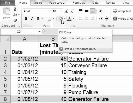
You can use Excel’s data formatting, commenting and filtering tools to help visualize and clarify your data.
Highlighting: Select cells and click on Home-Fill Color to highlight cells:
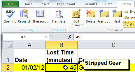
Commenting: To add comments to any cell, click on Data-Insert Comment:
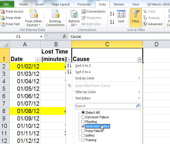
Subset: To select a subset of your data, click on Data-Filter and select the desired content:
Excel will simplify and streamline your data for ease of analysis:
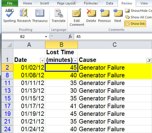
Excel has many powerful data exploration and visualization tools. Play with them!
Continue Reading "Data Visualization and Exploration In Excel"
Posted by Jay Arthur in Excel, Six Sigma.
Like a lot of people, I used to put my taxes off until the last minute. Then I’d grind away for a whole weekend getting the paperwork together and entered into my tax software. Boy that was dumb.
In the last few years I’ve started buying my tax software early and inputting every W-2 and 1099 when it comes in. When the last bit of paperwork comes in, I compare this year with last year, fix any glitches and I’m ready to file.
This is a Lean approach to handling my taxes. I handle everything, just in time, as it comes in.
Continue Reading "Lean for Tax Preparation"
Posted by Jay Arthur in Lean.
The American Statistical Association (ASA) has issued a statement about statistical significance and p values. It quotes ScienceNews article from 2010: “It’s science’s dirtiest secret: The ‘scientific
method’ of testing hypotheses by statistical analysis stands on a flimsy foundation.”
Six Sigma spends a lot of time on hypothesis testing using p values, but our use of p values may lack the rigor required. The ASA states: By itself, a p-value does not provide a good measure of evidence regarding a model or hypothesis.
Continue Reading "p value’s Dirty Little Secret"
Posted by Jay Arthur in Six Sigma.
Microsoft added a box and whisker plot to Excel 2016, but it’s not everything you might hope for. Here’s an Excel 2016 box and whisker plot:
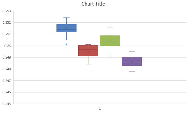
You might notice that the whiskers have a crossbar on the end. It seems to have a spare “x” in the middle of each box and it’s a little hard to see where the median is. And there are unnecessary gridlines that are considered chartjunk. It does, however, show the outlier below the first box.
Here’s what the QI Macros Box and Whisker Plot looks like:
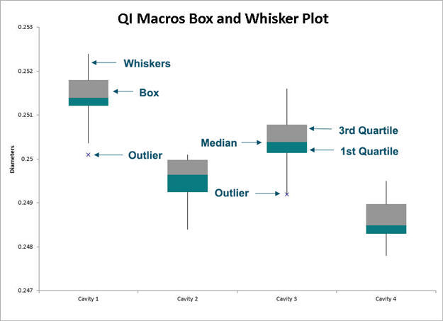
The whiskers are whiskers. The median is easily visible.
Continue Reading "What’s Wrong with the New Excel 2016’s Box and Whisker Plot?"
Posted by Jay Arthur in Excel, QI Macros, Six Sigma, Statistics.

