Improvement Insights Blog
IHI Quality Tool Usage in Poster Presentations
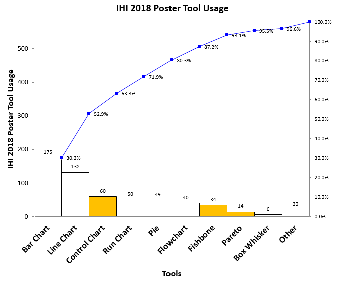
QI Macros exhibited at the Institute for Healthcare Improvement (IHI) conference in Orlando this week. There were over 500 improvement posters. Like prior years, I used a checksheet to collect data about the tools used. Once again, the results are disappointing. Quality tools–control charts, Pareto charts, and Fishbone diagrams–are still a small percentage of tools used, unchanged since I started collecting data in 2015. Bar and line charts still dominate posters; I call them Dumb and Dumber charts.
The quest for Zero Harm using high-reliability methods and tools (i.e., Lean Six Sigma, control charts, Pareto charts, histograms, etc.) is gaining momentum. More people asked about spreading these tools throughout their hospital to monitor performance, because you simply cannot achieve or sustain Zero Harm without them.

