Improvement Insights Blog
Frames and Frames of Reference

I was running errands one afternoon and I found myself in a small cluster of retail shops near my home. A bout of unseasonably warm January weather had graced us with sunshine and mild temperatures, so I was ambling along the sidewalk gazing into shop windows, killing time before my appointment to get my flu vaccine. A beautifully framed black and white photo of a dilapidated gate in one particular shop caught my eye, so I went in to look around.
I found myself in a framing gallery, surrounded by striking artwork in magnificent frames. The shopkeeper was in the back corner at the counter, deep in conversation with a customer regarding some artwork she wanted to have framed. I overheard him helping her decide on a frame.
“You’re such a wizard at this!” the customer exclaimed. “Where do we start?”
“Let’s start here,” the shopkeeper said, pointing to the counter. “I’ve selected these three frames. I think any of them would look good; it’s up to you to decide which one is the right one for you. This one here is a little wider than the others, and the color would accent the blue tones in the artwork, this second one…”
The conversation faded as I meandered to the other side of the shop, engrossed in the artwork and the skilled framing. I heard the bell over the door jingle as the customer exited, then I heard a voice behind me.
“You helped my friend Andrew improve his bicycle accessory shop, didn’t you?” I turned around to see the shopkeeper standing behind me, cocking his head to one side. He was of medium height and not physically imposing, but despite his friendly grey goatee and ponytail of long hair sprouting from the back of a black baseball cap, there was a directness of approach in his manner that took me by surprise.
“Uh… yeah! I think so,” I stammered, a little off guard. “If Andrew talked about a Fabulous Freelance Quality Improvement Specialist, then yes, that’s me. If he had anything bad to say, then that must be some other fella. Pleased to meet you…?” I questioned, holding out my hand.
“Larry,” the man responded, shaking my hand. “Andrew’s been a friend of mine for quite a while, and he couldn’t say enough about how much you helped his business. I’m glad you happened to come in today,” he said, turning back to the counter and motioning me to follow. “After talking with Andrew, I’ve been graphing some of the data on my business, and I can’t make much sense of it. Wondered if I might hire you to help me out a bit.”
“Sure. What have you got?” I asked, following him to the back counter.
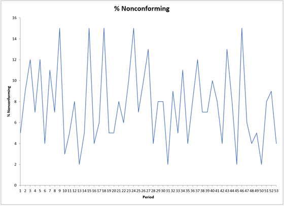
He opened up a laptop and showed me this graph:
“I work with a company overseas, and they supply me with the moulding and millwork.” He looked up over his spectacles to see my blank expression. “That’s the decorative wood or metal that I cut into the lengths I need to make the outside of the frame.”
“Got it,” I answered, nodding.
“So there’s always some damage by the time it arrives here, and that means I can never use 100% of it. It might get dried out in transit and crack, or some of it will break in shipment… that sort of thing. They’re good about it, and always credit me back the amounts I can’t use, but it’s frustrating because even though I might order more than I need, I never know if I’m ordering way too much or if I’m risking running short.”
“And you’re keeping track here of… what, exactly?” I asked.
“This is the percentage of each week’s shipment that I can’t use. It’s sometimes as little as 2%, but has been as much as 15% on some shipments. I just can’t see what this graph is supposed to tell me.” he concluded, sounding frustrated.
“Well, considering that’s just a line chart, I can’t tell much from that either. However, I think I’ve got just the tool that will help you. Can I get that data from you?” He produced a USB drive and I opened my laptop and copied the data into a new spreadsheet.
Larry pointed at my screen. “That’s the Q-One Marco, right? Andrew bought it and raves about it, but I’ve just been using Excel’s free line charts because I thought that was the same thing. I mean, it’s the same data, so it’s all the same, right?”
“Not even a little bit,” I responded, smiling. “First of all, it’s ‘QI Macros’ – QI, like in ‘Quality Improvement.’ And second, let me ask you this: if I hung two identical photos on the wall – one with no frame at all around it, and one with a frame you did – which one would look better?” I asked.
“Oh, the one with the frame,” answered Larry.
“And why is that? It’s the same photo, right?” I asked, baiting him a bit.
“Oh, you have no idea!” he exclaimed. “The frame can accentuate different tones in the photo, it can make it stand out or blend in with your other decor… among other things. The frame makes a huge difference.”
“So having a frame around a photo can make the photo have a bigger impact, right?” Larry nodded, and I continued. “In the same way, having things like Upper Control Limits, Lower Control Limits and a Center Line around a chart line can give that data line a frame of reference. It can give you an idea of whether the data you’re graphing is varying within limits you’d expect it to, or whether it’s going outside what’s normal.” I explained.
“That makes sense,” said Larry. “But Andrew said there’s lots of different charts to choose from. How do I know which one I need?”
“Easy. I heard that customer tell you that you’re a wizard at selecting framing, didn’t I?” Larry nodded. “QI Macros has wizards of its own. Let’s use the QI Macros Chart Wizard.”
I highlighted his data and selected the QI Macros Chart Wizard.
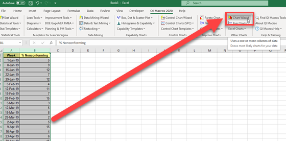
The software worked for a second or two and created several new tabs at the bottom of the spreadsheet.
“What this has done is similar to what you did with the customer earlier. The Chart Wizard analyzed your data and selected several charts that might be right for you, and then it went ahead and created them for you. It’s up to you to make the final determination which one is right for you.”
I clicked the first tab:
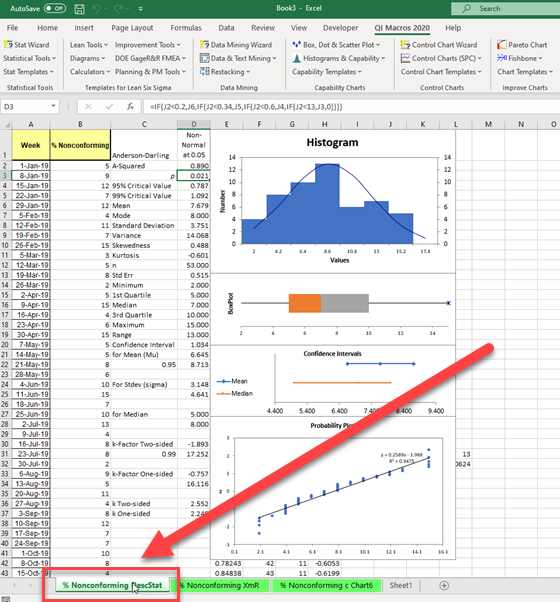
“In this tab, it’s created a Descriptive Statistics analysis of your data. This generates a histogram showing the number of times that each percentage of scrap has occurred, it’s created a box-and-whisker diagram, a probability plot, and a couple other things.”
“So what do we do with this?” asked Larry.
“Well, on another project, I think we might do a lot with it. In this case, I don’t think this is the best tool for you. Let’s take a look at the others.”
I clicked the second tab:
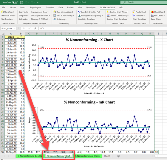
“In this tab, it’s created an XbarR chart. This tool actually has two charts: The X chart up top, which is like your graph with a few extra elements, and the R chart down below. The R chart measures the difference between one week and the next. The X chart adds the dotted red Control Limit lines; these show, according to the results you’ve gotten in the past, what the high and low points that we might expect to see. Not only that, both of them add the teal Center Line; this is the average of all the points.
“So this shows that, on average, you can expect about 7.7% of any given week’s shipment to be unusable, but it could be as high as 21.8%… although that’s unlikely, given the consistency of their past shipments. It also shows on the R chart that you can expect that number to be – on average – between 4.6% higher and 4.6% lower of last week’s number, although it shows that does vary a bit.” I explained.
“That sure tells me a whole lot more than I could tell from the line chart I was using,” said Larry.
“It does. Let’s take a look at the last chart,” I said, clicking the tab.
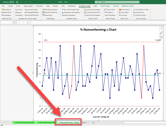
“This is a c Chart. This is typically used when counting things where the opportunity for error is large but the incidence of error is small. I’m not sure this is exactly the right chart you’d want to use, given that you see bad moulding every week, sometimes as much as 15% of a shipment. This chart gives the same average as the XmR chart (after all, the mean average is computed the same way no matter what chart you’re using), but because this is meant to be used to chart things that happen rarely, you can see the UCL and LCL are much tighter to the Center Line than in the XmR chart. It is used to chart different processes, so it calculates those UCL and LCL using a different formula than the XmR chart.”
“Wow,” exclaimed Larry. “I had no idea you could tell so much from data.”
“Absolutely,” I looked at my watch. “However, we’ll have to continue this conversation another time. I’ve got to go get my flu shot.”
Larry grimaced and offered his business card. “I’m much more a fan of shots that are poured in a glass than shots that get poked in your arm. Give me a call tomorrow and I can pay you for the expertise you’ve shared here and set another appointment. I can’t wait to see what else you can help out with here.”
If you’re interested in learning more about the QI Macros Chart Wizard, the XmR chart or the c Chart, click HERE and HERE and HERE to read about it on the QI Macros website.

