Improvement Insights Blog
Colorado COVID-19 Cases and Deaths in Control Charts
While most COVID-19 charts show cumulative cases and deaths, I wondered what would happen if we turned the cumulative data into a daily data and plotted it as a control chart. It is possible to use c or XmR charts for this purpose. Process changes chosen based on runs and trends in the data.
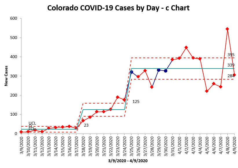
Daily new cases still unstable, but hovering around 339/day. Cases began to rise 3/18. Potentially leveling off 3/26. the date of state “stay-at-home” order.
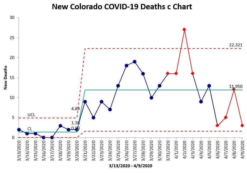
Daily deaths still unstable, but hovering around 12/day. Deaths began rising 3/21, but appear to be stabilizing. Significant spike on 4/2, root cause unknown. When there are eight points in a row above (bad) or below (good) the average daily deaths, it will signal a process shift.
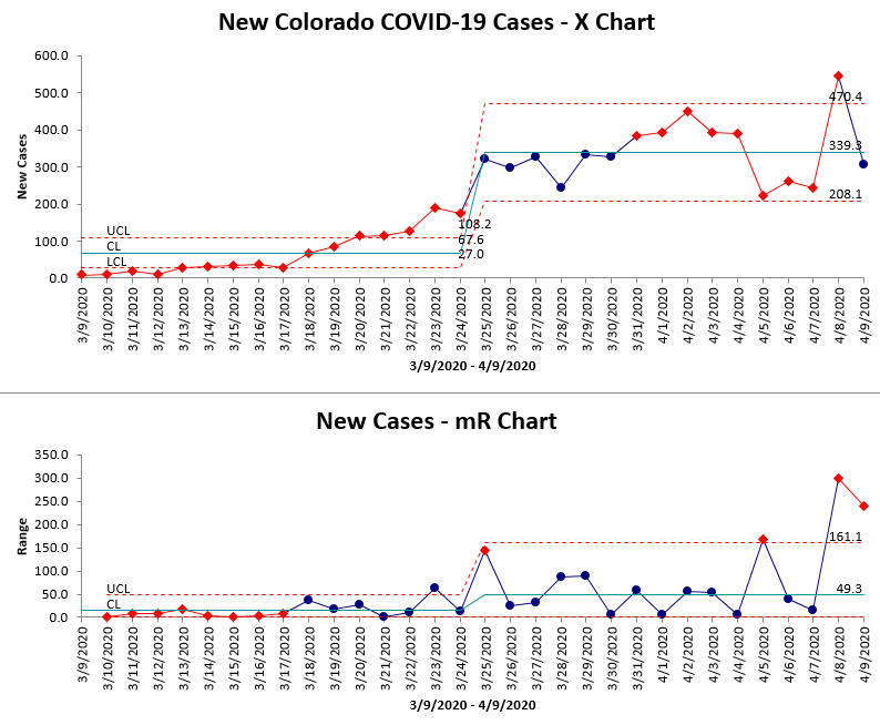
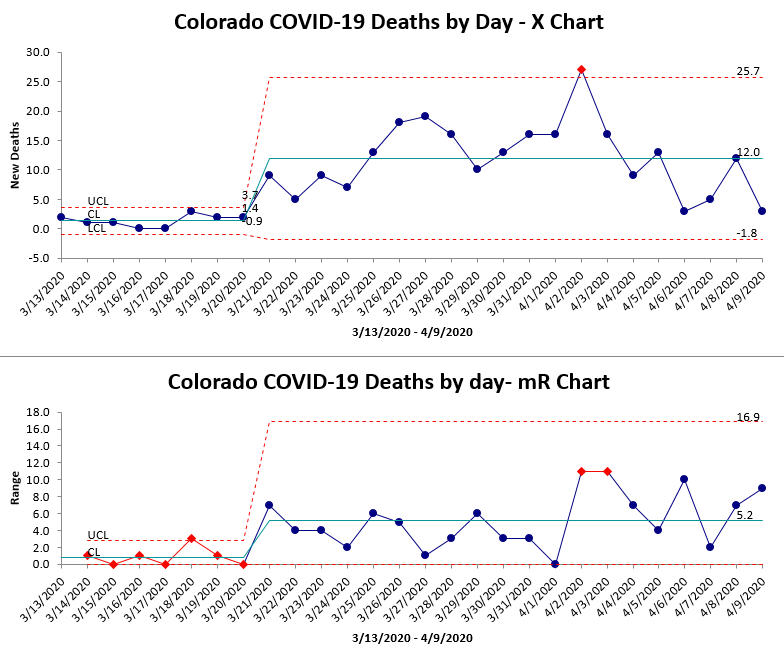
XmR charts show similar results to c chart. The Range chart shows the variation from day to day.
These charts show that cases and deaths are stabilizing. A downward trend or run would be terrific. An upward trend or run means the countermeasures aren’t working.
Note: Charts created with QI Macros for Excel using Colorado data.

