Testimonial from ASQ Phoenix
At the ASQ Conference in Phoenix, and got some wonderful comments from one of the attendees who uses QI Macros:
At the ASQ Conference in Phoenix, and got some wonderful comments from one of the attendees who uses QI Macros:
The Joint Commission Journal on Quality and Patient Safety (Feb 2018) has an article entitled “Temporal Trends in Fall Rates with the Implementation of a Multifaceted Fall Prevention Program.” Ouch!
I believe the story could have been told easily with quality improvement tools, so here’s how I’d go about it. First, there are a number of tables (i.e., spreadsheets of performance data) like the one below.
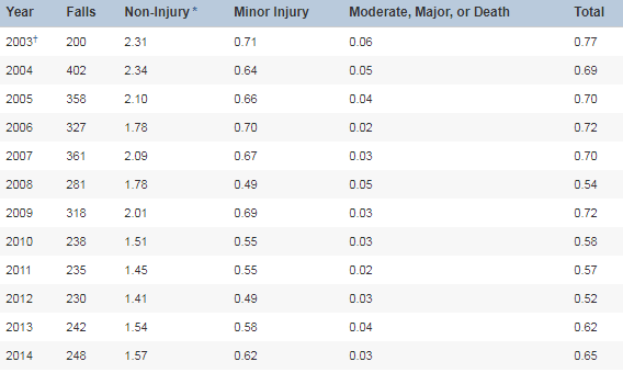
The first year, 2003, had only 200 falls because they started measuring in July. The first full year of measurement was 2004.
It would be easy to turn these into control charts, but the authors chose a boxplot with a trend line of predicted falls.

If you’ve used QI Macros for any length of time, you’ve undoubtedly run across something you had questions about. Let us clue you in to a secret weapon: The QI Macros search box.
Located on the top right corner of every page of the QI Macros website, this can come in handy if you’ve got questions
Continue Reading "Your Friend, The QI Macros Website Search Box…"
“Our evolutionary instincts sometimes lead us to see patterns when there are none there. People have been doing this all the time – finding patterns in random noise.” – Tomaso Poggio
People just need a way to separate the Signal from the Noise.
Here are some insights from the book by Nate Silver.
As John Johnson and Mike Gluck point out in their book, EVERYDATA, ice cream consumption and murder rates both go up in the summer, but that does not mean that eating ice cream causes murder. Rising summer temperatures seem to be involved.
They also provide a link to Tyler Vigen’s website, Spurious Correlations.
Does U.S. spending on space, science and technology cause suicides? No, but they are correlated at a 99.79%. These and other crazy correlations are available.
So don’t confuse correlation with causation.
Steve Harvey misread the results of the final ballot at the Miss Universe 2015 pageant. Was it the cue card or the teleprompter?
Here’s the cue card:

Could the card have been designed in ascending order?
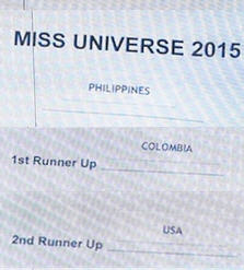
Did the teleprompter operator misread the card or Steve?
Is this the same problem the U.S. had with the “hanging chad” in the 2000 presidential election in Florida?
Is bad form design causing mistakes and errors?
I have found that people understand Lean more easily when I can show them examples in the “real world.” Subway, for example, is a Lean work cell. Your kitchen is a Lean work cell.
And I also look for places where people have “made things visual and self explanatory,” One of the principles of Lean. Here’s a couple of images from my local gas station:


When I went through Taco Bell’s drive through window this weekend and paid for my order, the cashier asked me if I wanted any sauce. “Mild, please,” I said.
Then she took the order from the next car in line, who I suspect asked for hot sauce.
When my order was ready, she grabbed some sauce and handed me the bag. Normally I would check, but I was in a hurry. Surprise, surprise, when I got home, I had hot, not mild sauce.
Usually Taco Bell cashiers wait until the order is ready to ask what kind of sauce I want, which is a great way to avoid the kind of mistake caused by the process above.
Dr. Richard Wiseman wrote a book called The Luck Factor that describes his research into what lucky people do that unlucky people do not do. I’d recommend it. Here’s the essence:

KnowWare International, Inc.
2696 S. Colorado Blvd., Ste. 555
Denver, CO 80222 USA
Toll-Free: 1-888-468-1537
Local: (303) 756-9144

