Home »
Blog » Statistics » Page 3
Improvement Insights Blog
Latest "Statistics" Posts
Renu Davi, Sr. Program Manager for Excel, reported at Excelapaloosa that two-thirds of the 650 million users use Excel to make lists. The other third of users do deeper analysis, but I’m wondering how? Microsoft keeps tabs on Excel usage. Here’s some statistics for usage in an Excel workbook:
- Only 4.3% have a function like SUM(A1:B2)
- 7.5% have Pivottables
- 17% use Freeze Panes
- 54% use Merged Cells (instead of Center Across Selection which works much better in many ways)
I wonder why we need any new features if the vast majority of users don’t or won’t use them. Maybe we need to invest in teaching people how to use the Excel features they have.
Continue Reading "Users Barely Using Excel"
Posted by Jay Arthur in QI Macros, Statistics.
The June, 2016 HRB article by Scott Berinato examines how to use charts and diagrams to express ideas and statistics. I agree with Anmol Garg, Tesla data scientist quoted in the article, “You can’t find anything looking at spreadsheets and querying databases. It has to be visual.”
Bernato says: “Convenient is a tempting replacement for good, but it will lead to charts that are merely adequate or, worse, ineffective.” He separates visualizations into four components: idea generation, idea illustration, visual discovery and everyday dataviz. Simple line, bar and pie charts are great for idea generation and illustration, but terrible for visual discovery and dataviz.
Continue Reading "Data Visualizations that Really Work"
Posted by Jay Arthur in QI Macros, Six Sigma, Statistics.
Creating homemade Cp and Cpk templates often results in incorrect values. There are many, many mistakes you might make without realizing. Here are a few examples.
A customer sent me their home grown template for calculating Cp and Cpk and wondered why the QI Macros got such radically different values. It was easy to see from their data that they were using standard deviation, not Sigma estimator (Rbar/d2) to calculate Cp and Cpk. Use Stdev to calculate Pp and Ppk, not Cp and Cpk:

They had run the QI Macros histogram on two columns of data, one measured at 0 degrees and one measured at 90 degrees.
Continue Reading "Cp Cpk Formulas and the Mistakes in Homemade Templates"
Posted by Jay Arthur in Manufacturing, QI Macros, Six Sigma, Statistics.
As John Johnson and Mike Gluck point out in their book, EVERYDATA, ice cream consumption and murder rates both go up in the summer, but that does not mean that eating ice cream causes murder. Rising summer temperatures seem to be involved.
They also provide a link to Tyler Vigen’s website, Spurious Correlations.
Does U.S. spending on space, science and technology cause suicides? No, but they are correlated at a 99.79%. These and other crazy correlations are available.
So don’t confuse correlation with causation.
Continue Reading "Correlation not Causation"
Posted by Jay Arthur in Jay Arthur Blog, Six Sigma, Statistics.
Microsoft added a box and whisker plot to Excel 2016, but it’s not everything you might hope for. Here’s an Excel 2016 box and whisker plot:
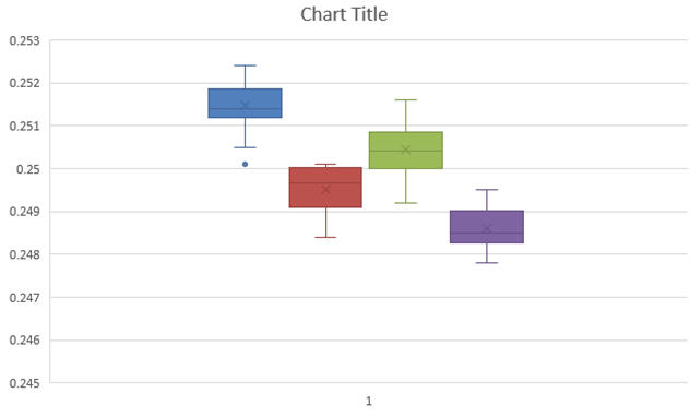
You might notice that the whiskers have a crossbar on the end. It seems to have a spare “x” in the middle of each box and it’s a little hard to see where the median is. And there are unnecessary gridlines that are considered chartjunk. It does, however, show the outlier below the first box.
Here’s what the QI Macros Box and Whisker Plot looks like:
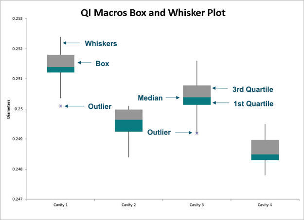
The whiskers are whiskers. The median is easily visible.
Continue Reading "What’s Wrong with the New Excel 2016’s Box and Whisker Plot?"
Posted by Jay Arthur in Excel, QI Macros, Six Sigma, Statistics.

