Improvement Insights Blog
Excel Bar Charts Hide The Signal in Noise
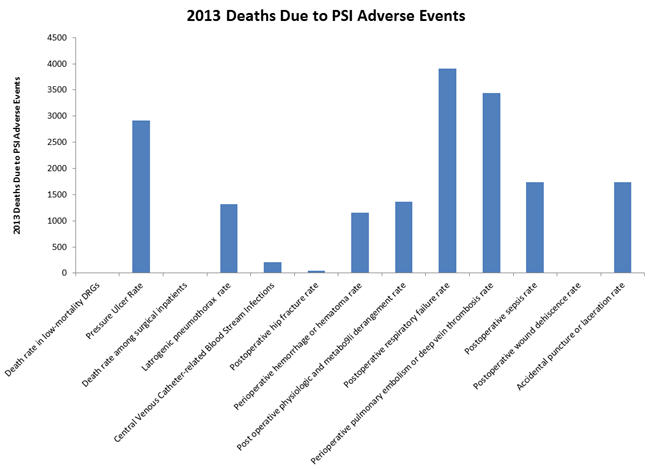
The July/August 2017 HealthLeaders magazine had a series of charts about the impact of Adverse Events. In general, the magazine used column charts:
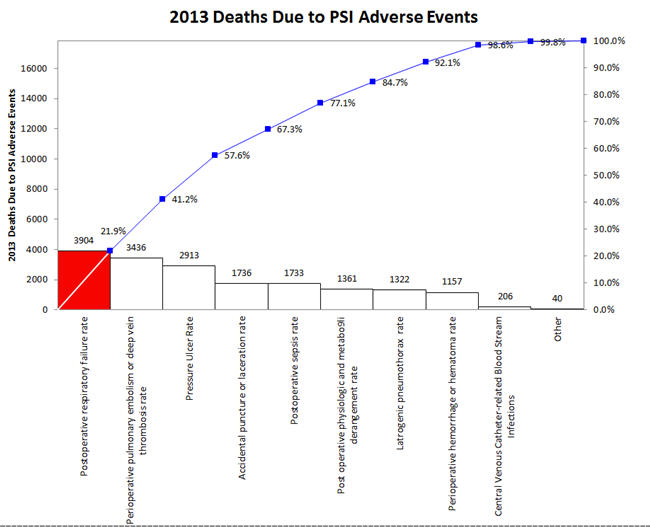
But wouldn’t a Pareto chart illuminate the important adverse events more clearly? The first three accounted for over 57% of 2013 deaths.