Home »
Blog » Bar Chart
Improvement Insights Blog
Posts tagged "Bar Chart"
Most people are still using line and bar charts to measure performance. Line and bar charts, especially ones with trendlines harm your customers and your company. They harm patients and hospitals. Here’s why:
Download my free ebook, Agile Process Innovation-Hacking Lean Six Sigma for Results.
“Hi, I’m Jay Arthur, author of “Lean Six Sigma For Hospitals” and QI Macros [software].
“Are line and bar charts harming your company, your hospital, your whatever (your country, even)? Line charts are really good for tracking overall trends like reduction in infant mortality, increase in world literacy rates, but [they’re] not very good for detecting what’s going on in your company.
Continue Reading "Are Line and Bar Charts Harming Your Customers and Company?"
Posted by Jay Arthur in Improvement Insights.
A statistician using a bar chart is like a surgeon using a butter knife. Here’s why:
Download my free ebook Agile Process Innovation.
“Hi, I’m Jay Arthur, author of “Lean Six Sigma Demystified” and QI Macros [software].
“I was recently perusing the American Statistical Association’s magazine, and they had some posters that were done by kids in K through 12. This one was an analysis of what kind of charts and graphs are used in poster presentations at statistical conferences. They found that more often than not, the winners had bar charts, and that bar charts were very popular because of their simplicity.
Continue Reading "Statisticians Using Bar Charts"
Posted by Jay Arthur in Improvement Insights.
Line charts with trend lines can be misleading. They can provide a kind of “false positive” that implies improvement where there is none. Here’s why:
“Hi, I’m Jay Arthur, author of “Agile Process Innovation.”
“I go to all these trade shows and I see a lot of poster presentations but they’re using line charts and then they draw a trend line through them and then they say, “Oh, we made an improvement.” No you didn’t. If it doesn’t really fit the line very well, if your goodness-of-fit metric is less than 80%, I’m not buying it. But nobody gives me a goodness-of-fit metric called r-squared, they just show me a line graph or a bar chart and then they show a little line through it.
Continue Reading "Trends Are Not Always Improvements"
Posted by Jay Arthur in Improvement Insights.
If you look at improvement project posters at quality conferences around the country, you’ll find that almost everyone is using Excel line and bar charts. Even after decades of Six Sigma training and association membership. What’s the hold up? Here’s my take:
“Hi, I’m Jay Arthur, author of “Lean Six Sigma Demystified” and QI Macros [software].
“Every year I look at lots of improvement posters and I keep wondering, “Why isn’t anyone using the tools of Quality?” Control charts, Pareto charts, histograms… Most of them are just using plain old Excel line and bar charts. Now it might be because they don’t know about the power and beauty and how easy it can be now to do Control charts, Pareto charts and fishbones.
Continue Reading "Why Are People Using Line and Bar Charts, not Control Charts?"
Posted by Jay Arthur in Improvement Insights, Lean, Six Sigma.
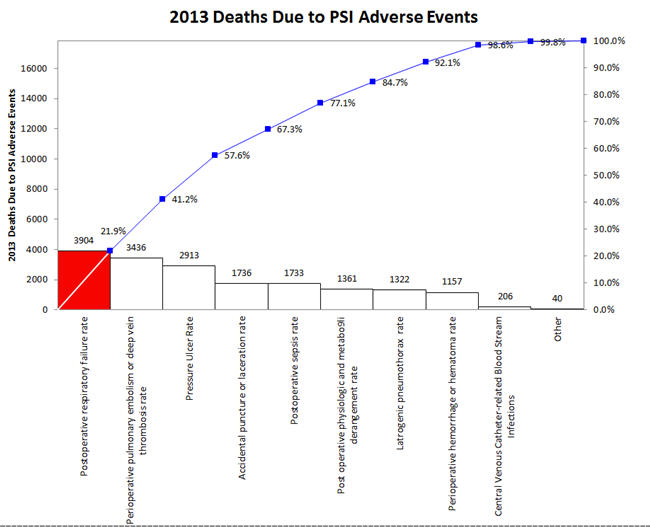
The July/August 2017 HealthLeaders magazine had a series of charts about the impact of Adverse Events. In general, the magazine used column charts:
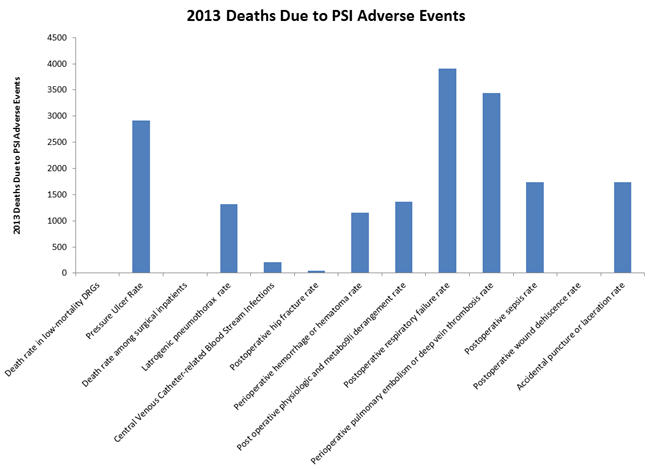
But wouldn’t a Pareto chart illuminate the important adverse events more clearly? The first three accounted for over 57% of 2013 deaths.
Continue Reading "Excel Bar Charts Hide The Signal in Noise"
Posted by Jay Arthur in Excel, QI Macros, Six Sigma.

