Magnet Improvement Posters
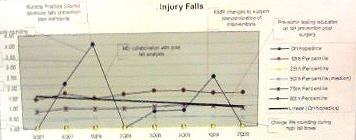
Last week, we exhibited at the Magnet conference for nursing quality. Every healthcare quality conference has posters about improvement projects: Magnet, NAHQ, and IHI. What struck me about these posters was the shortage of quality tools like control charts, pareto charts and fishbone diagrams. Those posters using charts often used the incorrect type of chart for the data.
Here’s an example. This chart has so many lines on it, how can you tell what story they are trying to tell?
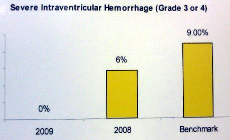
Here’s an example using a bar chart (instead of a line graph) and the dates are in reverse order:
Here’s another bar chart with the dates in the correct order, but again, time series charts like this one should be shown as a line, run or control chart.

