Home »
Blog » QI Macros » Page 28
Improvement Insights Blog
Latest "QI Macros" Posts
Seth Godin’s blog brought this data to my attention: http://www.nextbigfuture.com/2011/03/deaths-per-twh-by-energy-source.html.
There’s lots of ways to display it, but I thought it would be fun to look at as Pareto charts.
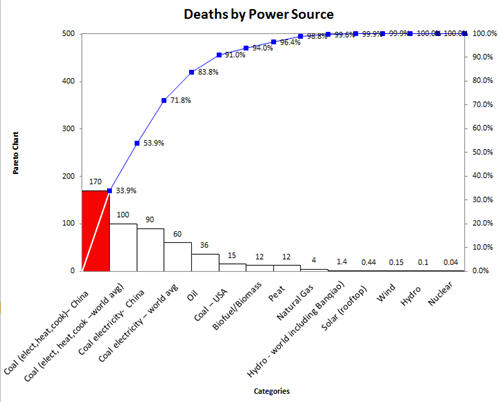
Deaths from nuclear power are small compared to the power produced. Coal and oil are still the heavy hitters in the mortality department.
Continue Reading "Deaths by Power Source Data"
Posted by Jay Arthur in QI Macros.
Use a histogram to determine the distribution of measurable data and the capability (i.e., the level of performance the customers can consistently expect) of the process. Process capability is determined using your data and the customer’s upper specification (USL) and lower specification limits (LSL).
Its easy to create a histogram in Excel using the QI Macros. See
http://www.youtube.com/user/QIMacros#p/a/u/2/tqlFKtmAxbU
Continue Reading "Create a Histogram in Excel Using the QI Macros"
Posted by Jay Arthur in QI Macros.
Control Charts show your data as a line graph with average and sigma lines to determine stability. The average and sigma lines are calculated from your data. It’s easy to create a control chart in excel using the QI Macros. See http://www.youtube.com/watch?v=5TVKz4OQTp0
Continue Reading "Use Control Charts to Determine Process Stability"
Posted by Jay Arthur in QI Macros.