Home »
Blog » Jay Arthur Blog » Page 6
Improvement Insights Blog
Latest "Jay Arthur Blog" Posts
My childhood doctor did it all. Now I almost never see a doctor. Are You Doing Black or Green Belt work, or “No Belt” work?
“When I was growing up as a kid, our family doctor, Dr. Pierce (and what an unfortunate name)… anyway, Dr. Pierce was actually a MASH 4077 kind of a doctor, right? He was he was in Korea [where] they were doing meatball surgery. But back in the 50s, he’d come in and take your temperature, check your pulse, and he would give you the shots and anything else that was there: write the prescriptions out long hand and rip them off a pad and hand them to you.
Continue Reading "Are You Doing Black Belt Work or No Belt Work?"
Posted by Jay Arthur in Improvement Insights, Jay Arthur Blog.
Jay Arthur was the featured speaker for the 12/16/20 ASQ Philadelphia Section Web Meeting. His topic was “Turning Data Into Dollars with Microsoft Excel: Big Profits from Small Data.” You may view the video of Jay’s webinar below:
If you’re interested in learning more about QI Macros for Excel (the software Jay wrote and developed), click HERE and view the demo video in the yellow box. You may also sign up for a free 30 day trial of the software by filling out the form on that page next to the video, or by signing up at THIS link.
If you’re interested in learning more about Jay’s ideas on Agile Lean Six Sigma, you can download a free brief summary of Jay’s ideas in his “Agile Lean Six Sigma Manifesto,” available at THIS link.
Continue Reading "ASQ Philadelphia Section 12/16/20 Web Meeting"
Posted by Jay Arthur in Agile Lean Six Sigma, Data Mining, Jay Arthur Blog.
People still seem to be confused about what kind of Quality Improvement chart to use. Here’s the short and simple answer:
Continue Reading "Ask Jay – What Kind of Chart Should I Use?"
Posted by Jay Arthur in Ask Jay, Jay Arthur Blog.
If you’re a registered NAHQ Next 2020 attendee, you can view Jay Arthur’s showcase until October 31, 2020.
1. Click on the link below.
https://www.webcastregister.live/nahq2020/welcome
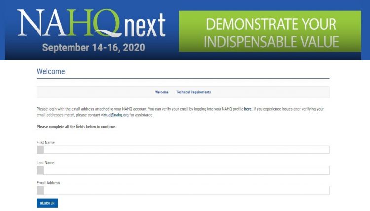
2. Click on the NAHQ Next top banner to log in. It will take you to the page below. Log in with your name and email address:
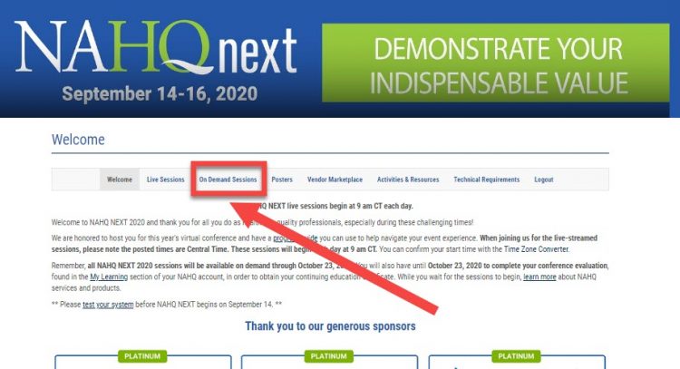
 3. Once you’re logged in, visit the On-Demand Sessions and scroll to the very bottom to view Jay’s session, “Zero Harm and the Trillion Dollar Prescription.”
Continue Reading "NAHQ NEXT 2020 HQ Showcase – Jay Arthur"
Posted by Jay Arthur in Agile Lean Six Sigma, Healthcare, Jay Arthur Blog, QI Macros.
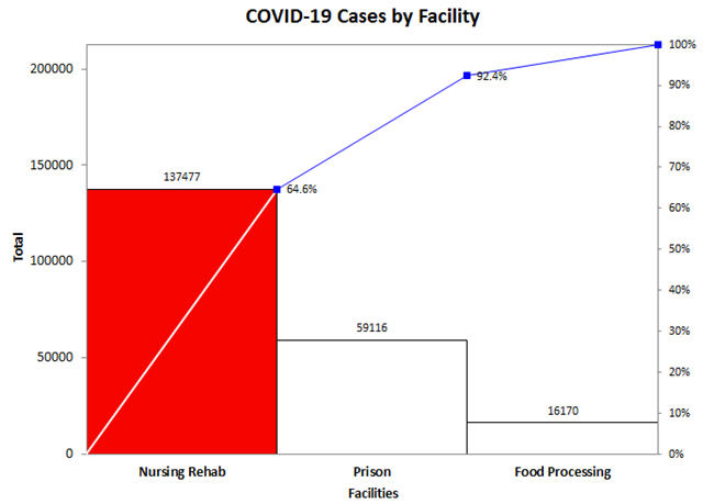
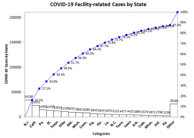
The New York Times published a list of cases by facility. I tweaked it to get Pareto Charts of the biggest problems. Nursing homes and rehab facilities were 64% of the total, then prisons and food processing (e.g., beef, pork, poultry, etc.).
Continue Reading "COVID-19 Cases by Type of Facility"
Posted by Jay Arthur in Agile Lean Six Sigma, Jay Arthur Blog, QI Macros.
This is a fun thing we did last week. While Watching the movie “Forrest Gump,” Jay heard this song and had the idea that this song is particularly applicable to our current situation. Several of the people that work for QI Macros are musicians, so we tried to do something fun while we’re working remotely. This was recorded in 4 separate homes and then assembled and arranged by Nicholas. We hope you enjoy it:
Continue Reading "Let’s Work Together"
Posted by Jay Arthur in Jay Arthur Blog.
People over age 55 account for 92% of COVID-19 Deaths (data from CDC). Sweden is using similar data to leave the country open for most citizens while asking seniors to stay at home. How do we reopen the economy? Self-quarantine seniors; let everyone else get back to work.
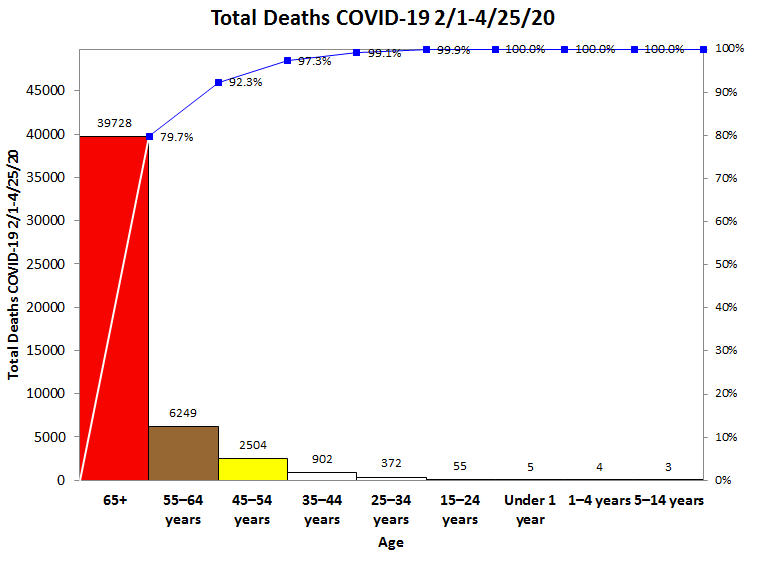
Here’s the 2019-2020 Influenza (i.e., Flu) deaths. Again, seniors are 83.5% of deaths. The flu death rate is about 1 per 1,000. COVID-19 death rate is 1-2 per 100, perhaps lower in people under the age of 55 and higher for those over age 55.
Countermeasure: Self-quarantining seniors will help flatten the curve and prevent overwhelming healthcare.
Continue Reading "U.S. Deaths by Age Group as of 4/24/2020"
Posted by Jay Arthur in Healthcare, Jay Arthur Blog, QI Macros.
While most COVID-19 charts show cumulative cases and deaths, I wondered what would happen if we turned the cumulative data into a daily data and plotted it as a control chart. It is possible to use c or XmR charts for this purpose. Process changes chosen based on runs and trends in the data.
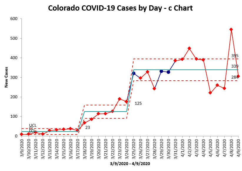
Daily new cases still unstable, but hovering around 339/day. Cases began to rise 3/18. Potentially leveling off 3/26. the date of state “stay-at-home” order.
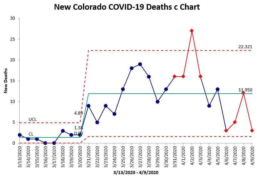
Daily deaths still unstable, but hovering around 12/day. Deaths began rising 3/21, but appear to be stabilizing. Significant spike on 4/2, root cause unknown.
Continue Reading "Colorado COVID-19 Cases and Deaths in Control Charts"
Posted by Jay Arthur in Jay Arthur Blog, QI Macros.
One of our QI Macros users offered to share his dashboard of paramedic response during the Seattle area response to COVID-19. His team transported the first COVID patient in America. As you can see, turnaround times (TAT) at the hospital averaged 30 minutes and temperatures spiked in transported patients.
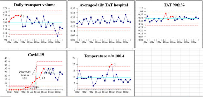
Continue Reading "COVID-19 Paramedic Dashboard 2020"
Posted by Jay Arthur in Healthcare, Jay Arthur Blog, Lean, QI Macros.
Back in 2002, thousands of miles from New York City, I worked with a hospital in Oregon. I was amazed to find that they had staffing data from 9/11 about the up and down for that month. As you can see in this X Chart, absenteeism (understaffing) was lower for each of the four following days, 9/12-15, and then recovered. I have noticed this pattern with COVID-19 as well: a week of paralysis followed by a return to normal. Unfortunately, healthcare workers haven’t had the luxury of downtime when dealing with the new crisis.
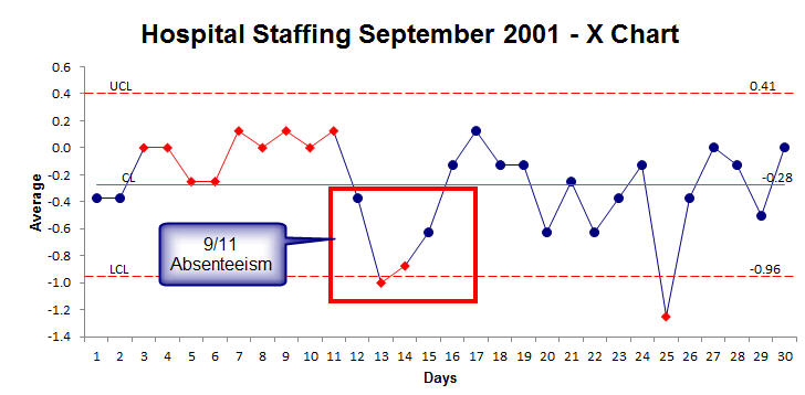
So don’t be surprised if crisis and uncertainty cause you or someone you know to hit the pause button.
Continue Reading "How Crisis Affects U.S. Healthcare Workers"
Posted by Jay Arthur in Healthcare, Jay Arthur Blog, Lean, QI Macros.

