Improvement Insights Blog
What’s Wrong with the New Excel 2016’s Box and Whisker Plot?
Microsoft added a box and whisker plot to Excel 2016, but it’s not everything you might hope for. Here’s an Excel 2016 box and whisker plot:
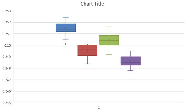
You might notice that the whiskers have a crossbar on the end. It seems to have a spare “x” in the middle of each box and it’s a little hard to see where the median is. And there are unnecessary gridlines that are considered chartjunk. It does, however, show the outlier below the first box.
Here’s what the QI Macros Box and Whisker Plot looks like:
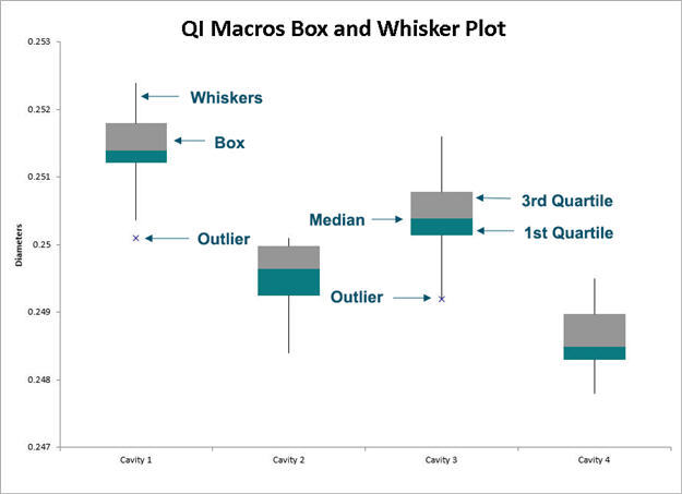
The whiskers are whiskers. The median is easily visible. And it shows outliers.
If you try to open the Excel 2016 box and whisker plot in earlier versions of Excel, you get this message:
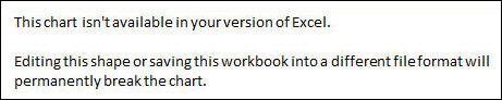
QI Macros Box and Whisker charts can be viewed in all versions of Excel.

