Improvement Insights Blog
When are bar charts dangerous?
Answer: Almost always.
- When everything is presented in a bar chart, everything looks the same. And before long, everyone forgets what they’re looking at. Dan Roam
Bar charts always remind me of a Jack-O-Lantern with bad teeth.
Bar charts are one of the most misused charts. The most common mistake is using bar charts for time-series data (i.e., dates):
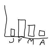
Bar charts are best used for categories—types of defects, objects, or whatever. Even so, the bars are often in a random order which makes distinguishing the important from the unimportant pretty difficult. Simply sorting the bars into a descending order makes them easier to analyze.

This gives us the beginnings of a Pareto chart. Pareto charts are the key chart for optimizing any business process. Pareto charts identify the most common type of issue in the data. Pareto’s principle says that 20% of any process will cause 80% of the defects, mistakes and errors. Pareto charts help simplify this analysis.
If you’ve ever tried to create a Pareto chart in Excel, you know how hard it can be. Fortunately, there’s software that will automate this analysis for you.
QI Macros—an addin for Excel—simplifies creation and analysis of control charts as well as many others.
Which would you rather have: a dumb bar chart or a smart Pareto chart? Download a free 30-day trial at www.qimacros.com.

