Home »
Blog » Data Visualization
Improvement Insights Blog
Posts tagged "Data Visualization"
The June, 2016 HRB article by Scott Berinato examines how to use charts and diagrams to express ideas and statistics. I agree with Anmol Garg, Tesla data scientist quoted in the article, “You can’t find anything looking at spreadsheets and querying databases. It has to be visual.”
Bernato says: “Convenient is a tempting replacement for good, but it will lead to charts that are merely adequate or, worse, ineffective.” He separates visualizations into four components: idea generation, idea illustration, visual discovery and everyday dataviz. Simple line, bar and pie charts are great for idea generation and illustration, but terrible for visual discovery and dataviz.
Continue Reading "Data Visualizations that Really Work"
Posted by Jay Arthur in QI Macros, Six Sigma, Statistics.
You can use Excel’s data formatting, commenting and filtering tools to help visualize and clarify your data.
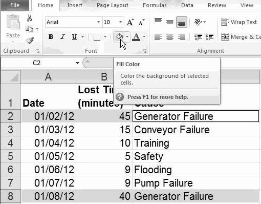
Highlighting: Select cells and click on Home-Fill Color to highlight cells:
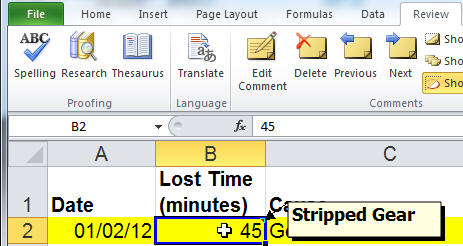
Commenting: To add comments to any cell, click on Data-Insert Comment:
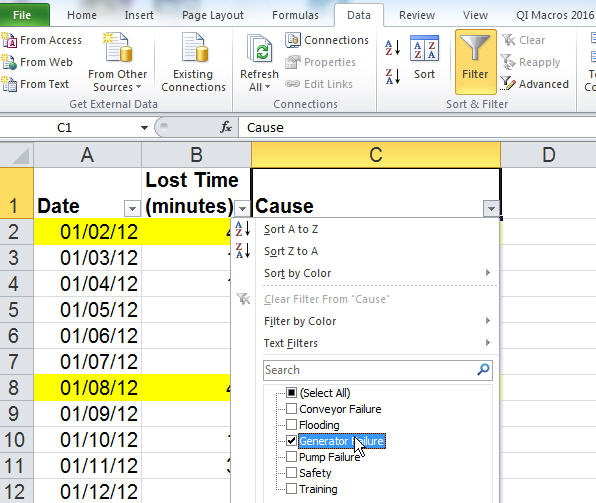
Subset: To select a subset of your data, click on Data-Filter and select the desired content:
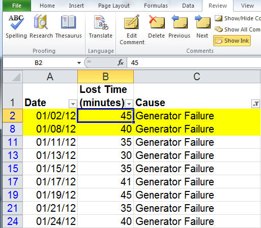
Excel will simplify and streamline your data for ease of analysis:
Excel has many powerful data exploration and visualization tools. Play with them!
Continue Reading "Data Visualization and Exploration In Excel"
Posted by Jay Arthur in Excel, Six Sigma.

