Applications for QI Macros Templates
Did you know that QI Macros has a Lean Six Sigma template for most of its charts including the pareto chart, histogram and every control chart?
To access these templates click on the QI Macros menu and then click on Fill-in-the Blanks-Templates then SPC Charts.
Following is a case study which provides some ideas on how to use the templates.
Case Study - Measuring Reduction in Mortality Rates
One health care group initiated a Rapid Response Team (RRT) to respond to the 100,000 lives challenge (save an extra 100,000 lives in the next year).
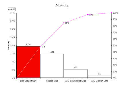
Studies by the IHI.org found that 48% of deaths occurred outside of the ICU for non-comfort care. The goal is to prevent cardiac arrest by detecting the most common warning signs (acute changes in heart rate, systolic BP, respiration rate, saturation, O2, or conscious state) and taking immediate action.
For the team to measure its effectiveness, it needs to know:
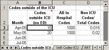
- How many "codes" (i.e., cardiac arrests) occur per 1000 discharges.
- How many codes occur outside of the ICU
- Use of the rapid response team
Using the templates in QI Macros, it was easy to set up these measures.
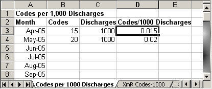
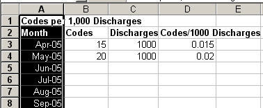
- Calculating Codes/1000 Discharges: I opened an Excel spreadsheet and typed in the key inputs for each of the three measures. I used a formula in D3 to calculate the codes/1000 discharges. The formulas is =SUM(B3/C3). I then copied the formula down into the other rows below.
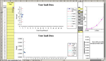
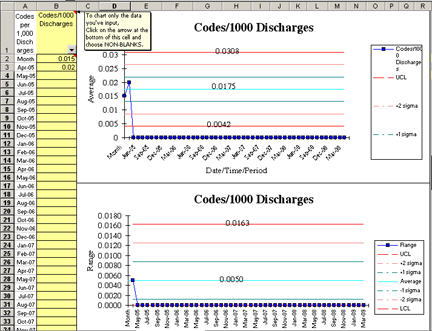
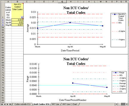
- XmR Chart Template: Using QI Macros, I went into the Fill in the Blank Templates then SPC Charts then XmR Four Pack. This template has all of the working information I need to graph the codes/1000.
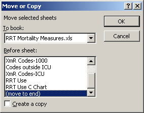
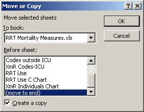
- Moving or Copying Sheets to Another Workbook: Using Excel, I chose Edit-Move or Copy Sheet, to move the template to the end of my measures workbook. Just click on the "To book:" arrow to select the destination data sheet. Click OK and Excel will move the XmR template to the selected workbook.
- Copying Cells: Then, I went back to my data sheet and selected the dates in column A and chose Edit-Copy.
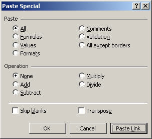
- Using Paste Link: Then, I switched to the XmR chart template and in cell A1, I chose Edit-Paste Special and clicked on the Paste Link button to copy a "link" from the data sheet to the template. This way, I can update the data on the data sheet, and the XmR Chart template will update automatically.
Then I did the same thing for the codes per 1000 discharges column. Once you populate the input cells (shaded in yellow), the chart draws itself automatically.
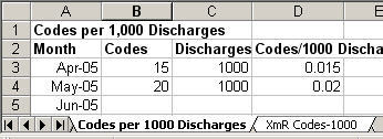
- Use control-key to select more than one worksheet:Then, because the second measure is about the same format as the first one, I simply clicked on the codes/1000 data sheet, held down the control-key and clicked on the XmR Chart of codes/1000 to select both sheets.
And again I selected Edit-Move or Copy sheet. This time I checked the "copy" box to make a complete copy of both the data and the chart.
This makes a complete copy of the data and chart sheets. This made it easy to fill in the new column headings to create the new codes/total chart.
- c chart template: For the third measure, I chose the c chart because we're measuring numbers of calls, but there is no denominator for this measure. And I did the same thing as I did for the first one.
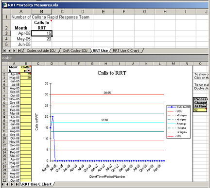
Now all the team has to do is drop their numbers into the data sheet and the control charts will draw for them automatically.
- Using Autofilter in the Templates: If you don't like all of the empty space on the right of the chart, simply click on the arrow in column B1. Select "nonblank" and the chart will redraw itself with just the current data. This is the "Autofilter" function you will find under Excel's Data toolbar. This is a great way to reduce the amount of data you see.
What could be easier than that?
Learn More...
Other Charts Included in QI Macros for Excel
Join 100,000+ Users
in 80 Countries

