Formatting Charts in Excel
Once you create a chart it's easy to format and enhance your chart using Excel's menus and commands. To change chart style in Excel, simply right-click or double-click on the chart item you want to format to view the formatting options for that item.
Just a few of the chart items you can format are:
Chart Titles, Axis Titles, and Data Labels
TO CHANGE TEXT: To change the title, axis or data label text, click once on the text box to highlight it, then click again to place your cursor within the text box. Note: don't double-click on the title; this will open the formatting box and text cannot be modified there.
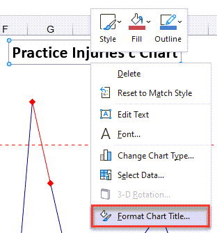
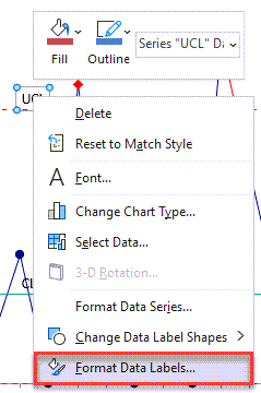
TO CHANGE TITLE APPEARANCE: Right-click on the title or data label you want to format and select "Format Chart Tile/Format Axis Title/Format Data Labels", or double-click.
Chart Title:
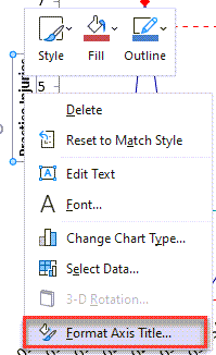
Axis Title:
Data Label:
From the formatting window you can change text box color and patterns, font style, and text box alignment:
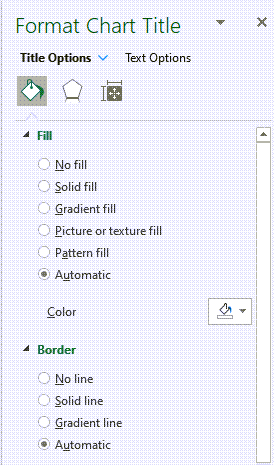
Chart Lines
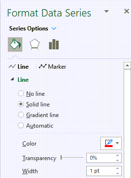
To change the color or style of chart lines, simply click on the line to highlight it, then right-click to view the formatting options, or double-click on the line:
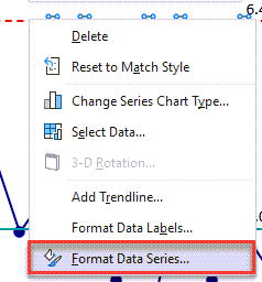
From the Format Data Series window you can select line colors and styles and show or hide data labels:
Axis Labels
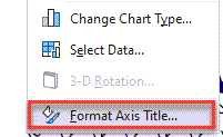
Right-click the axis labels you want to format and select "Format Axis Title", or double-click:
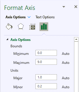
From the formatting window, you can change label fonts, number formats, label alignment, and axis scale (e.g., change minimum and maximum values on y axis):
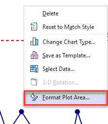
Plot Area / Chart Area
If you are using QI Macros charts in a presentation, you may want to add some color. You may add a background color to the chart by right-clicking in a blank area inside the chart and selecting "Format Plot Area":
You may also add a background color to the chart area (the area surrounding your chart) by right-clicking in a blank area outside of the chart and selecting Format Chart Area:
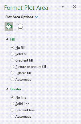
From the Format Plot Area or Format Chart Area window, you can select a background color for the chart, chart borders, and fill effects:
As you can see, once you run a chart with QI Macros, you can use any of Excel's chart formatting options.
Stop using old technology!
Upgrade Your Excel and Data Analysis Skills to Smart Charts Using QI Macros.
Track Data Over Time
Line Graph
Control Chart
Compare Categories
Pie Chart
Pareto Chart
Analyze Variation
Bar or Column Chart
Histogram
QI Macros add-in for Excel makes creating smart charts a snap.
Join 100,000+ Users
in 80 Countries

