Home »
SPC Software for Excel » SPC Tools
Want to Create SPC Charts and Tools Right in Excel?
QI Macros SPC Excel add-in contains all of the tools you need!
QI Macros installs on Excel's menu. To create a chart:
- Select your data
- Click on QI Macros menu
- Select the chart you need*
QI Macros does the rest.
SPC Tools Included in QI Macros SPC Software for Excel

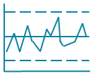
Control Charts are the SPC tool used to analyze process performance over time. Control charts plot your data and calculate average and sigma lines to evaluate the stability of the process.
Special cause variation - Unstable points or trends identified by control charts. These need to be investigated and corrected.
Common cause variation - Variation that is inherent in the process. Launch improvement efforts to improve a stable process.
More about Control Charts

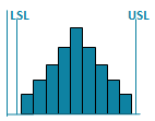
Histograms are the SPC tool used to show the spread, or dispersion, of variable data. The upper specification (USL) and lower specification limits (LSL) are defined by the customer. Measurements outside of the spec limits represent data points that don't meet customer requirements.
Process capability metrics Cp Cpk are used to measure how well the data fits between the spec limits (cp) and how well its centered between the spec limits (Cpk).
More about Histograms with Cp Cpk

Pareto charts combine a sorted bar graph with a cumulative line graph. Pareto Charts are the SPC tool used to graph counts of defect data or error types.
The "big bars" on a Pareto chart show you where to focus your improvement efforts. Often, two or three "big bars" represent most of the problem (80/20 rule).
More about Pareto Charts

Fishbone diagrams are the SPC tool used to document the results of root cause analysis. Start with a problem statement that represents one of the big bars on your Pareto chart. Then ask at least 5 Whys until you get to the root cause.
More about Fishbone Diagrams

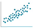
Scatter Plots are the SPC Tool used to show the correlation or cause-effect relationship between two sets of data.
If the points are tightly clustered along the trend line, then there's probably a strong correlation. If it looks more like a shotgun blast, there is no correlation.
More about Scatter Plots

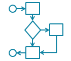
Flowcharts show the current and improved process flow. One of the key benefits of creating a flowchart is in the act of creating one. Getting different groups in the same room to discuss a process helps them better understand how they affect each other and often leads to identifying obvious problems that can be corrected quickly.
More about Flowcharts
What People Are Saying...
I've installed the QI Macros and walked through some of the graphs. What I've seen so far is absolutely amazing. I cannot use enough adjectives to describe how pleased I am with it. It is incredible.
– Judy Vinson, R.N.
Quality Studies Advisor
You've thought of everything. I used 12 features to complete a QI project in just a day. No more documentation was necessary. The QI Macros aren't sexy, just practical!
– John Weisz
Read more QI Macros testimonials


