Compare SigmaXL® to QI Macros®
QI Macros Wins on Ease of Use and Features
- SPC Software Comparison Table (PDF, 374 KB)
QI Macros is Easier to Use than SigmaXL - Here's Why:
QI Macros |
SigmaXL |
|
Foundation it Was Built On |
Designed to simplify learning and use |
Mimics Minitab |
First Step to Create a Chart: Select the Data or the Chart?
|
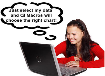
You: Select your data QI Macros: Will analyze the data and select a chart for you. Analyze the resulting chart. |
You: Analyze your data and select a chart. Point to data to define range. SigmaXL: Make calculations and draw a chart |
Why It Matters Most users have data BUT don't know which chart to use. |
|
|

QI Macros is a fantastic tool. It allows me to do things that once took 30-60 minutes down to 2-3 minutes. It's also very user-friendly and easy to operate.
- Wade Johnson
Carlson Craft Business Solutions
Ease of Use Step-by-Step Comparison
QI Macros | SigmaXL |
|
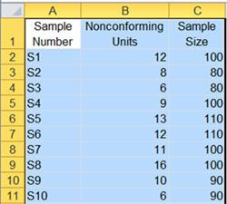
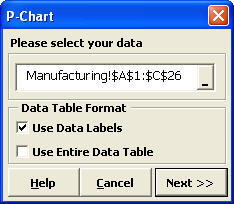
1. In Excel, select your data
|
1. In Excel, select the chart you want.
|
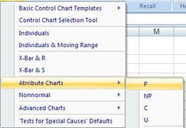
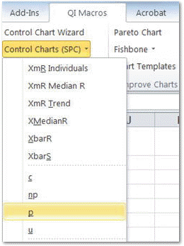
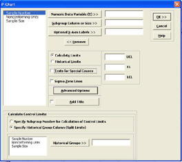
2. Click on the QI Macros Menu and select the desired chart or the Control Chart Wizard if you are not sure.
|
2. In the SigmaXL window, define the data range in your spreadsheet. |
3. QI Macros will do the math and draw the chart for you.
Better yet, if you don't know which chart to use for your data, QI Macros control chart wizard can analyze your data and select the right chart for you.
|
3. Here is where SigmaXL gets ugly. You must define up to seven different items like numerator, denominator, data labels, chart title, etc. In comparison, the QI Macros contains code to determine most of this for you.
|
| 4. QI Macros gives you more time to focus on the chart and what it tells you. | 4. SigmaXL will do the math and draw the chart for you.
|
As you can see, there is a complicated additional step to achieve the same result. And, as we know from Lean, extra steps mean additional chance for error and more importantly: delay.
Most people find step 3 confusing.
How do I select my data? What column do I select to do what? Does it really need to be this hard?
QI Macros Charts Look Better and Are More Comprehensive
QI Macros Chart Examples |
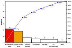
Pareto Chart
Bars over 20% of the total are shaded. Why is QI Macros the only product that creates a proper Pareto chart? - Joe DeFeo |
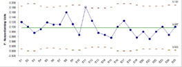
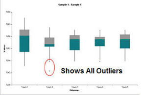
Box and Whisker Plot
Second and Third Quartiles are distinguished using colors. |
SigmaXL Chart Examples |
Pareto Chart
No special shading of bars. |
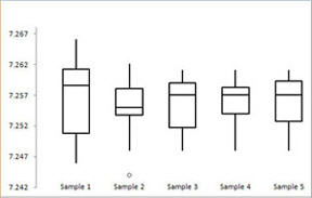
Box and Whisker Plot
Second and Third Quartiles within the box are the same color. |
QI Macros Features Not in SigmaXL
Wizards to Automate Data Analysis and Select the Right Charts or Statistical Tests
Because QI Macros has you select your data first, it can help you analyze it and run the right chart or test. SigmaXL and other competitors CANNOT do this since they make you select the chart first.
- Improvement Project Wizard - combines the power of the pivottable and control chart wizards to turn a table of raw data into the first steps of an improvement story with just one click
- Chart Wizard - chooses and runs all possible charts from your data
- Control Chart Wizard - chooses and runs the correct control chart from your data
- Statistics - chooses and runs all possible hypothesis tests
- PivotTable - shortcut to Excel Pivottables - just select up to four columns of data and we organize your pivot table for you
I was very well impressed with the functionality of QI Macros Improvement Project Wizard. This certainly saves time and cuts down the chart populating process substantially. I will be recommending this tool to my colleagues here at work and within the ASQ leadership community.
- Data Analyst
Medical Device Manufacturer
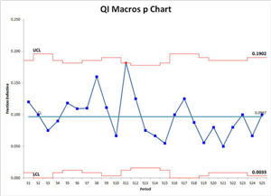
Automated control chart dashboards:
Just drop your data sets into the data input sheet and click on the "Create Charts" macro button to create a control chart dashboard for all of your measures.
Fill-in-the-blank chart templates:
QI Macros contains more than 40 chart templates including all attribute and variable control charts, pareto, scatter, box and whisker plots, histograms, and more. Just drop your data into the yellow input area and your charts are built in the same spreadsheet.
Every two weeks I have to update 600 control charts for more than 30 hospitals in our system. I used to spend three days updating these charts. Once we created the charts using QI Macros Control Chart Dashboards, and utilized automation including stability analysis, we reduced the time it takes to update the charts to just three hours. QI Macros Control Chart Dashboards save me valuable time that I can use for other important projects. Thanks for making this process quicker and easier.
- Mary Ayuso
Adventist Health System
QI Macros vs. SigmaXL® Pricing
Quantity |
SigmaXL® |
QI Macros® |
1 |
$399 |
$379 USD |
* Prices as of 02-01-2026
QI Macros is a technically reliable and very cost effective solution for our college; and very intuitive to use. The performance of this Excel add-in compares very well to other software that costs much more.
- Truett
Adjunct Instructor, Quality Manager
Join 100,000+ Users
in 80 Countries


KnowWare International, Inc.
2696 S. Colorado Blvd., Ste. 555
Denver, CO 80222 USA
Toll-Free: 1-888-468-1537
Local: (303) 756-9144