Is There A Trend in My Data?
A customer recently asked: How can I tell if there's really a trend in my data? He wanted to know if scans were increasing.
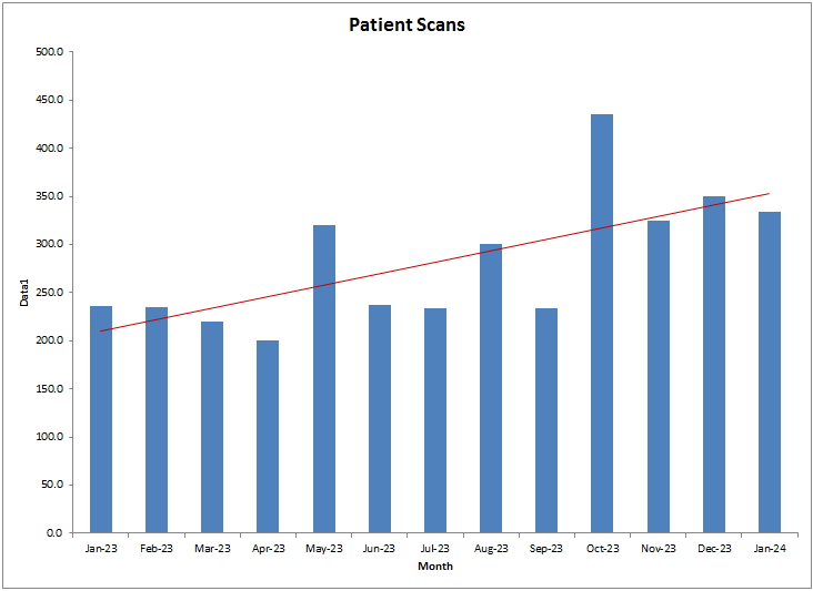
He had used Excel to add a trend tine to a bar chart, but wanted to know if there was a way to show control limits:
QI Macros XmR Trend Chart
Using QI Macros, you can create an XmR Trend Chart:
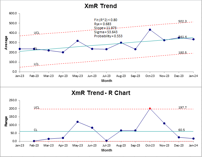
- In this case 0.6832 = 0.44 (a 44% fit).
- Slope is increasing by 12 scans per month.
- And the process is in control except for the range change in October.
He can count on a 12 patient increase per month.
Here's my Point: Use the QI Macros XmR Trend Chart to check your data for trends.
Trend Lines Can Lie
A trend line does not a trend make. Click here to find out why.
Stop Struggling with Control Charts!
Start creating your Control Charts in just minutes.
Download a free 30-day trial. Get Control Charts now!
Other Charts Included in QI Macros for Excel
Join 100,000+ Users
in 80 Countries


KnowWare International, Inc.
2696 S. Colorado Blvd., Ste. 555
Denver, CO 80222 USA
Toll-Free: 1-888-468-1537
Local: (303) 756-9144
©
1997 - 2026 KnowWare International Inc. All Rights Reserved. Legal Info | Terms of Use