Trend Lines Can Tell Lies
Don't be Mislead
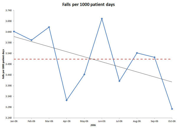
I was reading an old issue of the Joint Commission Journal on Quality and Patient Safety. In an article about patient falls, the authors used a run chart with a trend line to assert that they had achieved a 9.9 percent reduction in patient falls.
Trend Lines Aren't Trends
The trend line suggests a trend, but does one exist? If we use an XmR control chart to plot the same data, we find that the process is stable and unchanged:
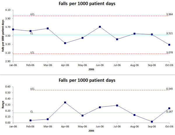
The trend line has lied about the improvement. This is why primitive line charts, run charts and trend lines can be so misleading--they aren't statistically useful. You need a control chart to detect actual changes in performance.
Over a decade ago I worked with a hospital that actually reduced falls and you could see it in their data. There's a real downward trend of six consecutive points in a row:
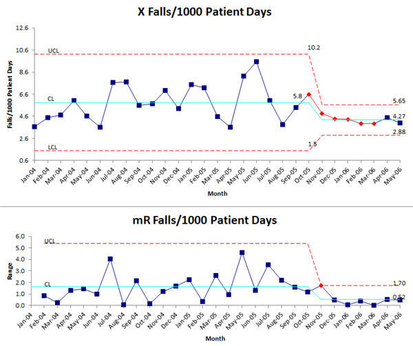
While the falls average is higher than the first example, in this case, we've actually demonstrated a sustained improvement.
Don't Let Primitive Charts Like Run Charts and Line Graphs Spoil Your Analysis
Learn how to use control charts to analyze data and demonstrate real results.
Rights to reprint this article in company periodicals is freely given with the inclusion of the following tag line: "© 2015 Jay Arthur, the KnowWare® Man, (888) 468-1537, support@qimacros.com."
 Take our FREE Lean Six Sigma Yellow Belt training online.
Join 100,000+ Users
in 80 Countries

