Choosing the Right Chart for Your Data
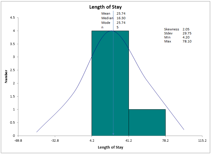
A customer recently sent me their data for length of stay by surgeon.
They had run the data as a histogram, but wanted to know how to add the surgeon's names to length of stay.
Choosing the Right Chart
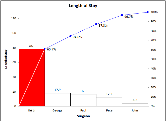
I'm not sure why they choose a histogram. The most obvious chart for their data is a Pareto chart.
QI Macros Chart Wizard
Years ago, I got tired of customers calling to ask: "Jay, what chart should I use?" Someone said: "I often find myself thinking, What Would Jay Do? So I created the QI Macros Chart Wizard to answer that question.
In this case, the user could have answered this question for themselves. If you're not sure what chart to choose, the QI Macros Chart Wizard will figure it out for you. Just select data with your mouse and click on the Chart Wizard.
In this case it would have automatically created a Pareto chart, not a histogram.
Let the QI Macros Wizards help you look super smart. Since I created them, I use them instead of trying to figure out what chart to choose. I let the wizards decide: What would Jay do?
Stop using old technology!
Upgrade Your Excel and Data Analysis Skills to Smart Charts Using QI Macros.
Track Data Over Time
Line Graph
Control Chart
Compare Categories
Pie Chart
Pareto Chart
Analyze Variation
Bar or Column Chart
Histogram
QI Macros add-in for Excel makes creating smart charts a snap.
Join 100,000+ Users
in 80 Countries


KnowWare International, Inc.
2696 S. Colorado Blvd., Ste. 555
Denver, CO 80222 USA
Toll-Free: 1-888-468-1537
Local: (303) 756-9144