Signals vs Noise - Special vs Common Cause Variation
Use Control Charts to Detect Faint Signals in the Noise of Daily Operations
In the book, The Signal and The Noise, author Nate Silver examines why so many predictions fail, while others don't. The trick is in separating the signal (what's important) from the noise (what's not important). In some systems like the economy, this is very difficult. Weather forecasting, however, has dramatically improved over the last several decades.
I realized while reading Silver's book that control charts detect faint signals in the noise of daily operations. Unlike Silver's book which focuses on predicting what will happen, control charts look backward at the performance of any business process to detect "out-of-control" conditions. I have come to believe that without control charts, you cannot monitor and correct a company's performance, or sustain improvements. And failing to sustain improvements will kill Six Sigma.
The Costs of Confusing Signals with Noise
One of the byproducts of trying to run a business by spreadsheets alone is the ongoing tampering and knee-jerk reactions to changes. This occurs because managers look at snapshots of performance, not the ongoing movie of performance. One of my friends in corporate finance has found that almost weekly she'd be sent on a wild goose chase to figure out why some number moved up or down. In retrospect, she has come to believe that most of those movements were noise, not signals. If she'd had control charts of the financial data, she could have easily separated the signals from the noise.
I often see this in sales organizations; one month sales are up and everyone celebrates; the next month sales are down and everyone tries to explain the drop. If you look at sales volumes using a control chart, there's rarely any problem. Sales vary up and down. On average, they stay the same.
Control Charts
Control charts originated at Western Electric in the 1920s. They are one of the reasons the Bell System had one of the most reliable telephone networks in the world. While widely used in manufacturing to monitor production, control charts have not spread to the service industries and internal services like finance, marketing, sales, purchasing and payments. I believe that widespread use of control charts to monitor and detect changes in these processes would slash costs and boost profits in remarkable ways.
Signal or Noise?
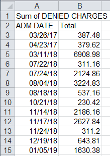
if we look at a spreadsheet of denied claims in healthcare, it's difficult to identify the signals. Cell B5 looks high, but is it?:
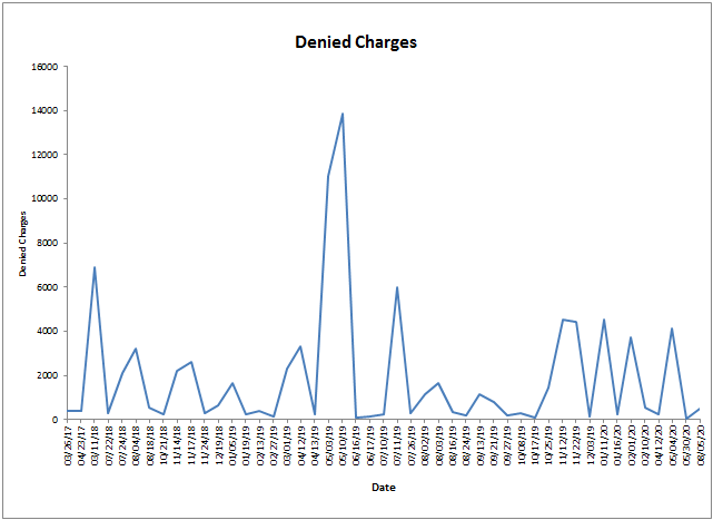
If we take performance data and chart it as a line graph, we still can't really tell if there's something going on. We can see a spike in May, but is it signal or noise?
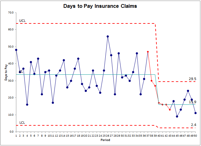
But if we turn the same data into a control chart, the QI Macros will calculate upper and lower control limits (UCL/LCL) which encompass 99.7% of all of the data. We might consider most of the points within these limits to be noise ( i.e., common cause variation). Using these limits, the software highlights points that are statistically unlikely, i.e., signals or special cause variation . We can see from the red points that the process is out of control.
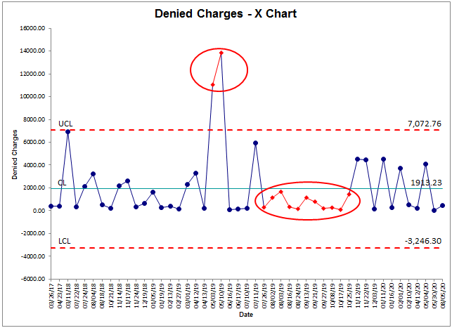
So, the control chart will identify the two points in May as a signal that the process is out of control, but it will also detect that the eleven points below the average are also a signal. Using the first signal, we would seek to determine the root cause of the problem and correct it. Using the second signal we might want to figure out what we were doing to hold down the cost of denied insurance claims. Sometimes these signals can catch your doing something right, not wrong.
Control Chart Signals - Special Cause Variation
QI Macros use calculated control limits and control chart rules to separate signals from noise. Each of the rules should occur naturally only three times out of a thousand (3:1000). So when they appear in 20-50 data points, it's very likely that they are a signal, not noise.
Once QI Macros detects one of these signals and highlights them by turning the point red, the next step is to immediately ask "why" five times to determine the root cause and correct it.
Common Cause Variation is a Form of Noise
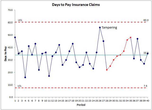
A stable process has no signals. Variation from point to point is just the noise of daily operations. Of course, if we wanted to reduce days to pay insurance claims to a target of 30 days, we'd need an improvement team to investigate why it takes 33.3 days on average.

Overreaction to Noise Can Make Things Worse
Using a snapshot of the data can cause managers to tamper with a stable process. Tampering with a stable process can make it unstable. If, for example, a manager reacts to point 26 in Days to Pay Insurance Claims, it could cause overtime to clear the backlog or some other knee-jerk reaction. This might reduce days to pay for a short while, but might also cause employee burnout and increased days to pay.
If a process is stable, don't fiddle with it. Use Lean Six Sigma to reduce the cycle time and variation. Use QI Macros Chart Menu to Show the Process Change.
Why Bother?
Companies who don't use control charts consistently perform around three Sigma (a six percent error rate). This costs a quarter to a third of total expenses to find, fix or replace the defective product or service. It causes overtime and crisis management. Wouldn't you like to cut costs by 25-33 percent? You can, but as you make improvements and climb to four or five Sigma, you will no longer be able to detect the signals that your process is out of control. Without control charts, you will not be able to detect the subtle changes that slowly drive performance back toward three Sigma.
Using control charts in every aspect of your business will only take a little more effort than you are spending today, but it will save a ton of rework and waste, freeing up employees to satisfy customers without the firefighting.
Learn how to use control charts to detect the signals that your process is shifting. Use them to determine if improvement is needed and initiate improvements as needed. Use them to monitor and sustain new and improved levels of performance. Your customers will be delighted. Your market will expand. Your competition will wonder what happened. Employee morale will improve with the improved performance. Your CFO will be delighted with the reduced costs and increased profits. And everyone from the CEO to the front line worker will get a better night's sleep.
Isn't it time to add control charts to your competitive toolbox?
Rights to reprint this article in company periodicals is freely given with the inclusion of the following tag line: "© 2015 Jay Arthur, the KnowWare® Man, (888) 468-1537, info@qimacros.com."
 Take our FREE Lean Six Sigma Yellow Belt training online.
Join 100,000+ Users
in 80 Countries

