Mistake Proofing Forms to Improve Quality
Example of Designing Hospital Rounding Forms
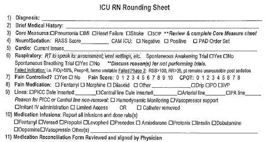
I recently worked with a hospital group. They showed me an ICU rounding form. And I wondered: How do they get consistent results with this form? What if they wanted to collect some data from the forms? It would be hard!
Here's part of the form. Looks pretty dense, doesn't it?

ICU Rounding Form Redesigned
Many years ago, I took a course in Information Mapping®. I felt that the current form could be improved and mistake-proofed using this methodology.
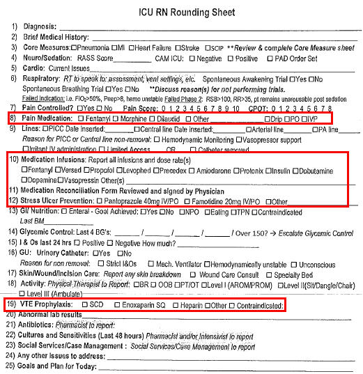
As I looked more closely at the existing form, I noticed that medications were spread all over the form, but the physician sign-off was in the middle.

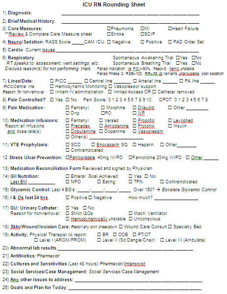
One of the Information Mapping principles is to "put like things together". So, I moved the medications together and aligned the check boxes and put a little more whitespace between lines. I didn't notice that Fentanyl is both a pain and a sedation medication until I did this.

Designing Clean, Clear, Concise Forms
Get the idea? The revised form is cleaner, more consistent and easier to follow. If we needed to collect improvement data from these forms, it would be much easier. And this was just my first draft.
Here's My Point:
Poorly designed forms cause problems. Maybe you don't work in an ICU, but are your forms causing problems? Are they error-prone? Hard to use? Isn't it time to mistake-proof your paper forms?
Need help? Consider using Jay's writing staff to redesign your forms. Send us your forms and call for a quote.
Rights to reprint this article in company periodicals is freely given with the inclusion of the following tag line: "© 2015 Jay Arthur, the KnowWare® Man, (888) 468-1537, support@qimacros.com."


