Time Value Map of an Ultrasound Process
I think we can agree that there is too much patient wait time in healthcare—waiting for doctors and nurses, waiting for test results, emergency room wait times, and so on. How can we make the wait time more visible? Use a time value map.
Open QI Macros Time Value Map Template Under Lean Tools
QI Macros Time Value Map shows wait time in a way that might trigger improvement. Here's an example borrowed from John Black's book, A World Class Production System. To use the template:
- Enter the descriptions of the activities in column A.
- Enter the duration of the activities (the touch times) for each step in the patient's journey in column B. Five minutes would be entered 0:05
- Enter a 1 for value added activities and a minus 1 (-1) for non value added activities in column D. In this example, waiting and walking are coded as non-value added (NVA).
- Enter the start time (usually 0:00) in E2.
- Enter the interval (e.g., 0:01 or 0:05 minutes) in E4. The interval affects how the bars are drawn on the chart. If you have wide time spans, a bigger interval might work better. The lower the interval, the wider the bars. If you aren't sure what to enter just use the default.
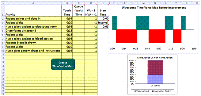
In this example, the value added (VA) steps are shown in green; the non-value added wait and travel times are shown in red. The column chart shows how much of the total time is value added (39%) vs non-value added (61%).
We could have shown the patient wait time as "queue time", but it wouldn't have been quite as powerful. The red bars are smaller and the wait time seems "built in":
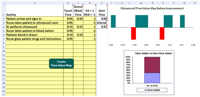
Show the Improvement
After improvement, you can use the time value map to show improvement:
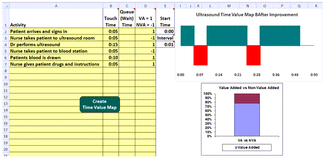
The total cycle time has been reduced from an hour and a half to just 45 minutes. 78 percent of the process is now value added. Good for the patient, good for clinicians and good for the hospital's bottom line.
Get the Idea?
The time value map provides a way to show the patient's "pain" from excessive waiting and travel. This might be a good way to start an improvement discussion.
Learn more about the Time Value Map: Click Here
Other Charts Included in QI Macros for Excel
Join 100,000+ Users
in 80 Countries

