No One Can Read an Excel Spreadsheet
So Stop Trying to Make Them Pretty!
Put Your Data in a Column and Draw a Smart Chart!
CPAs and Finance folks can read a spreadsheet; no one else. But I keep seeing people try to make their spreadsheets "pretty" as if they can be read and understood. Nonsense. Too many spreadsheets look like this data about patient falls per 1000 patient days:
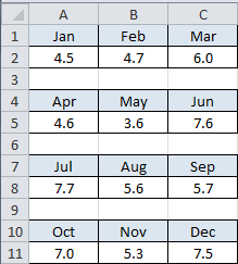
What can we make of this data? Is May a really good month? Is July really bad? We don't know.
Having the data all split up like this makes it impossible to chart this data as a smart control chart. You will have to put it back into a single column to chart it:
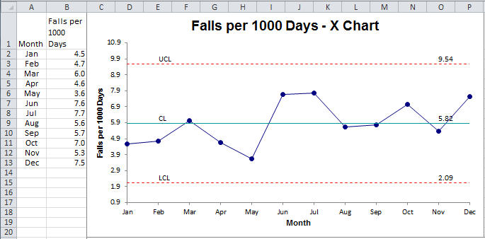
Does the spreadsheet or chart give us more information about a hospital's performance regarding patient falls? The chart of course! The process is stable and predictably delivers 5.82 falls per 1000 patient days with a variation of ∓ 3.73.
Please stop trying to create "readable" spreadsheets. No one can read them or learn anything useful from them. Put your data in a column and chart the results—control charts for time series data and column or Pareto charts for categories. Use histograms to show the spread of data.
It's too easy with QI Macros. So why don't more people do it? Laziness? Fear?
Just do it. You'll be surprised how much more insight and discussion comes from a good chart rather than an unreadable spreadsheet.
Warning: include(/kunden/homepages/26/d362440150/htdocs/qimacros/includes/php/calltoaction-skills.php): failed to open stream: No such file or directory in /homepages/26/d362440150/htdocs/qimacros/free-excel-tips/no-one-can-read-a-spreadsheet/index.php on line 73
Warning: include(): Failed opening '/kunden/homepages/26/d362440150/htdocs/qimacros/includes/php/calltoaction-skills.php' for inclusion (include_path='.:/usr/lib/php7.4') in /homepages/26/d362440150/htdocs/qimacros/free-excel-tips/no-one-can-read-a-spreadsheet/index.php on line 73
Join 100,000+ Users
in 80 Countries

