Reduce Scrap
A Six Sigma Manufacturing Case Study
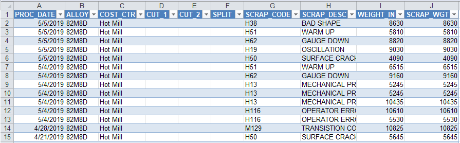
One of the biggest challenges improvement professionals face is figuring out how to develop improvement stories from volumes of data. In most cases, the data looks like this:
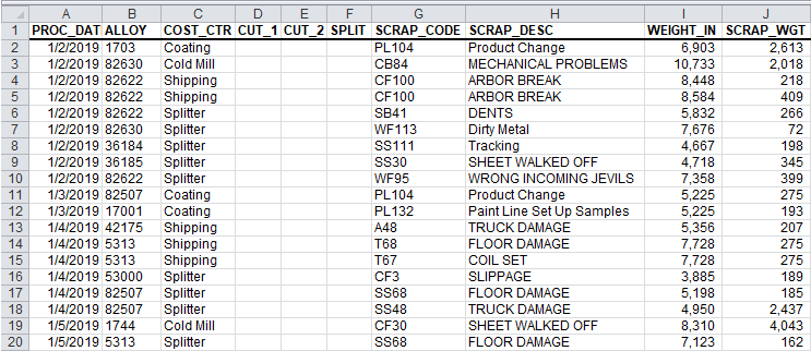
This data is from a metal manufacturer. The scrap information shows the date scrapped, alloy, cost (i.e., machine) center, cuts, splits, scrap code and description and the actual weights of material and scrap. Clearly there is a lot of scrap, but how do you turn this into something resembling an improvement project?
Create Pivot tables + an improvement story from this data
Similarly, data from a hospital's maternity ward might look like this:
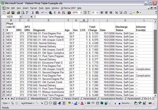
It shows dates, physicians, diagnosis, patient age, length of stay (LOS), adverse events and discharge status. Do some physicians have more complications, higher costs, or longer lengths of stay?
This kind of data reminds me of the old joke about the father who finds his daughter digging through a pile of horse manure. When he asks her what she's doing, she replies: "There has to be a pony in here somewhere!"
Is there an improvement pony in your pile of data? With data like this, you will want to do some data mining with Excel to find the improvement projects hidden in your data.
Data Mining With Excel
Using Excel's PivotTable function, it's easy to analyze this data to find improvement stories. Here's the process:
- Click on any cell in the data. (Excel will automatically select all of the rows and columns in your data.)
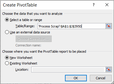
- Click on Excel's Data-PivotTable and Pivot Chart Report menu:
- Click Finish to reveal the PivotTable tools:
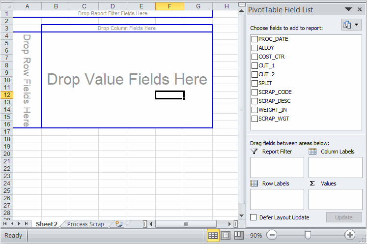
- Now simply use your mouse to drag-and-drop items onto the PivotTable fields:
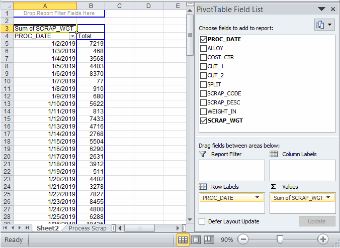
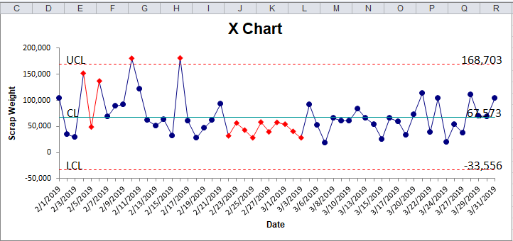
Want scrap by day? Drag PROC_DATE into the Row Labels box and drag SCRAP_WGT into the Values box. Then use QI Macros to create an XmR chart:
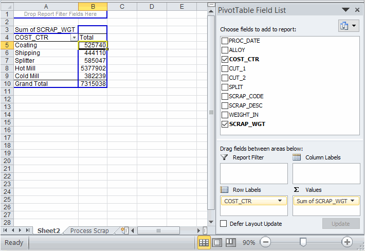
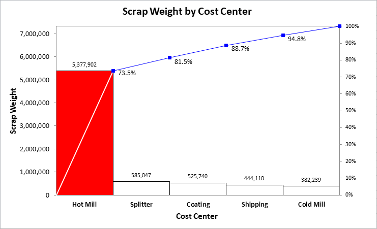
Want scrap by Cost Center? Drag cost center into the Row Labels box and drag SCRAP_WGT into the Values box Then sort the scrap in descending order by clicking on the Total Column and Data-Sort-Descending:
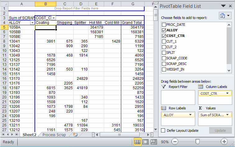
Want scrap by Alloy by Cost Center? Drag Alloy into the Row Labels box, Cost_CTR into the Column Labels box and SCRAP_WGT into the Values box.
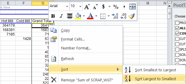
- To sort your data, right click on the column you want to sort and select Sort and then the way you want to sort your data.
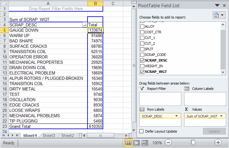
- Now that the data is sorted, we may want to drill down into the detail of the larger values. To drill down on any cell in a PivotTable, just double click on the cell. In the example below, double click on cell E5 to view the raw data behind 610,355 of scrap for Alloy 82M8D and Hot Mill 610355.
Raw data
- We could then create a PivotTable on this data subset to analyze just the scrap description for this single coating:
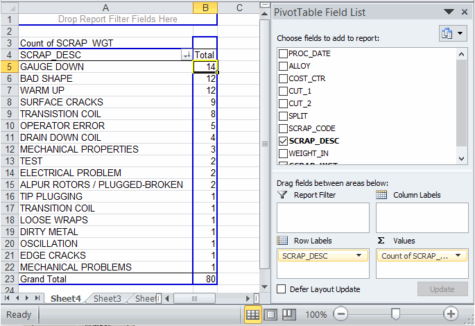
You could also double click on "Sum of SCRAP WGT" and change to "Count of SCRAP WGT" if you want to analyze the frequency of of each type of scrap:
Improvement Projects
I usually create control and pareto charts as I'm mining the data. From my perspective, most improvement stories consist of using three key tools in the right order:
- Line or Control Chart
- Pareto chart (two or more levels of detail)
- Ishikawa or fishbone Diagram
Control Chart of Scrap
Pareto Chart of Cost Centers
Pareto Chart of the Biggest Cost Center and Biggest Alloy
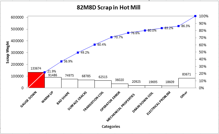
Hint: Narrow your focus. If you can fix the issues with one alloy in the top cost center, then you can replicate the improvement to the other alloys. Trying to do all alloys at the same time would be too confusing and potentially derail the improvement.
Ishikawa or Fishbone Diagram
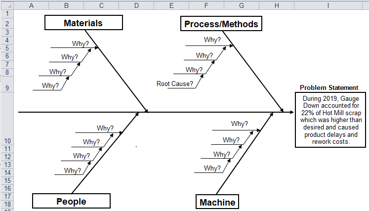
If you really wanted to make dramatic and rapid improvement, you could add root cause teams for all of the top five bars of the pareto chart: warm up, bad shape, surface cracks and transition coil.
Create Pivot tables + an improvement story from this data
Get the Idea?
You can distill mounds of data down into simple counts and sums using Excel's PivotTable function. From there, you can draw many pareto charts and double click on the PivotTable cells that show the biggest "pain" to drill down and do additional analysis.
The data is out there... Start Digging!
QI Macros Improvement Project Wizard automates this process
Since this article was written we have automated most of these steps by creating an improvement project wizard. You can find it on QI Macros primary menu. 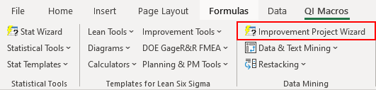
Stop Struggling with Improvement Charts!
Start creating your Improvement Charts in just minutes.
Download a free 30-day trial. Get Improvement Charts now!
Popular Charts Included in QI Macros for Excel
Join 100,000+ Users
in 80 Countries

