Creating an Improvement Story in Excel
Case Study - Creating an Improvement Story
Many people look at an Excel spreadsheet of data and have a hard time figuring out how to convert the data into an improvement story. QI Macros Improvement Project wizard has this intelligence built right into the code. Here are the steps the wizard and anyone should go through in analyzing data for an improvement project.
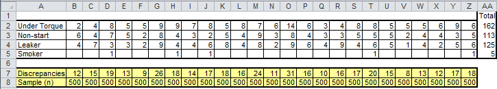
Step 1: Most Six Sigma improvement stories start with a line, run, or control chart of defect data over time. Look at this data from c:\qimacros\testdata\AIAG SPC.xls (pg. 88 in AIAG SPC 2nd Edition):
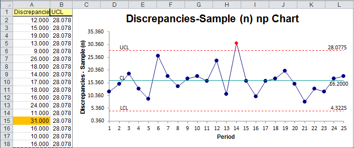
In this example, I immediately see the discrepancies as the variable I want to graph. Each 500 sample group has an implied time element to it. So I'd grab this data and run a np chart, because it's as easy to run a control chart as a line or run chart and it gives you more information:
The next thing to do is to look for ways to stratify the data to find a pareto pattern. Now I look at the data in a different way. I look for categories to graph as a pareto chart.
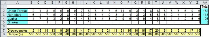
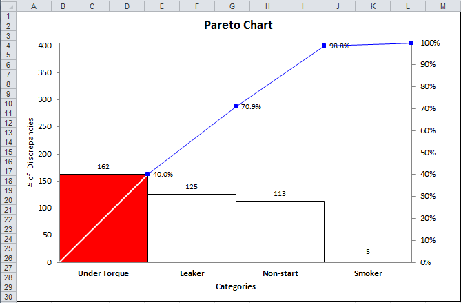
To run a chart for data that is not in adjacent columns, select the first set of data (cells A2 to A5) then hold the ctrl key down and select the second set of data (AA2 to AA5). This gives the following pareto chart:
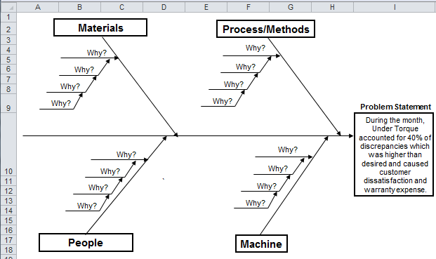
Given this, I can use the template selector to start creating fishbone diagrams of the top three categories:
Quick and easy, isn't it?
Stop using old technology!
Upgrade Your Excel and Data Analysis Skills to Smart Charts Using QI Macros.
Track Data Over Time
Line Graph
Control Chart
Compare Categories
Pie Chart
Pareto Chart
Analyze Variation
Bar or Column Chart
Histogram
QI Macros add-in for Excel makes creating smart charts a snap.
Join 100,000+ Users
in 80 Countries

