Why Line, Bar and Pie Charts are Dunce Charts
I get to see lots of corporate dashboards and virtually all employ simple line, bar and pie charts. Multi-million dollar businesses depending on basic charts to monitor and manage performance. What could be bad about that?
Lots of things!
If you have a bar chart with a target line like the one below, it encourages short term thinking and what Deming calls "tampering"—trying to decide why this month's numbers are higher or lower than the target.
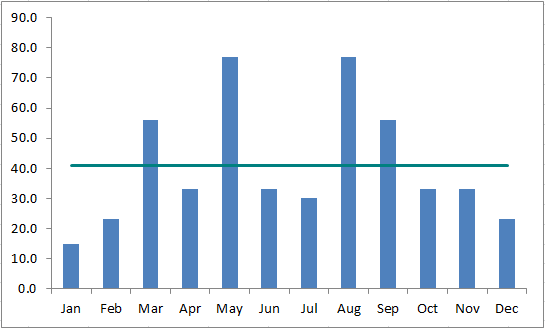
Far too much time is wasted in corporate meeting rooms trying to explain why a number is up this month and down the next. That's because bar charts don't have any intelligence built into them. Bar charts are dunce charts. They can't alert you to a real problem or tell you when to ignore the numbers.
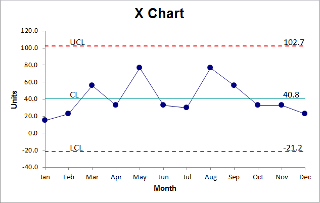
A control chart can! Here's the same data in a control chart . Because there are no points highlighted in red, the process is performing as expected. You can count on it delivering an average of 38.7 with variation between the upper and lower control limits. Unless you want to improve the process by moving the center line up or down, or narrowing the variation, there's nothing to be done here. Chasing variation between months is most likely a waste of time. If there were any special causes worth investigating, they would alert you by turning red.
Line charts have the same problem. They can't tell you if there's a problem or if everything is running smoothly. It's another dunce chart. Pie charts are just as bad.
What If a Bar Chart and a Line Chart Had A Baby with Brains?
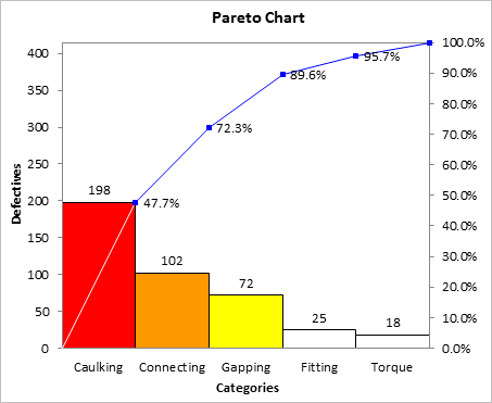
If you take a bar chart and sort the bars in descending order, and add a cumulative line graph, you get a Pareto chart. Pareto charts help laser-focus improvement efforts in ways that neither a line or bar chart can.
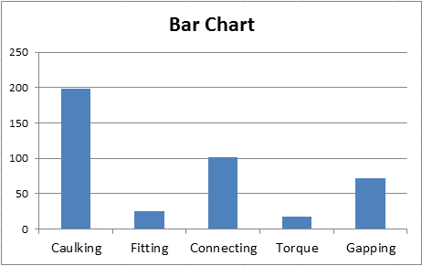
Compare the two side by side. The Pareto chart tells us to focus on Caulking because it is 47.7% of the total defects. A bar chart cannot tell us this easily.
Dunce Charts and Smart Charts
There are charts that just aren't that smart and there are ones that have gone to college, learned statistics and how to tell a good story in the best, most visual way.
 |
Smart |
|---|---|
|
line graph |
|
pie chart |
|
column chart |

Get the Idea?
Start using charts that have been to college and know statistics. They will make you look smarter as well.
Stop using old technology!
Upgrade Your Excel and Data Analysis Skills to Smart Charts Using QI Macros.
Track Data Over Time
Line Graph
Control Chart
Compare Categories
Pie Chart
Pareto Chart
Analyze Variation
Bar or Column Chart
Histogram
QI Macros add-in for Excel makes creating smart charts a snap.
Join 100,000+ Users
in 80 Countries

