Data Display Tips Using Airline Quality Data
The April 7, 2009 Denver Post article about Airlines smooth out the bumps had statistics about on time, bumping, lost baggage and complaints for flights out of Denver International Airport. The statistics were reported independently, which makes it hard to compare airlines. Even though the airlines were ranked from best to worst, it wasn't readily apparent from the article.
The newspaper used up a lot of space to report these results as text, when it would have been much more apparent using some kind of chart. This is where a paper like USA Today excels. They use graphics to condense statistics into a readable, comparable form. And you can too.
Be Like USA Today
Many people have a hard time figuring out how to display their data. I can tell you from experience that executives like things they can grasp quickly to make decisions. So let's look at various ways to display the airline quality data.
Accountant Method
Accountants love spreadsheets and can read them like you or I would read a novel. The airline quality data for them would look like this:
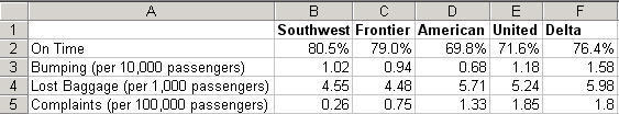
Most people, however, become easily overwhelmed by the sheer volume of information. They have a hard time choosing among the various bits of data.
Sorted Accountant Method
Of course, you could sort the data in descending or ascending order (e.g., best on time performance):
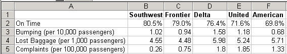
Again, still hard to grasp all of the data elements.
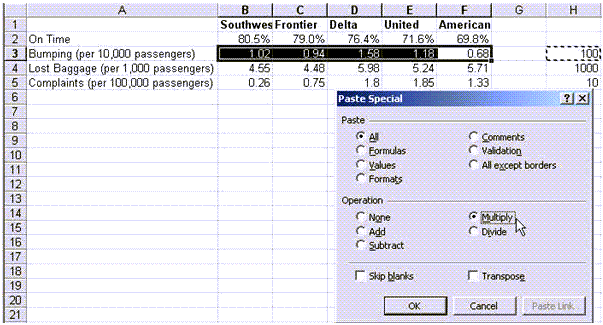
Convert to a Consistent Measurement
I like separate charts for each metric, but first I'd like consistency in the data. Notice how lost baggage, bumping and complaints are measured in different ways.. The mental math on that is cumbersome. So first, let's convert those numbers to parts per million (PPM).
To do so, multiply lost baggage rate by 1,000, bumping by 100, complaints by 10. Simply put the values in your spreadsheet, choose copy and then Paste Special-Multiply to change the values to PPM:
Which gives us a new table with consistent metrics measured in parts per million. (I could have converted on time rates to PPM, but then I would have flipped to not on time which, even for the best, would be 195,000 late flights per million. This is closer to 2-sigma than 3 sigma):
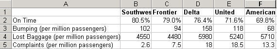
Chart Method
Charts can make all of this information clearer and easier to analyze. They can also make it just as complex. Some people would try to put all of this data into one chart:
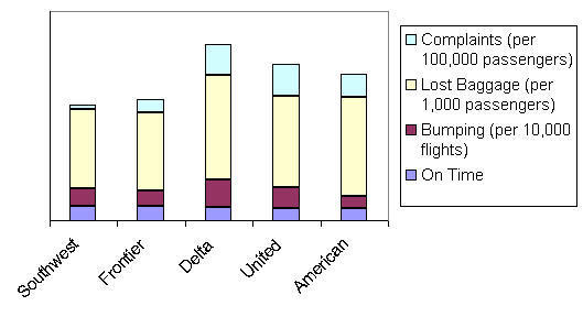
Again, packing too much information into a chart makes it confusing. Instead, let's draw separate charts. I like to sort the data in an order that draws attention from the best to the worst performers:
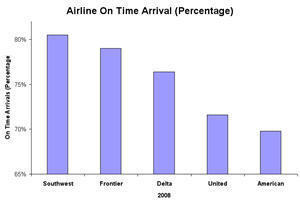
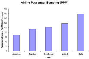
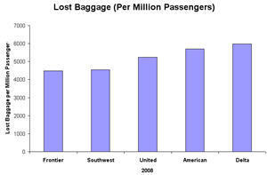
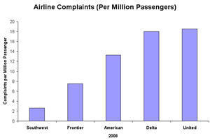
Looking at these four charts, I immediately notice:
- Lost baggage rate is fairly flat. So that shouldn't be a big criteria for choosing an airline.
- United is the largest carrier out of Denver, so I'd expect them to have more equipment and people to do a better job. But United's on time, passenger bumping and complaint rates are higher than most.
- Southwest and Frontier both perform better than the major carriers.
Based on this data, would you change how you travel?
Here's My Point
Your data can be presented in many ways. If you organize it in a consistent way, it will make it easier for viewers to make decisions. It doesn't matter if it's people reading a newspaper or executives evaluating a Six Sigma project. The best charts tell a story that anyone can grasp. At worst, numbers can languish on a spreadsheet begging for action.
What are you going to do to make your improvement stories into news everyone can use?
Stop using old technology!
Upgrade Your Excel and Data Analysis Skills to Smart Charts Using QI Macros.
Track Data Over Time
Line Graph
Control Chart
Compare Categories
Pie Chart
Pareto Chart
Analyze Variation
Bar or Column Chart
Histogram
QI Macros add-in for Excel makes creating smart charts a snap.
Join 100,000+ Users
in 80 Countries

