Chartjunk and Disinformation
I recently had the good fortune to stumble across a series of books by Edward R. Tufte on Envisioning Information. They remind me about the need for clarity in all of the charts and graphs we create, and their power to misinform.
Tufte argues for clarity and content over cuteness. Hence his phrase for anything that violates these principles: chartjunk.
Lurking behind chartjunk is contempt both for information and for the audience. Chartjunk promoters imagine that numbers and details are boring, dull, and tedious, requiring ornament to enliven. If the numbers are boring, then you've got the wrong numbers.
Worse is contempt for our audience, designing as if readers were obtuse and uncaring. In fact, consumers of graphics are often more intelligent about the information at hand than those who fabricate the data decoration. Our readers may be busy, but they are not stupid.
Clarity and simplicity are completely opposite simple mindedness.
Tufte argues that to make your information more usable, you will want to:
- Document the source and characteristics of the data
- Insistently enforce appropriate comparisons
- Demonstrate the mechanisms of cause and effect
- Demonstrate cause and effect quantitatively
- Evaluate alternative explanations
Chart Junk in Spreadsheets
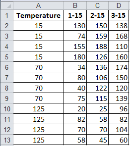
Dark gridlines are chart junk. You can use Excel's formatting capabilities to put boxes around cells, but they may not reveal the structure of the data you want to highlight:
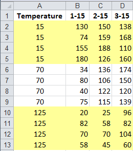
Instead, you could choose to highlight the three temperatures:
or the three trials:
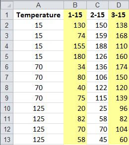
Chart Junk on Graphs
The same is true of charts. If you draw a plain bar chart using Excel's Chart Wizard, you get a chart cluttered with unnecessary information: gridlines, legends, background colors, and so on:
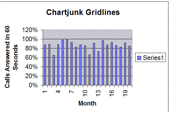
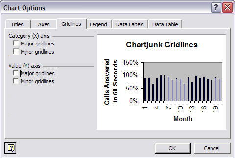
To fix some of these problems, right click on the chart and select Chart Options. Click on the gridlines and uncheck Major gridlines. Then click on the Legend and uncheck Show Legend.
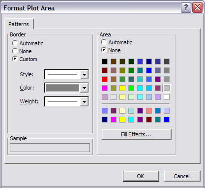
To clear the background color, double click on it and select Area: None:
The resulting graph becomes easier to read, but...
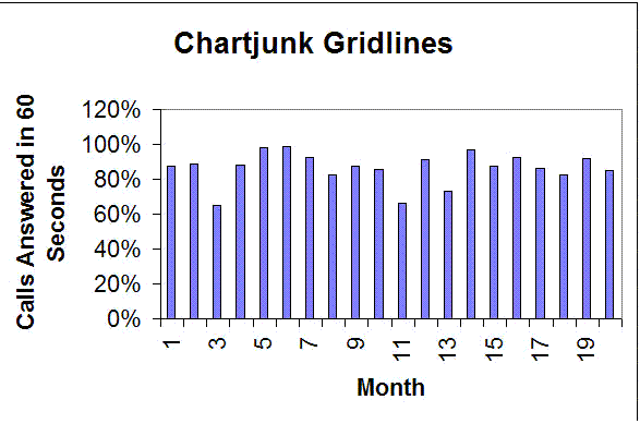
The bars are so tall that you can barely tell how much variation there is from month to month. I consider this to be a form of disinformation. The height and weight of the bars makes it look like there isn't really much of a problem. After all, we're over 80% most of the time, aren't we? I can't tell from this graph. It's too hard to read.
To change the scale, double click on the Y (i.e., vertical) axis and change the scale. In this case we changed the minimum from 0% to 60%.
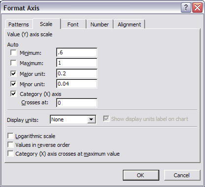
Now you can actually start to see the amount of variation from month to month.
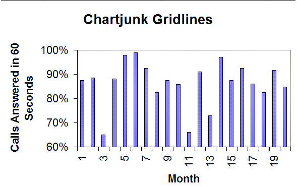
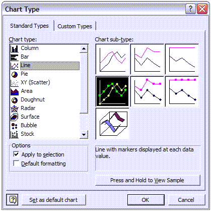
But bar charts are best for showing differences between two or more types of data: the height of men vs women, the weight of men ages 21 to 30, 31 to 40 and 41 to 50, etc. . Bar charts are not the right choice for showing how processes perform over time; use line graphs instead. To change the chart type, right click on it and select Chart Type and change the chart to one of the line graphs shown:
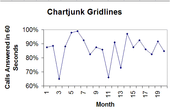
As you can see from the chart below, with the heavy bars gone, the only thing left to notice is the variation. What caused those big dips? What allowed us to answer the phone in 60 seconds 98% of the time in other months?
Get the Idea?
Chartjunk is a form of disinformation. It confuses the reader. Clean up your charts. Get rid of unnecessary clutter. Choose the right kind of chart for your data and you'll go a long way toward motivating the readers to understand and align with the business case presented. Note: Once you run a chart using QI Macros you can use all of Excel's capabilities shown here. Just double click or right click on the part of the chart you want to format.
Stop using old technology!
Upgrade Your Excel and Data Analysis Skills to Smart Charts Using QI Macros.
Track Data Over Time
Line Graph
Control Chart
Compare Categories
Pie Chart
Pareto Chart
Analyze Variation
Bar or Column Chart
Histogram


