Wondering How to Choose the Right Charts for Your Data
A Healthcare Case Study using QI Macros
A QI Macros customer recently sent us some data and a control chart that they thought was in error. Their problem illustrates the kind of confusion we see over and over again when it comes to figuring out how to choose a chart. We got their permission to sanitize the data and share the resolution with you.
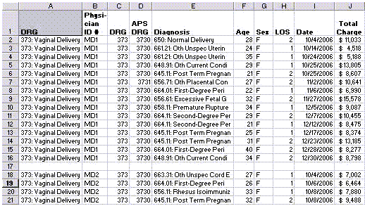
The original data looks like this:
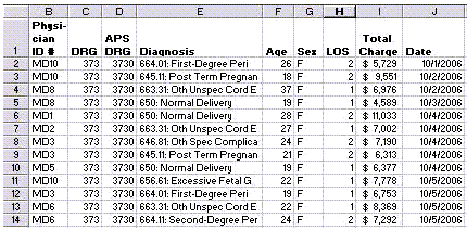
The user was asked to create an X Median chart of the total charges by physician. So, they sorted the data and then averaged the total charges. They did this manually by inserting rows:
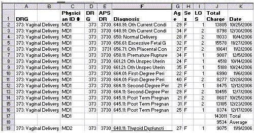
Then they manually summarized this all into a single table:
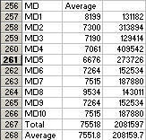
Then they graphed the result using the XMedianR chart:
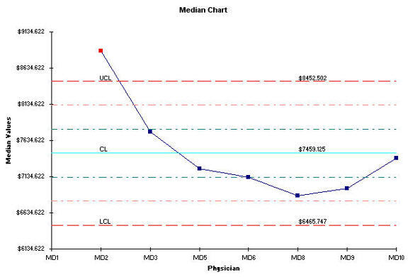
And they wondered why there wasn't a value for MD1.
What Went Wrong
- Median charts are designed to choose the median among two or more values. When using individual data, as we are in this case, the chart has to find a median between the values for MD1 and MD2, then MD2 and MD3 and so on. That's why there's no value for MD1. So the Median chart was the wrong chart for this data.
- The data had already been averaged, but the chart is trying to take the median of an average instead of the raw data. Averages are the wrong data for the X Median chart.
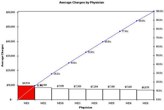
- But the real problem is that we've chosen the wrong chart for this kind of data. Control charts are designed to show process performance over time, not over individuals or steps in a process or some discrete category. A much better chart for this type of data would have been a bar or Pareto chart which shows little difference between physicians.
Manual vs Automated Summaries
Now let's turn our attention to how the data was summarized. Manual creation of totals and averages is unnecessary when your data is in this format because it's easier to use Pivot Tables. The process is simple:
- Click anywhere in the middle of the data.
- Click on Data-PivotTables and use the wizard to average the data. Just drag and drop the physician ID into the Row fields and the Charges into the data field. Change the format from Sum to Average:
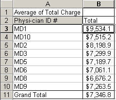
To find out more about using Pivot Tables and QI Macros, see our Pivot Table lesson.
A much more interesting chart could be created by sorting the data by physician and date.
If you insert blank rows between each MD, you'll get a stair-step chart of median charges by MD:
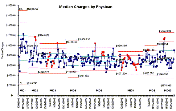
If you look at this one, you can see that MD1 and MD10 have the greatest variation in median charges, while MD8 has the least variation. If you were a expectant parent, wouldn't you rather go with MD8?
What Else Might Be Interesting?
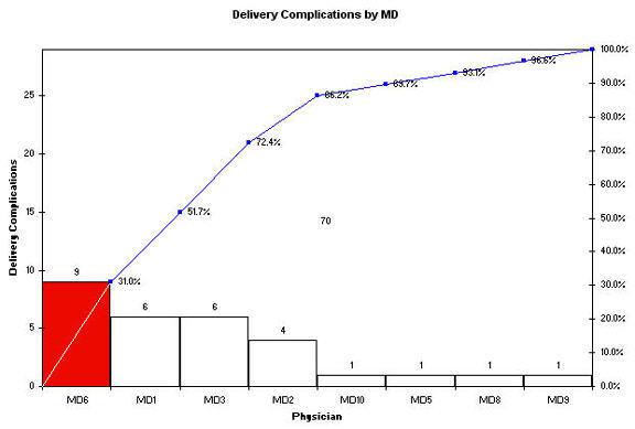
Turns out there's also information about complications during delivery that could be evaluated easily with a pivot table:
Pivot Table
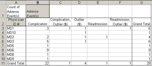
MD6 accounts for almost a third of all complications, but variation in charges is slight. MD1 and MD3 account for 41%. MD1 has the highest variation in charges.
What about MD8? He or she only had one complication (probably a contributing factor to lower variation in charges). Again, if you were an expectant parent, who would you prefer to deliver your baby?
Is there anything MD1,2,3,10 can learn from MD8 that would reduce costs and increase patient safety? Probably!
What Else?
We could evaluate complications by diagnosis using Pivot Tables and Pareto Charts:
Pivot Table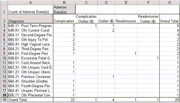
Pareto Chart
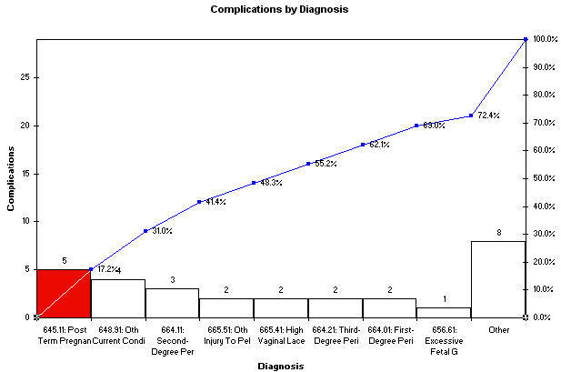
There are many other ways to look at this data: Average Length of Stay (LOS) by physician or complication. And so on.
Suggestions For Improvement
If you spend all of your time manually calculating totals and averages, you may miss the point of what you're trying to do or you may avoid the task completely. Learn to use Pivot Tables.
If you choose the wrong chart or the wrong data for your chart, you can end up trying to solve problems that don't exist. Learn to choose the right chart for your data.
Use Pivot Tables and QI Macros Together To Spotlight Your Course of Action
- Pivot Tables
- Use them to summarize your data in multiple ways
- Pareto Charts
- Pareto charts are great for showing differences between categories, not time usually. Use them to identify the "vital few" not the "trivial many." Focus on the 4% of your defects, mistakes, errors, or categories that provide the opportunity for significant improvement.
- Control Charts
- Use control charts to graph your data over time to monitor performance.
- Stair-Step Control Charts
- Use control charts with stair-steps to show differences in variation and central tendency across multiple sources (e.g., physicians).
If you draw a chart with QI Macros and it looks odd to you, don't assume QI Macros are at fault. Reevaluate your thinking: 1) Did you use the right chart for your data? 2) Did you use the right data?
Data Analysis Assistance
Because so many people struggle with this process of analyzing and graphing their data, I've developed a service that can accelerate your first few projects. It's like anything new; the first few times are slow, time consuming and filled with two-steps-forward-one-step-back.
We now offer data analysis assistance for a fee. Just send us your data and we'll analyze it, graph it and pull out any improvement stories, recommended graphs and insights we can find. If we can't find anything, you don't have to pay anything. Click here for more information.
Stop Struggling with Improvement Charts!
Start creating your Improvement Charts in just minutes.
Download a free 30-day trial. Get Improvement Charts now!
Other Charts Included in QI Macros for Excel

