Looking for a Way to Analyze Variable Data?
QI Macros Histograms and Box and Whisker Plots can help!
While control charts are great for showing process performance over time, sometimes you just want to see the spread, variation or deviation of variable (i.e., decimal) data. QI Macros provides a variety of charts to show the spread of data.
What is Variable Data?
Variable data is measured data. Measurements can be height, weight, time, age, money etc. Since it is measured, variable data often contains decimals. In contrast, attribute data is counted data based on an evaluation of yes-no, wrong-right, good-bad, etc. It is always measured in whole numbers since you can't have half of an error.
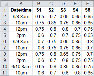
In the following examples, we'll use the same variable data for all of the charts (c:\qimacros\testdata\aiag spc.xls - XbarR sheet). There are five samples per subgroup collected at various times during the day.
Use Histograms to Analyze Variable Data
Histograms are the most common way to show variation in this kind of data. Ideally, you want to hit a specific target value, but the end product often varies around this ideal. The question is: How much?
Unlike the other charts, histograms not only show the spread of the data, but calculate Cp and Cpk. Cp asks the question" "Will the data fit between the specification limits?" Cpk asks: "How centered is the data between the specification limits?"
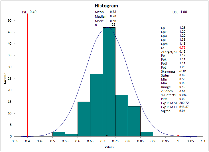
The histogram macro decides how to show the spread. In this case, it's very similar to the frequency histogram. When there's many different values, the histogram is the best choice.
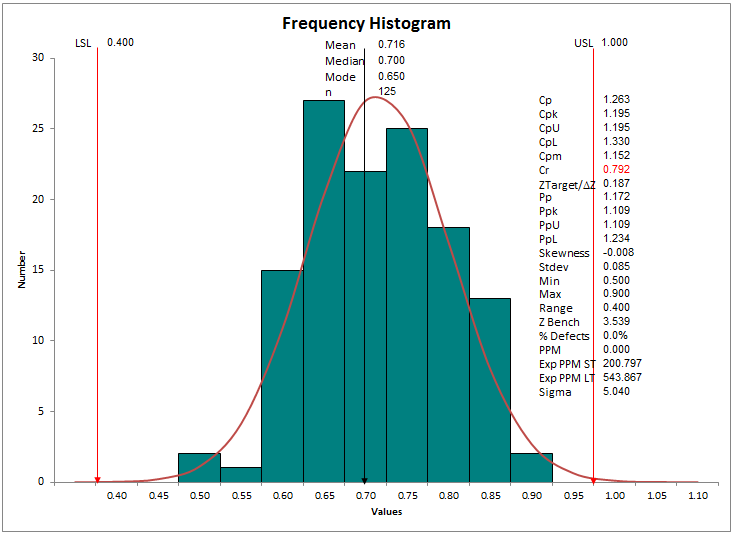
The frequency histogram counts the number of times each value appears in the data. If the values are consistent, the frequency histogram may a better choice.
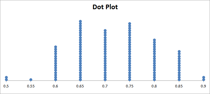
Use Dot Plots to Analyze Variable Data
Another way to show the spread of data is with a dot plot. In this case, we had to use the QI Macros' Data Transformation tools to unstack the 5X25 XbarR data into a single column. Then we can run the dot plot, which looks similar to the frequency histogram, but without the limits or capability measures.
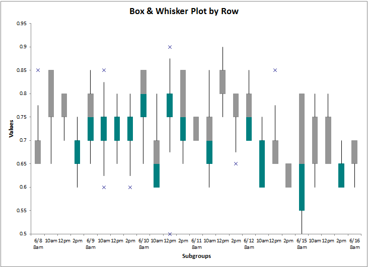
Use Box and Whisker Plots to Analyze Variable Data
The Box and Whisker Plot is like many histograms side by side. In this case, we can show the variation from batch to batch. The second and third quartiles of data are shown as boxes; the whiskers represent the first and fourth quartiles. And outliers are shown as asterisks. In this case, there seems to be a lot of variation from batch to batch.
If the data was for five different machines, we could orient the data by sample. In this case, they all look fairly similar.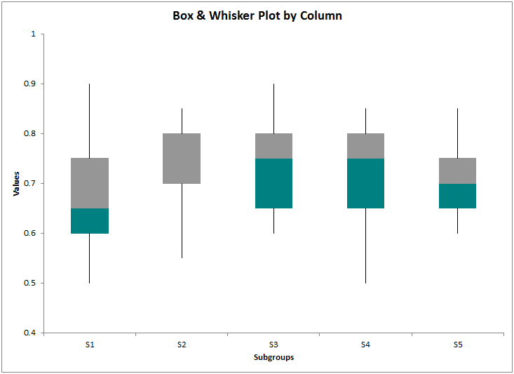
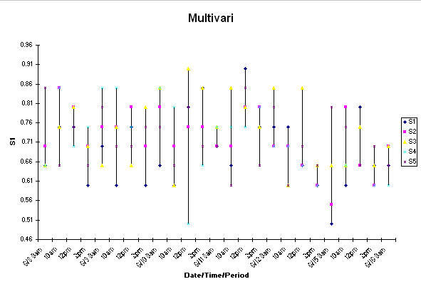
Use a Multivari Chart to Analyze Variable Data
The multivari chart also shows the spread of the data and each data point in the spread.
There's Lots of Ways to Show Variation
As you can see, there's lots of ways to show the variation of data. The big question is: "What story do you want to tell with your data?" When I'm in doubt, I draw all of them and then decide which one best and most easily tells the story I want it to tell.
Remember to have fun analyzing the variation in your data and then find ways to continuously reduce the variation to maximize profits.
Stop Struggling with Variation Charts!
Start creating your Variation Charts in just minutes.
Download a free 30-day trial. Get Variation Charts now!
Join 100,000+ Users
in 80 Countries

