Primitive Charts Hide Improvements
Improve Your Data Analysis Skills Using Control Charts and Histograms
I was reading an old issue of the Joint Commission Journal on Quality and Patient Safety. In an article about door-to-balloon times the authors used a scatter plot showing each time and a target line (90 minutes or 1hr 30 minutes):
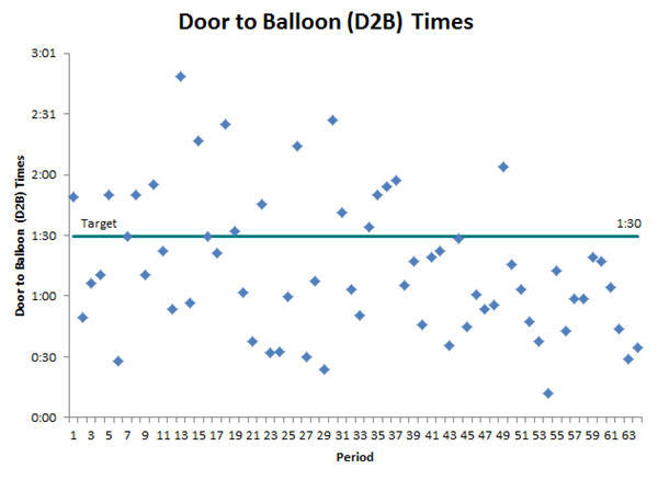
But what can we really tell from this chart? Not much.
Scatter Charts can be Unclear and Confusing
What if we used an XmR control chart to show performance over time?
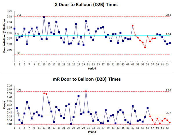
We can see that the process is stable and predictable with an average time of 74 minutes. There is a downward trend starting at point 49. Was an improvement implemented? Looking at the Range chart we see a run of points below the center line starting with point 56. Did an improvement reduce the variability?
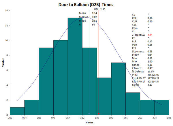
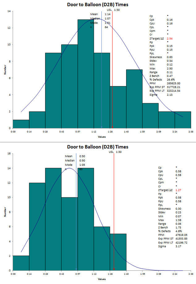
We could have also shown the data as a histogram to dramatize the inability to meet the 90 minute target:
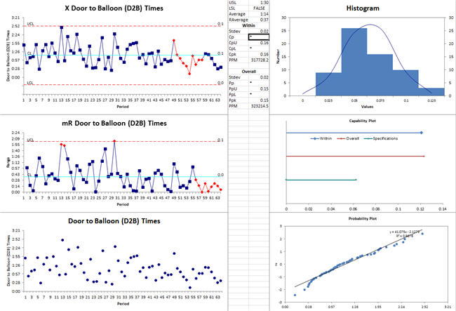
Or we could have used the Capability Suite to show all this and more:
I'd like you to consider that control charts and histograms would have told this story more clearly and established a baseline for improvement.
Use Control Charts to Show Before and After Improvement
We could add the improved DB times and demonstrate improvement with the same XmR control chart and histograms:
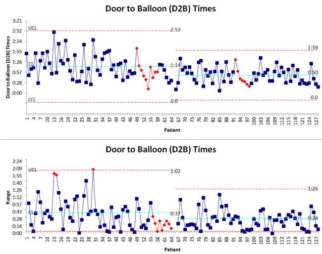
This shows we've both reduced D2B time and variation. There's still a statistically significant downward trend in the middle that I would want to analyze to determine if we tried but failed to lock in a significant improvement.
Comparing the before and after histograms shows significant improvement.
Don't Let Primitive Charts Spoil Your Analysis
Learn how to use control charts and histograms to analyze data and demonstrate real results.
Rights to reprint this article in company periodicals is freely given with the inclusion of the following tag line: "© 2015 Jay Arthur, the KnowWare® Man, (888) 468-1537, support@qimacros.com."
 Take our FREE Lean Six Sigma Yellow Belt training online.
Join 100,000+ Users
in 80 Countries

