Analyzing Different Machines
SPC Case Study - Machine Screws
On the governments statistic website, I found a case study about analyzing machines for replacement. The machines produce screws.
The essence of the case study is that:
- A machine shop has three automatic screw machines that produce various parts.
- The shop has enough capital to replace one of the machines.
- The quality control department has been asked to conduct a study and make a recommendation as to which machine should be replaced.
- The production specifications for the machines are 0.125+/-0.003 (LSL=0.122, USL=0.128)
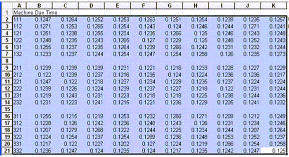
The first task is to get the data off the webpage and into Excel.
Converting HTML Data into an Excel Workbook
Using your mouse, all you have to do is select the data in the webpage:
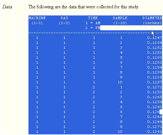
Then use EDIT-COPY to copy it to a Windows clipboard. Next, open Excel and try pasting it into a worksheet. If the data is in an html table, Excel will paste it easily. In this case, however, the data isn't. It's just numbers with spaces between them. So what do you do?
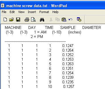
I opened up WordPad (or you could use Word) and pasted the data into a blank page. Then I saved it as a text file (filename.txt):
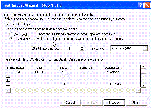
Excel can take this format and figure out how to import the columns. So I started Excel and opened the text file which starts the text import wizard which will figure out where each column of data belongs:
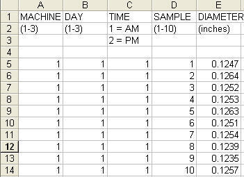
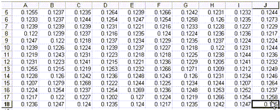
When finished, Excel gave me the following:
As you can see, there are 10 samples, but they're in a column. To get them into a format that will be usable for graphing with QI Macros, I need to get the data oriented into groups of 10. To do this, I selected the diameter data and used CTRL-SHIFT-G to start the gen table macro which prompts me for the sample size. It will convert any size array to a different sized array based on sample size:
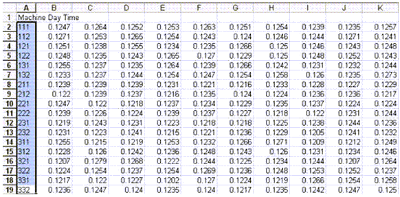
The result is 10 columns of samples by machine/day/time:
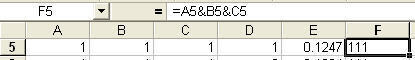
Next, I want labels for each of these rows that correspond to the machine/day/time. So I can use a formula to combine columns A&B&C (D is the sample number):
Then I can use QI Macros data transformation tools (or gen table macro in older versions) to sort these and give me a set of headings which I can insert in front of the data:
If you had trouble with any of these steps you can download the Excel spreadsheet we created at machinescrewdata.xls. Now we're ready to analyze the data.
Using the Box and Whisker Plot to Analyze the Data
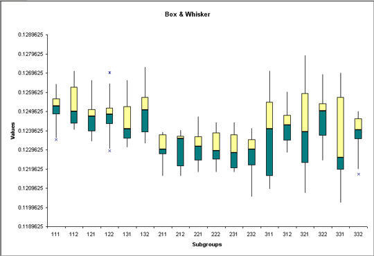
Just select all of the data (A1:K19) and select "Box & Whisker" from the QI Macros menu:
We could also use the data transformation tools (or gen table macro) to combine all of the data into three machines and draw a Box and Whisker Plot of that data:
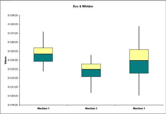
Just by looking at these charts we can see that:
- Machine 1's output fits squarely between our upper and lower specification limits (LSL=0.122, USL=0.128).
- Machine 2's output has some below the LSL (0.122). The variation is small, so maybe all we need to do is adjust the machine to move the results up to the target of 0.125.
- Machine 3 has much more variation and output below the LSL.
Based on just this analysis, I'd recommend replacing machine number 3.
Using Stair Step Control Charts To Analyze The Data
Another way to approach this would be to use the XbarR chart. If we insert blank rows between the three machines, we can analyze the data using stair step limits:
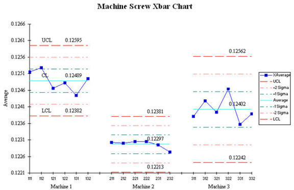
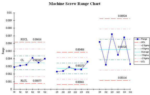
Again You can see from both the average (X) and the range charts that the variation for machine # 3 is much wider. Again, I'd recommend replacing machine #3.
Using Histograms To Analyze The Data
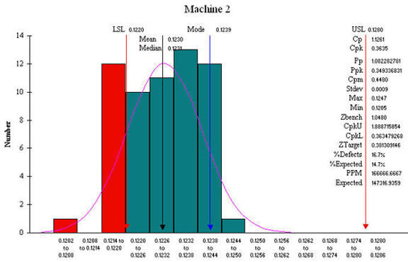
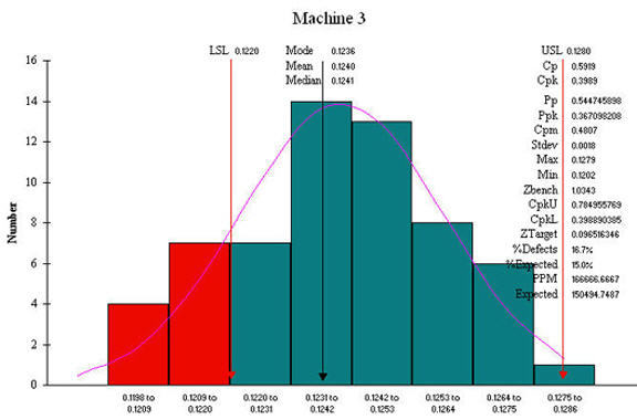
Another way to do this is to select the data for each machine, run a histogram for each machine, then compare:
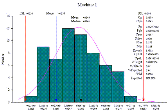
Machine 1 has a Cp of .8879 and a Cpk of .8793 (1.0 is considered to be capable). These capability measures tell us that machine 1 has enough variation from part to part that it could produce non-conforming parts.
Machine 2 has a Cp of 1.126 (capable) and a Cpk of 0.36 (off center). Based on these measures, Machine 2 has the least variation; it just needs to be adjusted to center the output on the target (0.125).
Machine 3 has a Cp of .5919 (not capable) and a Cpk of .3989 (not centered). Again, based on Cp and Cpk, I'd recommend replacing machine number 3.
Recommendations
It's so easy to draw charts with QI Macros that it makes sense to use several different approaches and see what they tell you. In this case, we used the Box and Whisker Plot, the XbarR using the stair step capabilities of the macro, and three histograms to verify and validate our decision. I don't know about you, but I find that managers often challenge one graph, but when you give them three ways to see the same thing, they're often convinced.
Other Charts Included in QI Macros for Excel
Join 100,000+ Users
in 80 Countries

