Not Sure How to Analyze Data With More Than One Variable?
QI Macros Has Several Tools for Analyzing Data With Multiple Variables
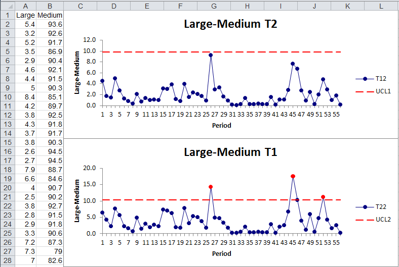
Hotelling T2 Chart to Measure Two Interacting Measurements
Imagine for a moment that you are measuring the location of a hole drilled in a sheet of metal. It could be left or right, up or down. It's possible that both measurements, analyzed separately, could be stable and predictable, but the two together could have outliers. The Hotelling T2 chart helps evaluate two interacting measurements simultaneously.
Similar to the XmR, the Hotelling T2 chart evaluates the covariances of the ranges between each of the two measures and the covariances of the actual data points. This gives two charts that are similar to the Average and Range in the XmR.
In phase 1, the T21 chart is used to establish control. The goal is to get a stable and predictable process so that you can monitor future production using the T22 chart in phase 2.
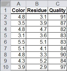
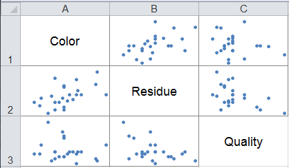
Matrix Plot (Many Scatter Diagrams)
Matrix Plots are used to evaluate the correlation or cause-effect relationship (if any) between two or more variables (e.g., color, residue and perceived quality in shampoo). Matrix Plot data looks like this:
To run this chart in QI Macros, select the data and select Matrix Plot from the pull down menu. If the points are tightly clustered along a line like machine gun stitching, then there's probably a strong correlation. If it looks more like a shotgun blast, there is no correlation.
Stop Struggling with Multi-variable analysis!
Start creating your Multi-variable analysis in just minutes.
Download a free 30-day trial. Get Multi-variable analysis now!
Other Charts Included in QI Macros for Excel
Join 100,000+ Users
in 80 Countries

