Looking for Tips on How to Organize Data in Excel?
Here are some best practices for analyzing data and creating charts in Excel.
Tips for Setting Up Your Data
Learn More in These Video Tutorials
Horizontal or Vertical?
Since most calendars show time horizontally, not vertically, most people tend to show data organized by dates and times horizontally. QI Macros will draw the chart either way, but the best way is vertically. Why? Because there's a lot more rows than columns available. You are limited to 255 columns horizontally:
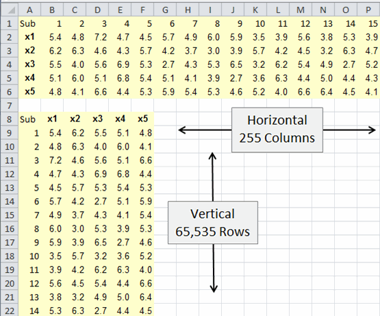
Given a choice, start with vertical data.
Column and Row Headings
Having settled on vertical, it's time to think about headings. Every column and row should have a heading:
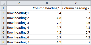
Column Heading: QI Macros will attempt to use whatever is in the column heading for chart tiles, so make the title descriptive.
Row Headings: If the data is organized by time, then the row headings should be:
- Dates
- Times
- Batch or subgroup (as shown above)
(If this is a number like 1,2,3 consider using an apostrophe in front of the number to force it to be text. That way QI Macros cannot be confused whether it's data or a label.)
If the data is a category like type of defect, then use descriptive labels for each category instead of codes (e.g., FF for folded flaps or BF for Bent/Damaged Flaps):
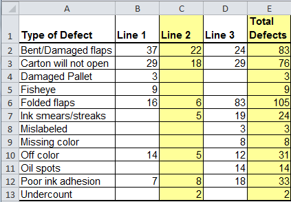
As shown in this example, use color for visual clarity.
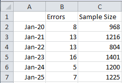
If your data has a numerator and denominator, put them in adjacent columns with a leading heading (e.g., discrepancies/sample size):
Common Heading Mistakes
The most common and troubling mistakes are:
Using multiple rows for headings:
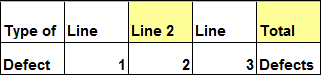
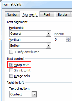
Instead, right click on the cell and use Format-Cells - "Wrap Text" to fit the text into the cell:
Formatting Mistakes
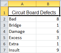
Don't merge cells like " Circuit Board Defects" below.
You can't tell if the title is in the first or second column.
Merged cells are particularly hard to use when copying, pasting or charting data.
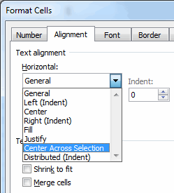
Instead of "Merge Cells" use "Center Across Selection" to accomplish the same visual result without hog-tying copy/paste/chart capabilities.
Don't put your time series data side by side, because you will have to stack it to draw a control chart.
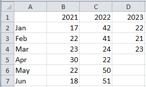
It's okay, however, to show category data side by side, because it's a good way to make comparisons.
Summarizing Data
First, put all of your data on one worksheet. We've seen annual data split into quarters and each quarter put on a separate worksheet. You can't use QI Macros if your data is split across worksheets.
Second, don't put quarterly totals and grand totals in line with your data. If you do. you'll have have to select around them to draw a chart. Put them beside your data:
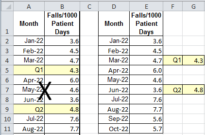 :
:
I know that some manager will ask to see it in a different, more complex way, but keep your raw data clean and simple. Use QI Macros "Paste Link" or "Paste Link Transpose" functions to make a linked copy of the data that you can modify to meet any need, while keeping the raw data clean.
If, for example, we take the data above and use QI Macros "Paste Link Transpose" function, we will get the following data that has links back to the original data.:
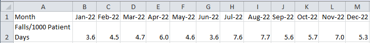
You can insert quarterly averages for reporting purposes, but still have access to the original data for charting.
Summary
So, these are just some simple ways to make your data life easy or hard. It's up to you to implement them.
Stop using old technology!
Upgrade Your Excel and Data Analysis Skills to Smart Charts Using QI Macros.
Track Data Over Time
Line Graph
Control Chart
Compare Categories
Pie Chart
Pareto Chart
Analyze Variation
Bar or Column Chart
Histogram
QI Macros add-in for Excel makes creating smart charts a snap.
Join 100,000+ Users
in 80 Countries

