Before-After-Control-Impact (BACI) Charts
How to Show Impact Across Multiple Processes or Machines
In manufacturing, you might want to show the impact of improvements as they are migrated from one machine to another. In healthcare, you might want to show the impact of improvements as they are replicated across nursing units or hospitals. That's the essence of a BACI Control Chart.
It's Easy to Create a BACI Control Chart Using QI Macros
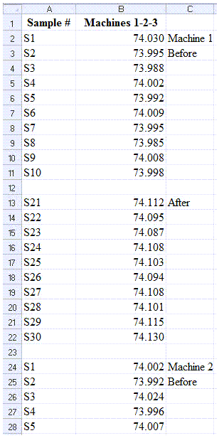
All you have to do is stack the before and after data for two or three machines and put blank rows between machines and changes. Your data might look like this:
Then Select the Data and Run a Control Chart Using QI Macros
The blank rows between machines or improvements tell QI Macros to start a new set of control limit calculations. The resulting control charts show the before-after control impact.
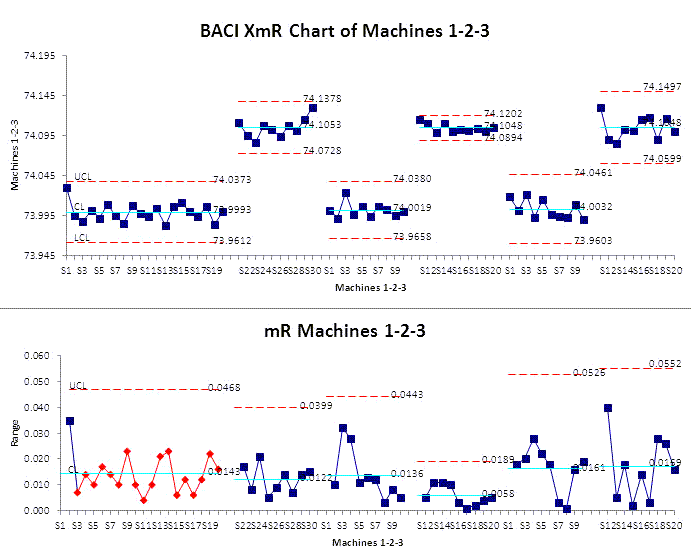
This chart shows that Machine 1's range chart was out of control until the improvement was implemented. Then Machine 2 improved as well showing lesser variation (the distance between the UCL and LCL). And Machine 3 improved as well showing slightly higher variation.
Show the Impact of Your Improvements Using Charts Anyone Can Understand
It's easy to see the impact of the improvements by comparing the before and after results.
Stop Struggling with BACI Control Charts!
Start creating your BACI Control Charts in just minutes.
Download a free 30-day trial. Get BACI Control Charts now!
Other Charts Included in QI Macros for Excel
Join 100,000+ Users
in 80 Countries

