PivotTables for Breakthrough Improvement
The first step in breakthrough improvement is summarizing the massive amount of data collected about defects, mistakes and errors in any business. It doesn't matter if it's scrap in manufacturing or medication errors in healthcare, defects, waste and rework are consuming a third of most corporate budgets. You can easily aggregate and chart this data using PivotTables and the QI Macros for Excel.
![]() Excel PivotTables summarize massive dumps of data about defects and money.
Excel PivotTables summarize massive dumps of data about defects and money.
(QI Macros PivotTable Wizard )
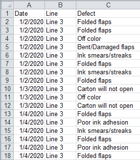
PivotTable Data
I have found that few Excel users understand how to use PivotTables, but that is where much of the power awaits. If you want to make breakthrough improvements in quality, you will want to pay more attention to the kind of data you can analyze with PivotTables. PivotTable data looks like the following examples that are installed with QI Macros in Documents/QI Macros Test Data/pivottable.xls.
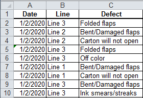
Companies often collect this information about defects, mistakes and errors, but fail to summarize and eliminate it with PivotTables, Control Charts and Pareto Charts. I have analyzed data sets containing 50,000 rows of data or more. One of our customers lamented that they had millions of rows of data (imagine daily credit card processing or check processing where even a tiny error rate can cost millions of dollars). Older versions of Excel only handled about 65,000 rows, but the newer versions can handle hundreds of thousands. Even if you just use a 50,000 row sample from a million rows of error data, it will most likely represent the total population.
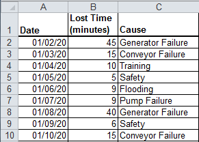
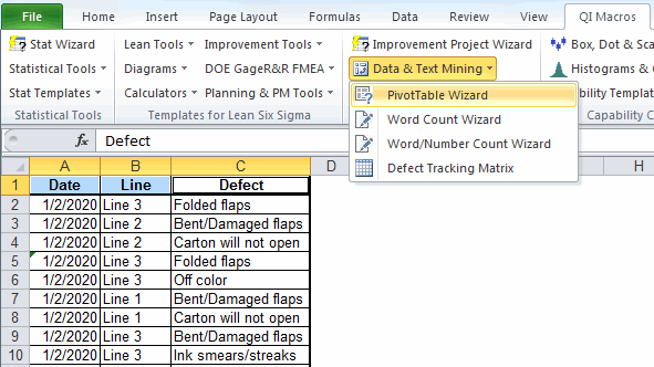
Using the QI Macros Defect Tracking Sheet
Even if you don't have this data, you can start to collect it with QI Macros Defect Tracking template. The template is located under the Improvement Tools submenu. Each column allows you to track errors. Data validation for the specific types of errors in B1:D10 make data collection simple, consistent and easy to summarize.
![]()
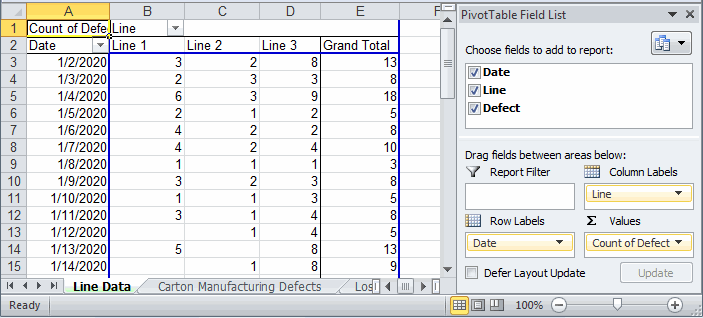
Using the QI Macros PivotTable Wizard
Once you've found or gathered this kind of data, you can summarize it easily with the QI Macros PivotTable Wizard. Just select 1-to-4 column headings and click on the PivotTable Wizard.
It will examine the data and create a PivotTable. The left column will often contain dates and the other columns will contain details and grand totals. If we select the first three column headings of the first example, it gives the following:
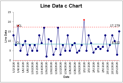
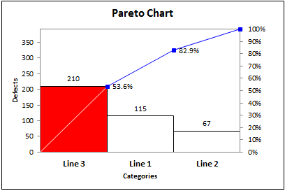
Using the data in column A and E, you can quickly create a control chart of the defects per day. Using the line labels in B2:D2 and the totals (not shown) in B49:D49 you can create a Pareto chart showing that Line 3 is the major source of defects.
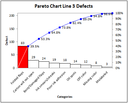
Then, we could simply double-click on the Grand Total for Line 3 to bring up all of the defects on that line and select the defect heading (C1) and use the Pareto Chart to summarize the types of defects. This shows that "Folded Flaps" are the "big bar" of the Pareto Chart. This becomes the head of the fishbone or Ishikawa diagram.
In a matter of minutes we'd be ready to start root cause analysis on the biggest problem on the most problematic line. When you focus on the vital few using PivotTables, Control and Pareto Charts, breakthrough improvements are easy.
Master the use of PivotTables and you'll be well on your way to success with Lean Six Sigma. QI Macros will support you every step of the way.
To learn more about Breakthrough Improvement with QI Macros and Excel, get my new book (click here) and watch the supporting videos (click here).
Why wait? Start creating these charts and diagrams in seconds using
QI Macros add-in for Excel.
Join 100,000+ Users
in 80 Countries

![]()
