Need to Analyze Data Using Pareto Charts?
QI Macros makes it easy to perform Pareto analysis right in Excel!
Watch this example using defect data from a garage door installer.
Pareto Analysis from PivotTables:
- Select the Total data.
- Click on QI Macros menu > Pareto.
- Identify the "Big Bar" (Motor) and drill down to create a 4-50 Rule Pareto..
Step by Step Example of Using Paretos to Reduce Service and Warranty Calls
Most companies have lots of data, but sometimes have a hard time figuring out what to do with it. I've found that I often use a common strategy for analyzing a company's data. I usually slice and dice an Excel table in the same way:
- First I use Pareto charts to analyze the "total" rows and "total" columns.
- Then I perform Pareto analysis on the biggest contributor in each total row or column.
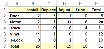
Let's look at an example. Here's a simplified PivotTable from a garage door installation company that was having trouble making a profit because of service and warranty calls. This data is in QI Macros Sample Data -> Pareto Chart.
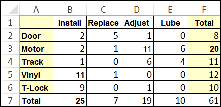
Because the company installs doors for builders, they sometimes have multiple service calls to install each door piece-by-piece. They may have to install, replace, adjust, or lubricate some part to get the door working properly. They work with five key parts: door, motor, track, vinyl trim, and T-lock.
First Level Analysis by Type of Part
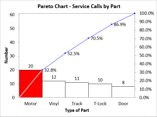
I've highlighted the first focus of my analysis in the data worksheet above in yellow: total parts. Here's the Pareto chart I created using QI Macros.
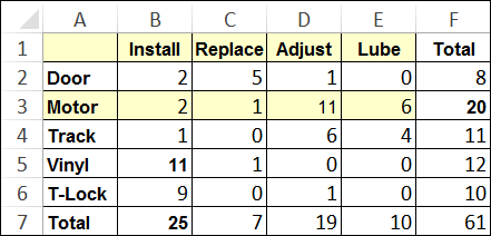
Drill Down on the Big Bar (Motors) by Type of Service
Motors are the big bar on the Pareto chart at 33%. Next, I drill down to look at the motor row by type of service (yellow):
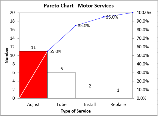
Adjusting the motor is the big bar on the Pareto chart at 55% of total motor services. Now we have something to analyze!
First Level Pareto Analysis by Type of Service
Now let's pull back and look at the service row:
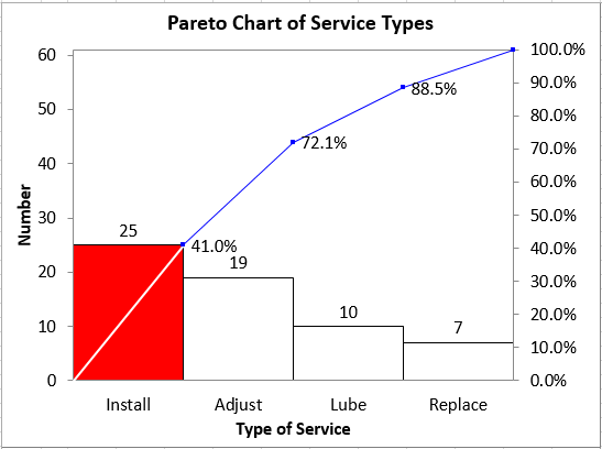
As you can see, installation is 41% of the total followed by adjustments. These two are 72% of the total as indicated by the cumulative line on the Pareto chart.
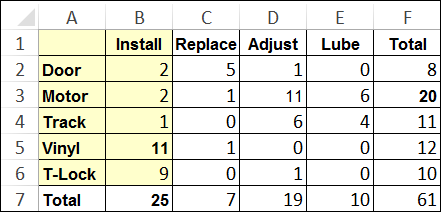
Drill Down on the Big Bar (Install) by Type of Part
Next, I'll drill down by looking at the installation column:
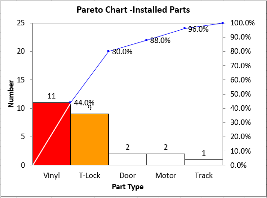
Installations of vinyl followed by T-locks are 80% of the total. Now we've got something to analyze. We could have one team analyze vinyl installs and another analyze T-lock installs.
The Key to Pareto Analysis: the 4-50 Rule
I keep hammering this point: 4% of any business is causing 50% of the waste, rework, and delay. As you can see from these pareto analysis examples, by slicing and dicing the data horizontally and vertically we can find two or three key problem areas that could benefit from root cause analysis.
Start with the total columns and rows. Draw Pareto charts with the QI Macros. Then use this information to narrow your attention to one key row and column within the table. Draw the lower-level Pareto charts from this data. The "big bars" in the lower-level Pareto charts can be turned into problem statements to fill the head of your fishbone diagram. Here's an example:
Problem Statement: During 2014, adjustments accounted for 55% of all motor service calls which is higher than desired and caused customer dissatisfaction and a loss of $60 per service call.
Start using the QI Macros to slice and dice your tables (no matter how large). You'll find it easy to find the 4-50 and start making breakthrough improvements.
Mistakes to Avoid When Using Pareto Charts to Analyze Your Data
1. Stopping Your Pareto Analysis Too Soon
A common Pareto chart mistake is to stop at too high a level. It may take two or more levels of Pareto charts to narrow the focus to an actionable level. How can you tell if you've stopped too soon? In the next step of the problem solving process, root cause analysis, your "fishbone" diagram will turn into a "whalebone" diagram covering many walls. By taking the "big bar" down one more level, we get a clear insight into where to improve.
2. Using a Parflato chart instead of a Pareto Chart
Another common Pareto mistake involves using a "parflato" chart. If the left bar or two on your Pareto chart are not significantly bigger than the other bars on the chart then you have a "perflato" chart. A flat Pareto chart means that the principle of 80/20 distribution does not apply.
Pareto chart
Parflato Chart
Try organizing your data by another attribute (e.g subtotal by geography, cost, or time of day instead of by error type) and see if you can get a Pareto chart that helps you better focus your efforts.
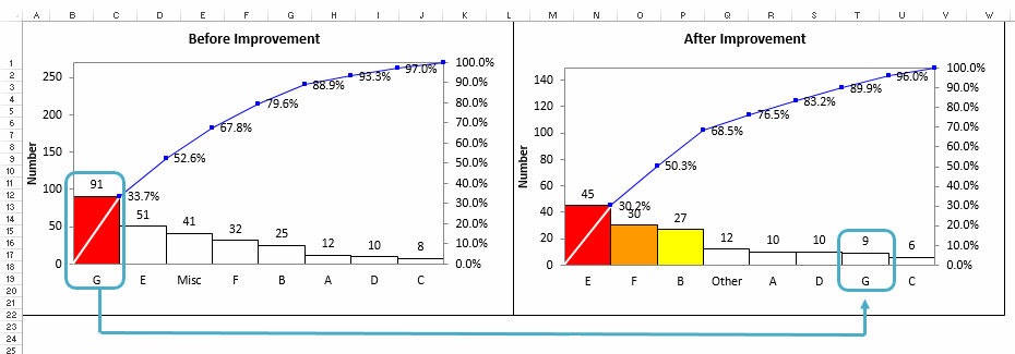
3. Not Using Before and After Charts to Demonstrate Improvement
Teams often want to "declare victory" after identifying root cause and implementing countermeasures. The only way to know if the change really improved the process is to run a Pareto Analysis on your before and after data. The paretos below, demonstrate the reduction in error type G.
Stop Struggling with Pareto Charts!
Start creating your Pareto Charts in just minutes.
Download a free 30-day trial. Get Pareto Charts now!
QI Macros Draws These Charts Too!
