Struggling to Create Frequency Histograms in Excel?
QI Macros can create them for you in seconds!
Create a Frequency Histogram using QI Macros:
- Select your data.
- Click on QI Macros menu > Histogram & Capability > Frequency Histogram.
- QI Macros will do the math and draw the chart for you.
Go Deeper: What is a Frequency Histogram?
Like a histogram, frequency histograms show the spread or dispersion of data. Rather than sort the values into bins, a frequency histogram has one bin or bar per value.
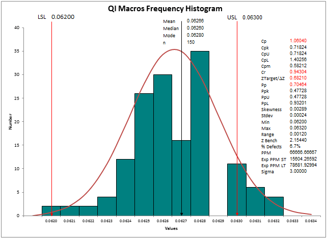
In the frequency histogram above, there were no data points with a value of .0629 so there is no bar for that value. More importantly, many measurements fall outside of the LSL and USL which means that the process does NOT consistently deliver the customer's requirements.
Why Use a Frequency Histogram?
Use a frequency histogram whenever the data has a limited number of specific values (e.g., 0.65, 0.60, 0.55). This will show exactly how many of each value are in the sample. You can also draw a dot plot on this kind of data.
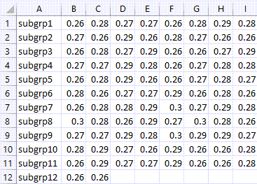
NOTE: If you have subgroups of data, make sure that your data set is plotted in ROWS of subgroups - NOT columns of subgroups. Otherwise your Cp/Cpk will be incorrectly calculated:
Stop Struggling with Frequency Histograms!
Start creating your Frequency Histograms in just minutes.
Download a free 30-day trial. Get Frequency Histograms now!
QI Macros Draws These Charts Too!
