Struggling to Create a Multi-Vari Chart in Excel?
You Can Draw Multi-Vari Charts in Seconds using QI Macros add-in!
Why it Matters? Multivari charts evaluate process variability within & between categories.
How to Create a Multi-Vari Chart Using QI Macros add-in for Excel
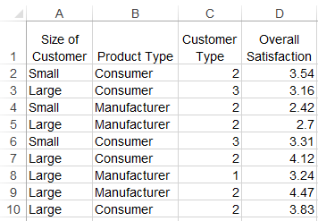
- First select your data. Multivari data can have one or more columns of words or numbers. The last column contains the values to be grouped and charted. Here is an example.
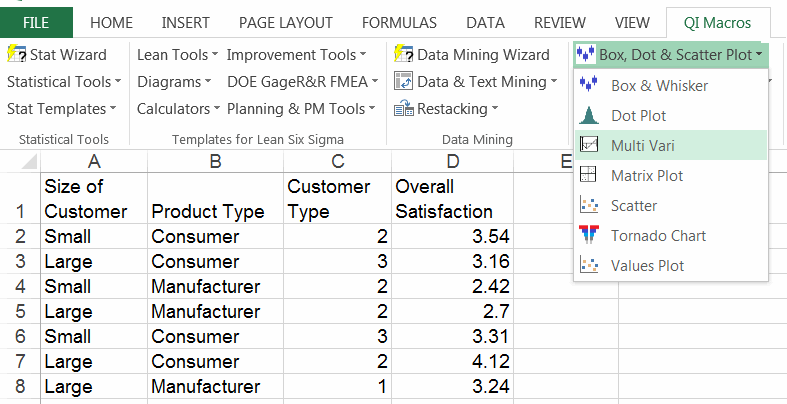
- Then click on QI Macros menu and find the Multi Vari chart under Box, Dot and Scatter Plots.
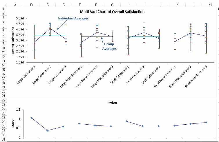
- QI Macros will perform all of the calculations and draw the multivari chart for you. This Multivari Chart shows the overall customer satisfaction by customer size and market segment.
How to Read a Multi-Vari Chart
At first glance, multi vari charts can be overwhelming. Here is a quick overview of each element.
Elements of a Multi-Vari Chart
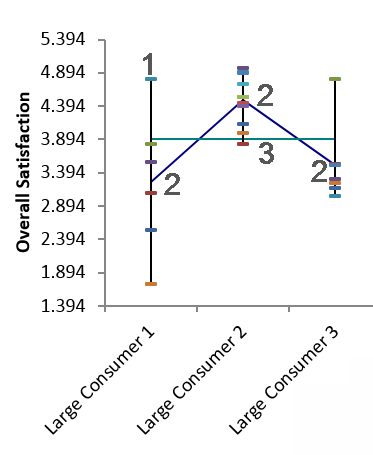
- Data for each category like "Large Consumer 1," is represented by a vertical line with horizontal cross bars. Each cross bar is a data point and a line is drawn from the highest to the lowest data point.
- Averages for each category are shown and compared to the others by drawing lines connecting the averages.
- The group average for the three categories is represented by the horizontal line. Compare these averages to the other groups.
To see the calculations for a QI Macros multi vari chart, just drag the chart over to the side to reveal the calculations behind it.
Learn More...
- Watch video of a Multivari Chart being created using QI Macros SPC Software for Excel.
- Box and Whisker Plot in Excel
- Scatter Plots in Excel
Compatible with Excel 2013-2021/Office 365 (PC) | 2019-2021/Office 365 (Mac)
