Need to Compare Two Histograms Side by Side?
QI Macros add-in has a ready made histogram template for you.
It's hard enough to create one histogram using Excel's Data Analysis Toolpak much less two histograms side by side. But it's easy using QI Macros Histogram Template for Excel.
Creating Side by Side Histograms is Easy Using QI Macros
To use the side by side histogram template:
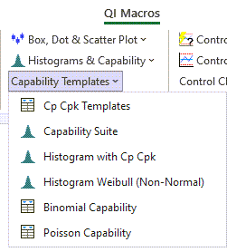
- Click on QI Macros Menu in Excel > Capability Templates > Histogram with Cp Cpk.
- Then select the second worksheet tab "Compare 2 Histograms":
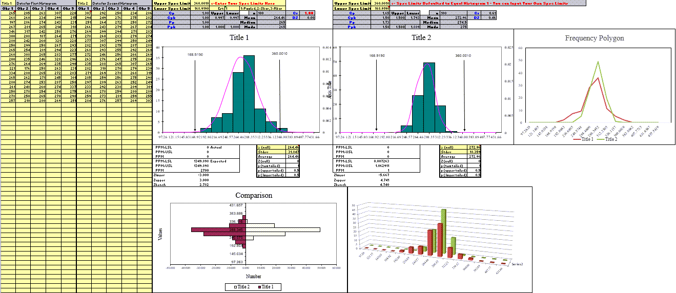
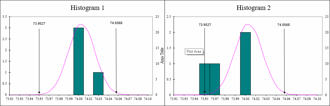
- Input your data in the yellow shaded input areas:
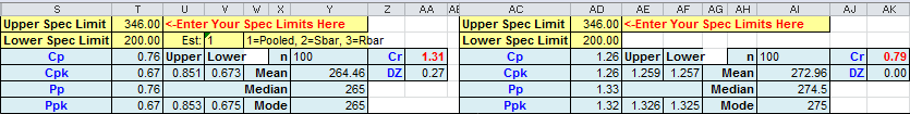
- Histogram 1: Data in columns A to E. Spec Limits are automatically calculated in cells T1 and T2.
(NOTE: You can overwrite these calculations and input your own Spec Limits) - Histogram 2: Data in columns F to J. Spec Limits in AD1 and AD2 are defaulted to Histogram 1's limits (cells T1 and T2), because the Spec Limits for both Histograms are intended to be the same for a valid comparison.
(NOTE: You can overwrite these default calculations and input your own Spec Limits) - To switch between sigma estimator formulas, change cell V2 to: 1) Pooled SD, 2) Sbar, or 3) Rbar.
- The histograms with independent bell curves are automatically created to the right of your data set. Right click on the Y axis to change minimum or maximum values if you want the scales to be the same.
- Process capability metrics Cp Cpk Pp Ppk are also calculated for comparison.

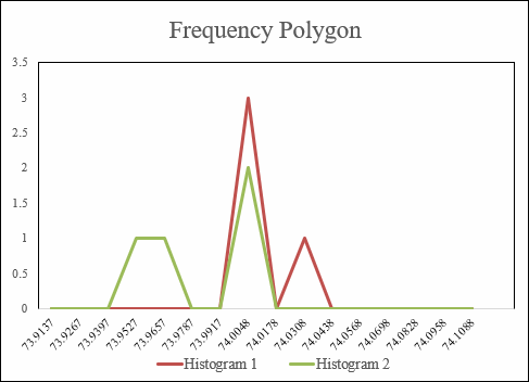
Overlaid Frequency Polygons
Found in our Compare Two Histograms template, a Frequency Polygon is a graph that is used to understand the actual shape of your distribution. Note that this is beneficial when you are comparing multiple data sets/multiple distributions.
It is created by placing a midpoint at the top of each bar/bin from your Histogram. A line is then drawn to connect the tops of said bar/bins, which represents the frequencies within your data set(s)/distribution(s):
Stop Struggling with Histograms!
Start creating your Histograms in just minutes.
Download a free 30-day trial. Get Histograms now!
QI Macros Draws These Charts Too!
