Struggling to Create Scatter Plots in Excel?
QI Macros add-in Can Create Scatter Plots for You in Seconds.
Draw a Scatter Plot using QI Macros
- Select your data.
- Select Scatter Plot on QI Macros menu.
- QI Macros will do the math and draw the graph for you.
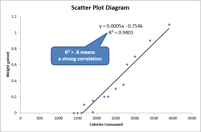
Example of an Excel Scatter Plot Diagram Created by QI Macros
Go Deeper:
Scatter Plot Diagrams are used to evaluate the correlation or cause-effect relationship (if any) between two variables (e.g., speed and gas consumption in a vehicle).
When you think there's a cause-effect link between two indicators (e.g., calories consumed and weight gain) then you can use the scatter plot to prove or disprove it. If the points are tightly clustered along the trend line, then there's probably a strong correlation. If it looks more like a shotgun blast, there is no correlation.
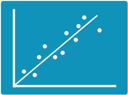
Scatter Diagram with Strong Correlation
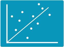
Scatter Diagram with No Correlation
Scatter Plot Diagrams can be made manually or in Excel. However, you have to find the right chart to get a trend line and Excel will not calculate the R² correlation of determination (square of the correlation coefficient) for you.
Use a Scatter Plot Maker like QI Macros for Excel to save time and get the calculations right.
Compatible with Excel 2013-2021/Office 365 (PC) | 2019-2021/Office 365 (Mac)
Stop Struggling with Scatter Plots!
Start creating your Scatter Plots in just minutes.
Download a free 30-day trial. Get Scatter Plots now!
Learn More...
- Switch X and axis and show/hide Confidence Intervals and Prediction Intervals
- Create a Quadrant Scatter Chart
- Scatter Plot Matrix for more than two variables
- Scatter Plot Templates
- Scatter Diagram Examples
QI Macros Draws These Charts Too!
