Trying to Create Cusum Charts in Excel?
QI Macros can create cusum charts for you!
Draw a CUSUM Chart using QI Macros:
- Select your data.
- Select Control Charts (SPC) > Special> CUSUM from QI Macros menu.
- QI Macros will do the math and draw the graph for you.
Cumulative Sum Charts Can Detect Small Shifts in a Process
Cusum charts can detect process shifts more rapidly than the XmR or XbarR. If a trend develops, it's evidence that the process has shifted. In addition to a Cusum chart, you might consider an EWMA chart.
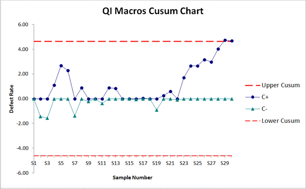
Example of a Cusum Chart Created by QI Macros Add-in for Excel
QI Macros also contains a ready made cusum chart template.
A Cusum Chart consists of:
- A target which is either provided by you or calculated as the mean of your data.
- Upper Cusum Limit and Lower Cusum Limit lines.
- C+ and C- lines which represent the cumulative sum of deviations of successive sample means from a target. Use these lines to determine if your process is shifting.
Default values calculated in the Cusum Chart:
NOTE: Using h=4 or h=5 and k=.5 will generally provide a cusum that has good ARL properties (per Montgomery SPC 4th ed.)k (slack) = 1/2 of your StDev
(this is an estimated value, but can be changed)FIR (Fast Initial Response) = 0
(This feature can be used to set an initial "head start" value to improve detection of an out-of-control condition at the start of the chart. If the process is in control, this initial head start has little effect; if the process is out of control, a signal will be given faster with a non-zero value than with a zero value)h (threshold value or decision interval) = 4
(this determines how many StDev from the mean the Cusum Limits are set)
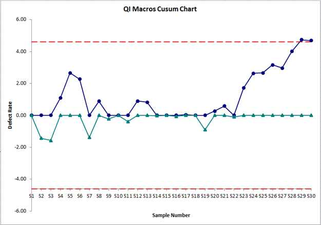
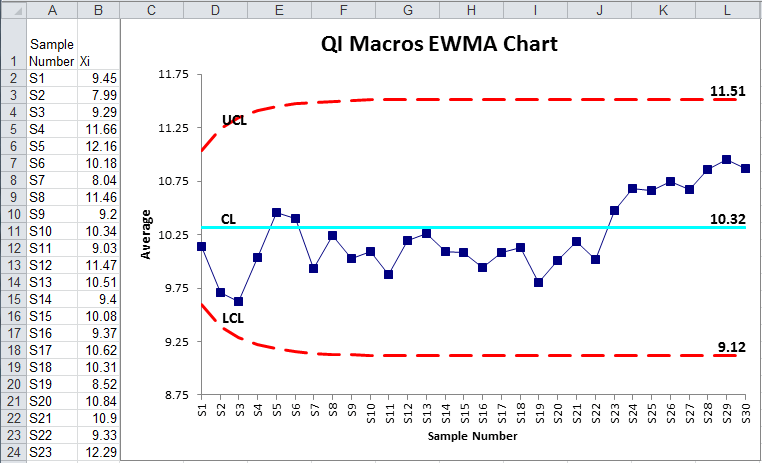
Compare a Cusum Chart with an EWMA Chart
Cusum Chart
Compare a Cusum Chart with an Individual Moving Range Chart
Cusum Chart
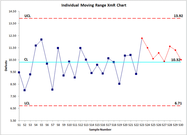
Notice how the Cusum chart more quickly and clearly identifies the process shift.
Stop Struggling with CUSUM Charts!
Start creating your CUSUM Charts in just minutes.
Download a free 30-day trial. Get CUSUM Charts now!
QI Macros Draws These Charts Too!
