Trying to Determine Data Normality in Excel?
QI Macros Can Check It For You!
Go Deeper: Is Your Data Normal?
Statistical analysis (e.g., ANOVA) may rely on your data being "normal" (i.e., bell-shaped), so how can you tell if it really is normal?
The two tests most commonly used are:
- Anderson-Darling p-value or Critical Value method
- Normal Probability Plot described on this page
The Anderson-Darling values shown are:
- A-squared = 0.270
- p value= 0.648
- 95% Critical Value = 0.787
- 99% Critical Value = 1.092
If |
Then |
| p value <= a | Reject the null hypothesis |
| p value > a | Cannot reject the null hypothesis (Accept the null hypothesis) - the data is normal. |
| A-squared > critical value |
Reject the null hypothesis |
| A-squared <= critical value |
Cannot reject the null hypothesis (Accept the null hypothesis) - the data is normal. |
"Null hypothesis" is that the data is normal.
The "alternative hypothesis" is that the data is non-normal.
Reject the Null hypothesis (i.e., accept the alternative) when p<=alpha or A-squared>critical value.
Using the p value: p = 0.648 which is greater than alpha (level of significance) of 0.01. So we cannot reject the null hypothesis (accept the null hypothesis)(i.e., the data is normal).
Using the critical values, you would only reject this "null hypothesis" (i.e., data is non-normal) if A-squared is greater than either of the two critical values. Since 0.270 < 0.787 and 0.270 < 1.092, you can be at least 99% confident that the data is normal.
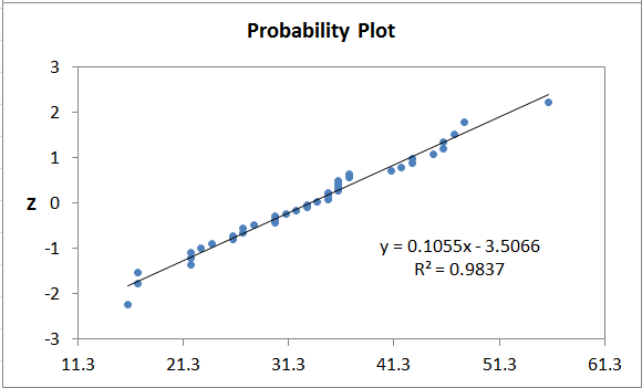
Normal Probability Plot Method
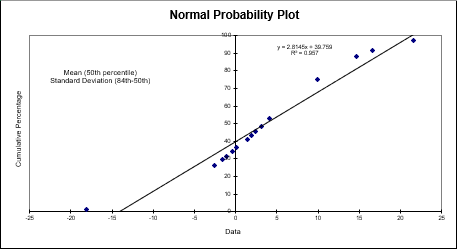
The probability plot transforms the data into a normal distribution and plots it as a scatter diagram.
- Normal data will follow the trend line.
- Non-normal data will have more points farther from the trend line.
- QI Macros probability plot also calculates R².
Normal Probability Plots in QI Macros Add-in for Excel
QI Macros has several tools that will run a Probability Plot for you. They include:
- Descriptive Statistics
- Capability Suite of Six Charts
- XmR, XbarR and XbarS Chart Templates
Example of QI Macros XmR Chart Template
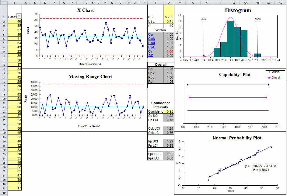
Just by looking at the histogram (bell shaped) and probability plot, you can see that this data is fairly normal.
Probability Plot Template
QI Macros also offers a Probability Plot template, found in the Chart Templates drop-down menu:
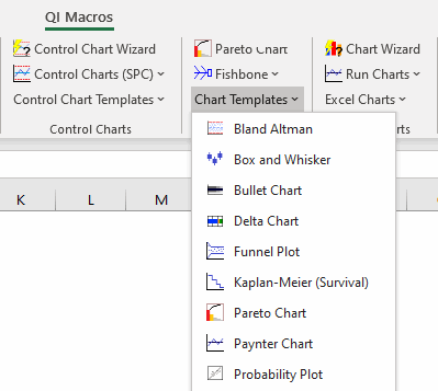
Within this template, there are 2 template options:
![]()
- Probability Plot (Z)
- Probability Plot (%)
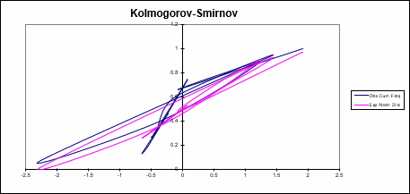
In each of these templates, you will find a Normal Probability Plot chart, a Half-Normal Probability Plot chart and a Kolmogorov-Smirnov Test.
A Normal Probability Plot graphs z-scores (standard scores) against your data set. It also provides you with a visual representation of whether your data set is a normal distribution:
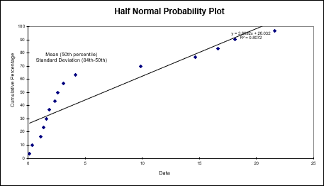
A Half Normal Probability Plot graphs your distribution to evaluate which factors are important vs. which are unimportant:
Kolmogorov-Smirnov (KS) is a Goodness-of-Fit Test that is used to indicate if a sample comes from a population with a specific distribution: