Are You Making One of These Pareto Chart Mistakes?
QI Macros Pareto Chart Maker Can Help!
Tips for Drawing Pareto Charts Using Data in Excel
Pareto charts are powerful tools for solving business problems because every process produces defects, mistakes and errors. But there are some common problems that people have drawing a Pareto chart. Here's a description of the problems and how QI Macros add-in for Excel can easily help you overcome these obstacles.
Common Problem #1 - Summarizing Data
More often than not, the data isn't summarized into something that is easily turned into a Pareto chart. If you have data that looks like the following example, there are a couple of ways to handle it. You will need a PivotTable to summarize the data before drawing a Pareto or use QI Macros Pareto chart tool which can do both in one step.

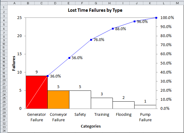
To create a Pareto of the number of errors for each type of cause listed in column C, select the heading in C1 and click on the QI Macros Pareto Chart. QI Macros will run a pivot table to count the number of times each cause is listed and draw a Pareto chart.
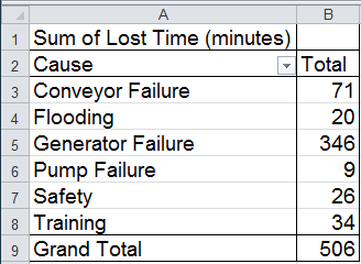
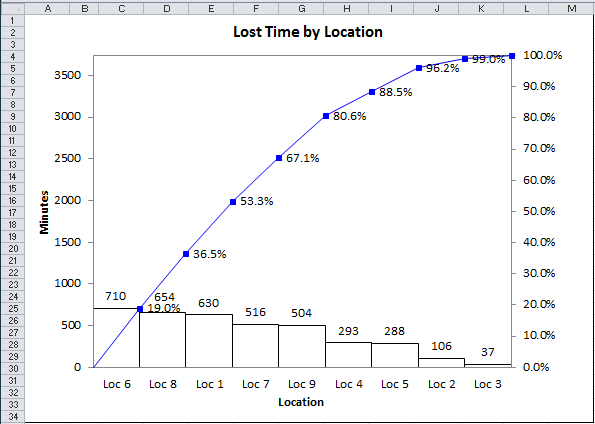
However, you may be most interested in how many minutes are lost to each type of error. If we select B1:C1 and choose QI Macros -> PivotTable Wizard, it will summarize the time for each type of defect.
Then we can use QI Macros Pareto Chart maker to show the magnitude of the problem:
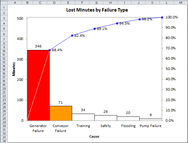
In this case, generator failure is both the most frequent and most costly failure. As you can see, it's easy to use the QI Macros PivotTable Wizard and Pareto Chart macro to turn text into Pareto charts.
Common Problem #2 - the "Other" Category
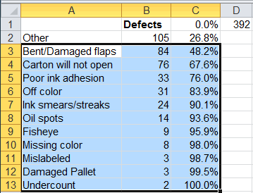
Another common problem involves the collection of data. Workers often categorize the type of defect as "Other" rather than investigate it enough to give it a correct description. In these cases the "big bar" at the front of the Pareto is Other:
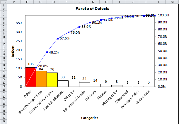
Any team that tries to solve the "Other" problem will end in frustration because the "Other" bar is composed of many different types of defects. The easiest choice in these situations is simply to reselect the data without the "Other" category. Bent and damaged flaps will become the most important problem to solve.
If you simply must retain the "Other" bar, you can manipulate the QI Macros Pareto chart data sheet to get the desired effect. If you drag the Pareto Chart off to the side, you will see the data behind it:
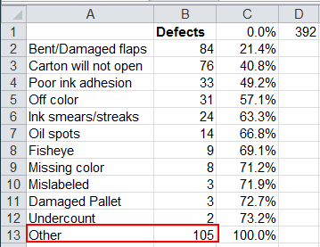
Select A3:C13 and use COPY/paste to move the data up one row. Then replace the last item in row 13 with the "Other" data.
Note:
Do not use cut/paste as this will break the formulas:
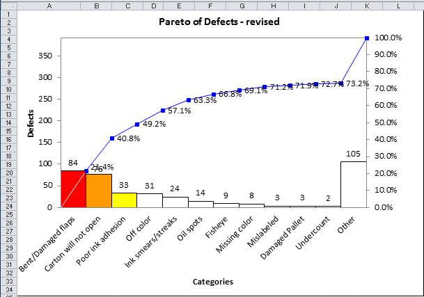
This will change the Pareto Chart to the correct form.
Common Problem #3 - Parflato Charts
The third most common problem is what I call a Parflato chart—a chart with no significant bars. These are sometimes useful to explain to other people why you aren't pursuing certain characteristics, but they are not useful for problem solving. When there is no Pareto pattern, there's no easy way to get breakthrough improvements. In the example below, location has no obvious Pareto pattern. Location 3 is much smaller which could show a reverse Pareto pattern, but this may be caused by lower volume at that location.
So there you have it, the three most common problems users face when trying to create a Pareto chart: summarizing data, useless Other bars and Parflato charts. I'd recommend doing a better job of collecting the data in the future to eliminate the Other category completely.
Have fun summarizing and Pareto charting data to solve the myriad problems facing your business today.
Learn More...
- The Pareto Principle
- Example of Pareto Analysis
- How to Use QI Macros Pareto Chart Features
Stop Struggling with Pareto Charts!
Start creating your Pareto Charts in just minutes.
Download a free 30-day trial. Get Pareto Charts now!
QI Macros Draws These Charts Too!
