Struggling to Tell Your Story With Data?
Learn these data visualization tips and tools.
Data visualization is the art of telling a story using graphical tools.
Imagine that you want to engage leaders, managers and fellow employees in a business case or improvement project. You can show them a spreadsheet of data or you can show them a series of charts and diagrams that explain exactly what is wrong and what needs to be done to make it better.
Often the most effective way to describe, explore, and summarize a set of numbers - even a very large set - is to look at pictures of those numbers.
- Edward Tufte
The Visual Display of Quantitative Information
You don't have to be an Excel Guru to create powerful charts and graphs
While Excel creates basic line, bar, or pie charts, it can take a lot longer than necessary and the resulting chart is often hard to read, suffering from what Edward Tufte calls "Chart-junk."
We believe that charting software should do as much of the work as possible. That's why we created QI Macros Add-in for Excel.
QI Macros makes creating standard Excel charts easier. More importantly, QI Macros makes it just as easy to create "smart charts." Charts like control charts, Pareto charts and histograms that help analyze your data, not just display it.
| Type of Analysis | Basic Chart |
Better Chart |
Smart Charts |
|---|---|---|---|
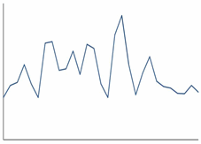
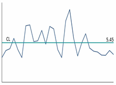
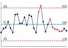
| Evaluate Over Time |
Line Graph |
|
|
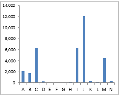
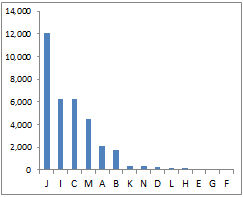
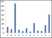
| Compare Categories |
Bar Chart |
Descending Bar Chart |
|
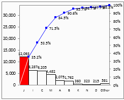
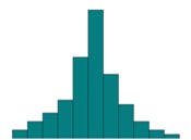
| Analyze Variation |
Bar Chart |
|
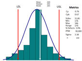
Histogram with Bell Curve and Process Capability Analysis |
When drawing charts to visualize your data, avoid these mistakes
- Wrong chart or diagram - a fatal flaw can be in presenting the data. A line chart may not reveal what a bar chart might reveal and vice versa.
- QI Macros Chart Wizards can help you choose the right chart every time. - Chart-junk - good design brings absolute attention to data. Bad design loses the insights in the clutter. Simplicity beats complexity. The clearer the chart, the more engagement you'll achieve.
- QI Macros creates charts free of chart-junk. - Lack of clarity in depicting cause and effect. An improvement project needs to clearly link performance (e.g.,a control chart) to types of problems (e.g., a Pareto chart or histogram), to the root causes, to the countermeasures, to the action plan.
- QI Macros Improvement Project Wizard can create control charts, Paretos and fishbones with just one click.
Additional Insights for Data Visualization
