Sustain Your Improvements
Lean Six Sigma Lesson 4
In Lesson #2 and #3 we talked about Doubling Your Quality and Doubling Your Speed. Once you have achieved success you don't want to backslide. The best way to ensure continuous improvement is to monitor and track the key measures you identified in your Master Improvement Story. After improving a process you may now want to flowchart it and ensure that you have identified the appropriate measurements.
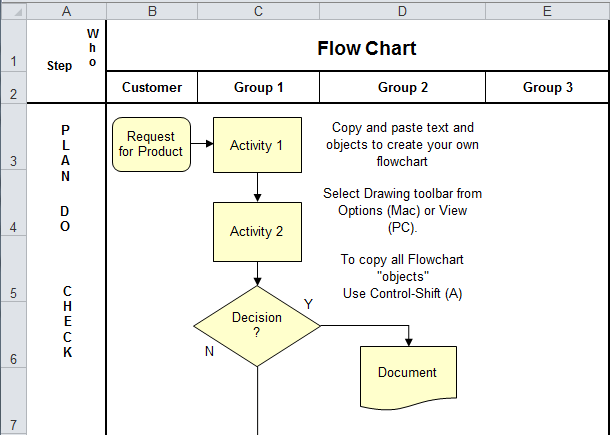
Flowcharting the Process
Flow Chart Symbols: A flowchart uses a few simple symbols to show the flow of a process, oval, box, diamond, arrow, and circle:
- An oval to represent starting and ending points from the customers point of view (e.g. customer places order, customer pays bill for shipped product, etc.)
- A box to represent activities that add value to the product or service. These should be indicated as a verb-noun (e.g. fill order, calculate bill, post payment, etc.)
- A diamond to represent decisions where someone is choosing between two or more alternatives (e.g. order approved?, email or snail mail?, etc.)
- An arrow to represent the flow of the process and the transition between activities or decisions. (We found Sticky Notes shaped like arrows on Amazon.)
- A circle to represent the Quality or Process indicators.
Developing the Flow Chart: Instead of writing directly on the flowchart, use square Post-it notes for both the decisions (diamonds) and activities (boxes). This way, the process will remain easy to change until you have it clearly and totally defined. Limit the number of decisions and activities per page. Move detailed sub-processes onto additional pages. Across the top of the flowchart list every person or department that helps deliver the product or service. Along the left-hand side, list the major steps in your process: planning, doing, checking, and acting to improve. Even going to the grocery store involves creating a list (plan), getting the groceries (do), checking the list (check), and acting to get any forgotten items.
Quality and Process Indicators
Process Indicators measure performance INSIDE the process. They help find and fix problems before the customer is affected. Put them at critical hand offs between functions and decision points-especially ones that require error correction.
Quality indicators are measured AFTER delivery. They track customer satisfaction with timeliness, accuracy, and value. See examples of quality indicators.
Analyzing Stability
A stable process produces PREDICTABLE RESULTS CONSISTENTLY. Process stability can be easily determined using control charts. A control chart is a line graph of your data (the same control chart used to identify and focus your problem) with average and sigma lines to determine stability. The average and sigma lines (+- 1, 2 and 3 sigma) are calculated from the data. The Upper Control Limit (UCL) is the +3 sigma line and the Lower Control Limit (LCL) is the -3 sigma line. 99.7% of all data points should fall between these two limits.
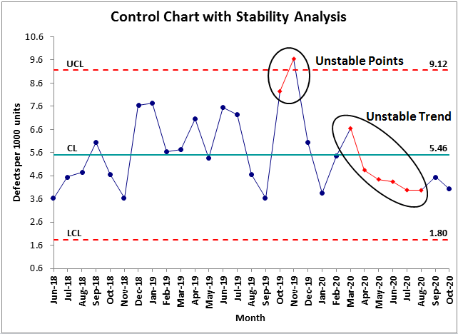
Common and Special Causes of Variation
How can you tell if a process is stable? Processes are never perfect. Common and special causes of variation make the process perform differently in different situations. Getting from your home to school or work takes varying amounts of time because of traffic or transportation delays. These are common causes of variation; they exist every day.
A blizzard, a traffic accident, a chemical spill or other freak occurrence would be a special cause of variation. Processes that are "out of control" need to be stabilized before they can be improved. Special causes require immediate cause-effect analysis to eliminate the special cause of variation.
QI Macros Statistical Process Control Software calculates unstable points or trends for you and turns them red.
Choosing the Right Control Chart
One area that most people seem to struggle with is choosing the right control chart. The right chart is based on the type of data, attribute (counted) or variable (measured), and the sample size.
The control chart wizard in the latest version of the QI Macros SPC Software for Excel can analyze your data and select the right control chart for you. To choose the right chart yourself, follow these guidelines.
For attribute data use np, p, c and u charts
- if you are counting defective items (e.g. incorrect orders)
- if you are counting the # of defects (e.g. number of errors on an order)
For variable or measured data such as time, cost, length, weight, etc. use XMR, XbarR, and XbarS Charts
- if the sample size is one, or you are graphing a ratio, use an XMR chart
- if the sample size is 2-10 use an XbarR chart
- if the sample size is 11-25 use an XbarS chart
Download the SPC Quick Reference Card for an easy to follow control chart selection guide. If you need more help consider the SPC Simplified Training Video or Six Sigma Tools Example Book.
Over the last two years, Jay has helped hundreds of customers understand which charts to choose and how to use them. Consider his One Day QI Macros Training
Analyzing Capability
A capable process MEETS THE CUSTOMER'S REQUIREMENTS 100% OF THE TIME. The Upper (USL) and Lower (LSL) SPECIFICATION limits are determined from the customer's requirements.
Attribute Capability: The capability of counted (i.e. attribute) data like defects, indivisible integers only, is zero defects. Customers hate defects, outages, etc. The capability of measured (i.e. variable) data like time, money, age, length, weight, etc. is determined using the customer's specifications and a histogram.
Variable Capability: When a customer defines an upper and a lower specification limit for a product or service, whether it's the diameter of a pipe or the time in line at a fast food restaurant, all points within the two limits are considered "good."
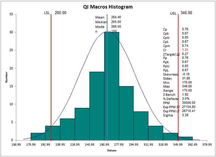
The process capability index (Cp) indicates how well the data fits between the USL and the LSL. Cpk on the other hand indicates how centered the data is within the range. If both Cp and Cpk are greater than or equal to 1 then the process is considered capable.
Cp and Cpk of:
- 1.00 is equivalent to 3 Sigma
- 1.33 is equivalent to 4 Sigma
- 1.67 is equivalent to 5 Sigma
- 2.00 is equivalent to 6 Sigma
To automate these charts, consider ordering the QI Macros for Excel (item #230). Histograms and Capability analysis are also covered in the:
Avoid the Common Pitfalls
Pitfall #1: Confusing Control Limits and Specification Limits. Many people confuse control limits, which are calculated based on your data with specification limits that are provided by your customers.
Solution: You can add specification limits to a control chart as a "target" or "goal" line. This will show you how your process compares to your target but it has nothing to do with whether or not the process is stable.
Pitfall #2: Getting caught up in formulas and statistics behind the charts and forgetting to interpret the results.
Solution: Use an SPC software package like the QI Macros for Excel and free yourself up to analyze the results and improve the process.
Having trouble training your employees on control charts? Dissatisfied with week long training classes and seemingly incomprehensible math, formulas and statistics. We offer a hands-on workshop tailored to your business that provides a simple, structured way to choose the right chart, graph the data and then interpret the results. Download QI Macros Workshop Flyer.
In Lesson # 5, we’ll look at Implementing Six Sigma using a "crawl, walk, run methodology. "
 Take our FREE Lean Six Sigma Yellow Belt training online.
Take our FREE Lean Six Sigma Yellow Belt training online.
Join 100,000+ Users
in 80 Countries
![]()
